import pandas as pd
import numpy as np
import pandas.api.types as pdtypes
from plotnine import (
ggplot,
aes,
stage,
geom_violin,
geom_point,
geom_line,
geom_boxplot,
guides,
scale_fill_manual,
theme,
theme_classic,
)
Violin Plot
geom_violin(
    mapping=None,
    data=None,
    *,
    stat="ydensity",
    position="dodge",
    na_rm=False,
    inherit_aes=True,
    show_legend=None,
    raster=False,
    draw_quantiles=None,
    style="full",
    scale="area",
    trim=True,
    width=None,
    **kwargs
)
Parameters
mapping : aes = None-
Aesthetic mappings created with aes. If specified and
inherit_aes=True, it is combined with the default mapping for the plot. You must supply mapping if there is no plot mapping.Aesthetic Default value x y alpha 1color '#333333'fill 'white'group linetype 'solid'size 0.5weight 1The bold aesthetics are required.
data : DataFrame = None-
The data to be displayed in this layer. If
None, the data from from theggplot()call is used. If specified, it overrides the data from theggplot()call. stat : str | stat = "ydensity"-
The statistical transformation to use on the data for this layer. If it is a string, it must be the registered and known to Plotnine.
position : str | position = "dodge"-
Position adjustment. If it is a string, it must be registered and known to Plotnine.
na_rm : bool = False-
If
False, removes missing values with a warning. IfTruesilently removes missing values. inherit_aes : bool = True-
If
False, overrides the default aesthetics. show_legend : bool | dict = None-
Whether this layer should be included in the legends.
Nonethe default, includes any aesthetics that are mapped. If abool,Falsenever includes andTruealways includes. Adictcan be used to exclude specific aesthetis of the layer from showing in the legend. e.gshow_legend={'color': False}, any other aesthetic are included by default. raster : bool = False-
If
True, draw onto this layer a raster (bitmap) object even ifthe final image is in vector format. draw_quantiles : float | list[float] = None-
draw horizontal lines at the given quantiles (0..1) of the density estimate.
style : str = "full"-
The type of violin plot to draw. The options are:
'full'        # Regular (2 sided violins)
'left'        # Left-sided half violins
'right'       # Right-sided half violins
'left-right'  # Alternate (left first) half violins by the group
'right-left'  # Alternate (right first) half violins by the group
**kwargs : Any-
Aesthetics or parameters used by the
stat.
See Also
stat_ydensity-
The default
statfor thisgeom.
Examples
Violins, Boxes, Points & Lines
Comparing repeated measurements and their summaries
Suppose you have two sets of related data and each point in the first set maps onto a point in the second set. e.g. they could represent a transition from one state to another for example two measurements of the height of pupils in different years.
For demonstration we shall generate data with a before measurement and an after measurement.
np.random.seed(123)
n = 20
mu = (1, 2.3)
sigma = (1, 1.6)

before = np.random.normal(loc=mu[0], scale=sigma[0], size=n)
after = np.random.normal(loc=mu[1], scale=sigma[1], size=n)

df = pd.DataFrame(
    {
        "value": np.hstack([before, after]),
        "when": np.repeat(["before", "after"], n),
        "id": np.hstack([range(n), range(n)]),
    }
)

df["when"] = df["when"].astype(pdtypes.CategoricalDtype(categories=["before", "after"]))
df.head()| value | when | id | |
|---|---|---|---|
| 0 | -0.085631 | before | 0 |
| 1 | 1.997345 | before | 1 |
| 2 | 1.282978 | before | 2 |
| 3 | -0.506295 | before | 3 |
| 4 | 0.421400 | before | 4 |
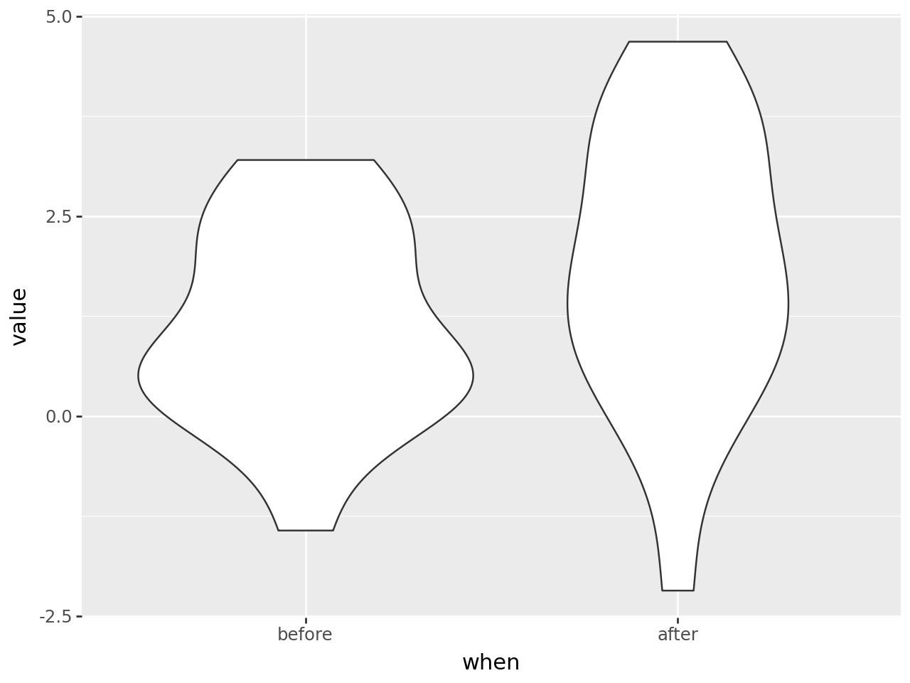
A basic violin plot shows distributions of the two sets of data.
(
    ggplot(df, aes("when", "value"))
    + geom_violin(df)
)
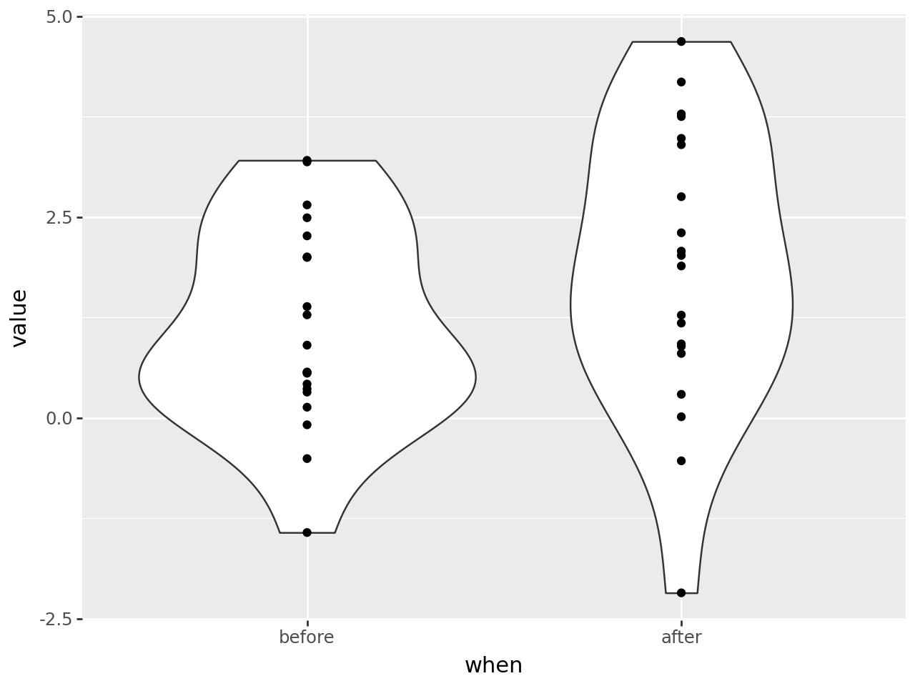
Add the original data in form of points.
(
    ggplot(df, aes("when", "value"))
    + geom_violin(df)
    + geom_point()
)
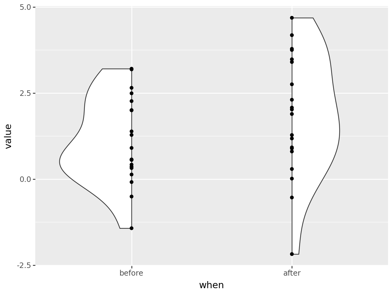
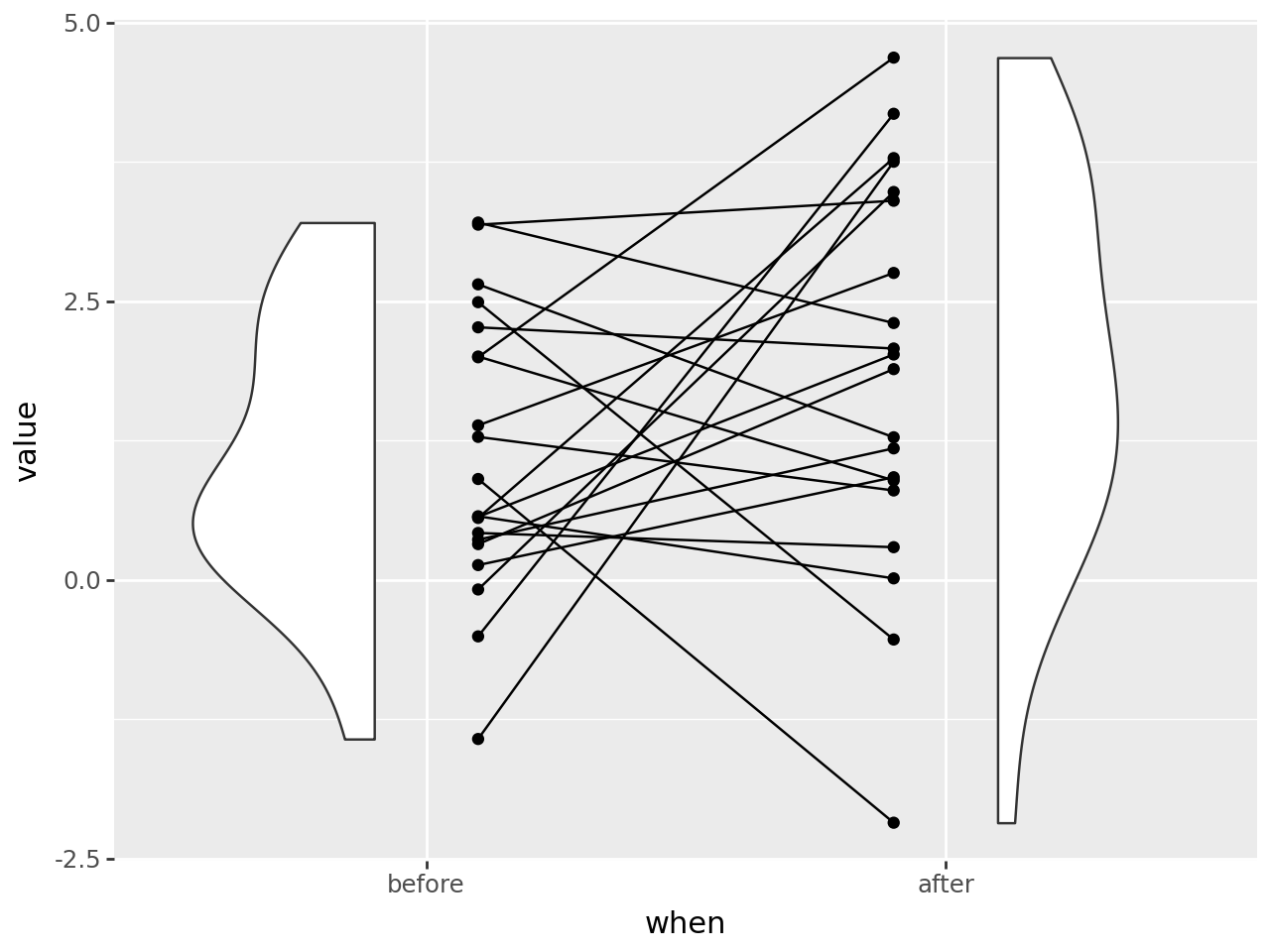
The violins are symmetrical about the vertical axis and half a violin has the same information as the full violin. We cut (style) the violins in half and choose to alternate with the left half for the first one and the right half for the second.
(
    ggplot(df, aes("when", "value"))
    + geom_violin(df, style="left-right")  # changed
    + geom_point()
)
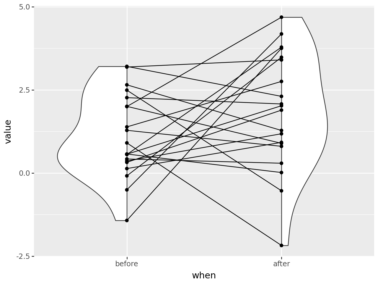
Link up the points to get a sense of how the data the moves.
(
    ggplot(df, aes("when", "value"))
    + geom_violin(df, style="left-right")  # changed
    + geom_point()
    + geom_line(aes(group="id"))  # new
)
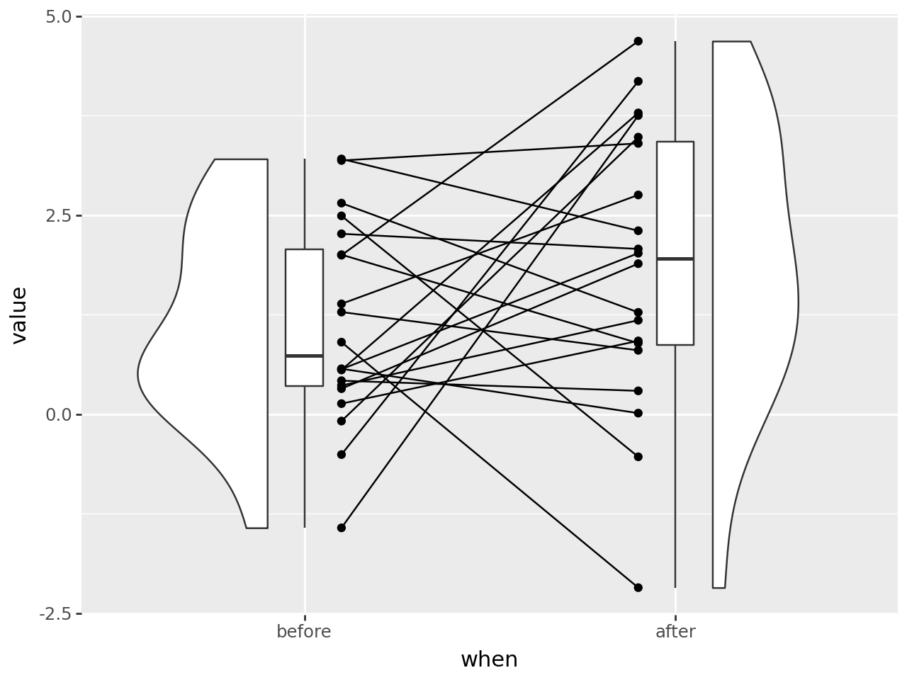
Make gap between the points and the violions. i.e. shift the violins outward and the points & lines inward. We used stage mapping to get it done. For example
x=stage('when', after_scale='x+shift*alt_sign(x)')says, map the xaesthetic to the ‘when’ column/variable and after the scale computed the x locations add a shift to them. The calculated x locations of a discrete scale are consecutive numbers 1, 2, 3, ..., so we use that move objects of adjacent groups in opposite directions i.e $(-1)^1, (-1)^2, (-1)^3 … = -1, 1, -1… $
# How much to shift the violin, points and lines
# 0.1 is 10% of the allocated space for the category
shift = 0.1


def alt_sign(x):
    "Alternate +1/-1 if x is even/odd"
    return (-1) ** x


m1 = aes(x=stage("when", after_scale="x+shift*alt_sign(x)"))  # shift outward
m2 = aes(x=stage("when", after_scale="x-shift*alt_sign(x)"), group="id")  # shift inward

(
    ggplot(df, aes("when", "value"))
    + geom_violin(m1, style="left-right")  # changed
    + geom_point(m2)  # changed
    + geom_line(m2)  # changed
)
Add a boxplot in the gap. The space between the flat edge of the violin and the center of the points is 2 * shift, so we can use the shift to control the width of the boxplot.
(
    ggplot(df, aes("when", "value"))
    + geom_violin(m1, style="left-right")
    + geom_point(m2)
    + geom_line(m2)
    + geom_boxplot(width=shift)
)
Finall, style it up.
# Gallery, distributions

lsize = 0.65
fill_alpha = 0.7

(
    ggplot(df, aes("when", "value", fill="when"))
    + geom_violin(m1, style="left-right", alpha=fill_alpha, size=lsize)
    + geom_point(m2, color="none", alpha=fill_alpha, size=2)
    + geom_line(m2, color="gray", size=lsize, alpha=0.6)
    + geom_boxplot(width=shift, alpha=fill_alpha, size=lsize)
    + scale_fill_manual(values=["dodgerblue", "darkorange"])
    + guides(fill=False)  # Turn off the fill legend
    + theme_classic()
    + theme(figure_size=(8, 6))
)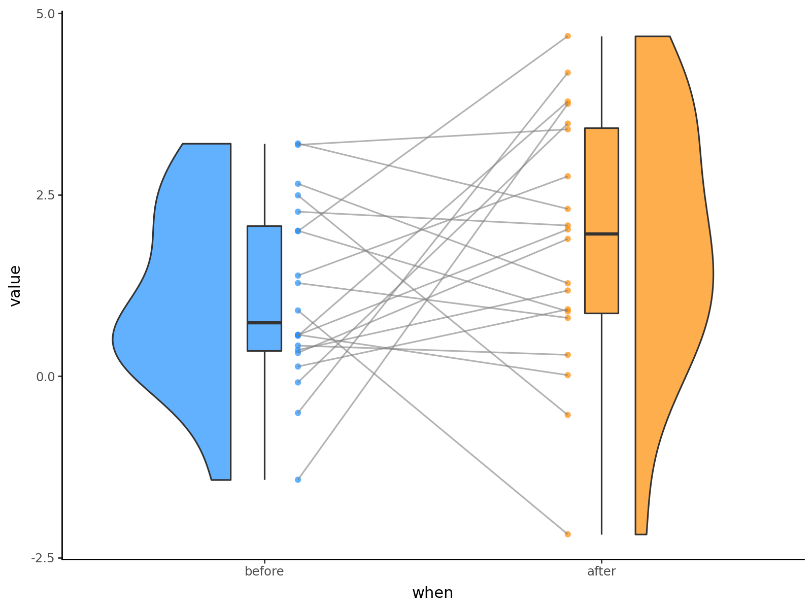
Credit: This is example is motivated by the work of Jordy van Langen (@jorvlan) at https://github.com/jorvlan/open-visualizations.