from plotnine import ggplot, aes, labs, geom_point, theme, theme_538, theme_set
from plotnine.data import mtcars
theme_set(theme_538())
labs(
    x=None,
    y=None,
    alpha=None,
    color=None,
    colour=None,
    fill=None,
    linetype=None,
    shape=None,
    size=None,
    stroke=None,
    title=None,
    subtitle=None,
    caption=None,
    tag=None
)
Add labels for any aesthetics with a scale or title, subtitle & caption
Parameter Attributes
x: str | None = None-
Name of the x-axis.
y: str | None = None-
Name of the y-axis.
alpha: str | None = None-
Name of the alpha legend.
color: str | None = None-
Name of the color legend or colorbar.
colour: str | None = None-
Name of the colour legend or colourbar.
This is an alias of the
colorparameter. Only use one of the spellings. fill: str | None = None-
Name of the fill legend/colourbar.
linetype: str | None = None-
Name of the linetype legend.
shape: str | None = None-
Name of the shape legend.
size: str | None = None-
Name of the size legend.
stroke: str | None = None-
Name of the stroke legend.
title: str | None = None-
The title of the plot.
subtitle: str | None = None-
The subtitle of the plot.
caption: str | None = None-
The caption at the bottom of the plot.
tag: str | None = None-
A plot tag
Examples
Text Outside the Panel(s)
# Gallery, labels
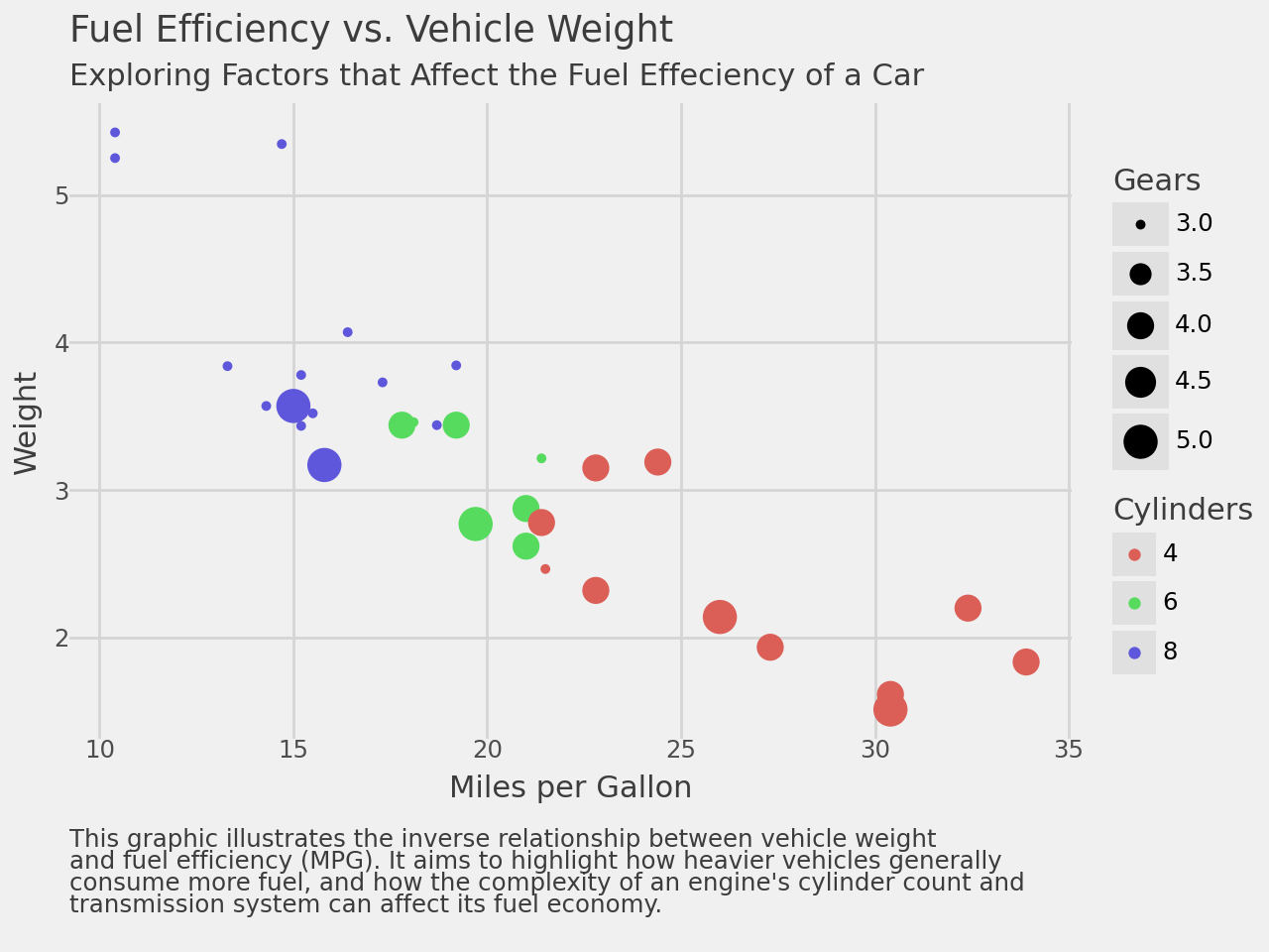
caption = """\
This graphic illustrates the inverse relationship between vehicle weight
and fuel efficiency (MPG). It aims to highlight how heavier vehicles generally
consume more fuel, and how the complexity of an engine's cylinder count and
transmission system can affect its fuel economy.
"""
from plotnine import *
(
ggplot(mtcars, aes("mpg", "wt", colour="factor(cyl)", size="gear"))
+ geom_point()
+ labs(
x="Miles per Gallon",
y="Weight",
colour="Cylinders",
size="Gears",
title="Fuel Efficiency vs. Vehicle Weight",
subtitle ="Exploring Factors that Affect the Fuel Effeciency of a Car",
caption=caption,
)
+ theme(
# left justify the caption and have one line of space between it and
# the x-axis label
plot_caption=element_text(ha="left", margin={"t": 1, "units": "lines"})
)
)