import pandas as pd
from plotnine import ggplot, aes, geom_bar, coord_flip, labs, scale_x_discrete
from plotnine.data import mpgCustom sorting of plot series
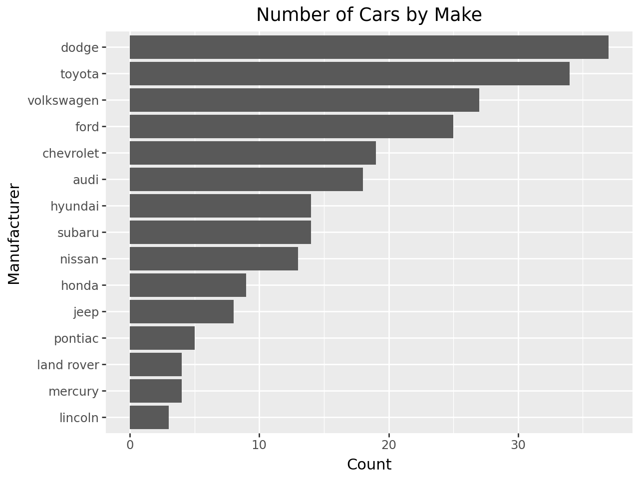
Bar plot of manufacturer - Default Output
(
    ggplot(mpg)
    + aes(x="manufacturer")
    + geom_bar(size=20)
    + coord_flip()
    + labs(y="Count", x="Manufacturer", title="Number of Cars by Make")
)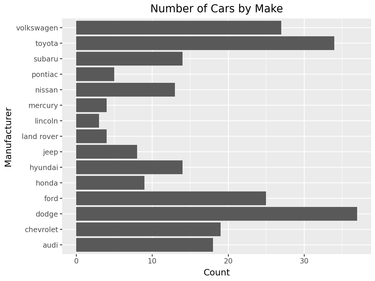
Ordered Horizontal Bars
By default the discrete values along axis are ordered alphabetically. If we want a specific ordering we use a pandas.Categorical variable with categories ordered to our preference.
# Determine order and create a categorical type
# Note that value_counts() is already sorted
manufacturer_list = mpg["manufacturer"].value_counts().index.tolist()
manufacturer_cat = pd.Categorical(mpg["manufacturer"], categories=manufacturer_list)

# assign to a new column in the DataFrame
mpg = mpg.assign(manufacturer_cat=manufacturer_cat)

(
    ggplot(mpg)
    + aes(x="manufacturer_cat")
    + geom_bar(size=20)
    + coord_flip()
    + labs(y="Count", x="Manufacturer", title="Number of Cars by Make")
)
We could also modify the existing manufacturer category to set it as ordered instead of having to create a new CategoricalDtype and apply that to the data.
mpg = mpg.assign(
manufacturer_cat=mpg["manufacturer"].cat.reorder_categories(manufacturer_list)
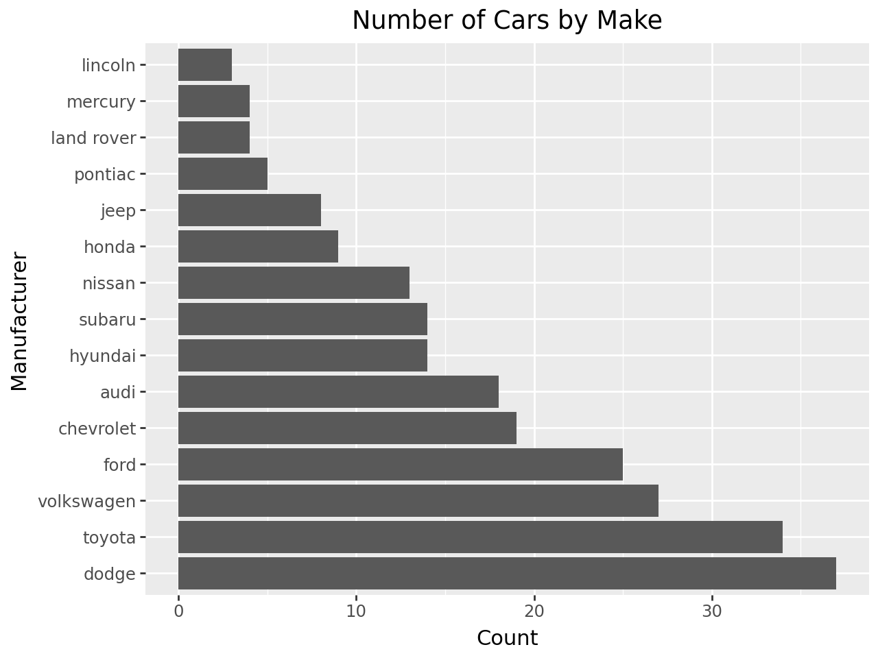
)Alternatively
Another method to quickly reorder a discrete axis without changing the data is to change it’s limits
# Determine order and create a categorical type
# Note that value_counts() is already sorted
manufacturer_list = mpg["manufacturer"].value_counts().index.tolist()

(
    ggplot(mpg)
    + aes(x="manufacturer_cat")
    + geom_bar(size=20)
    + scale_x_discrete(limits=manufacturer_list)
    + coord_flip()
    + labs(y="Count", x="Manufacturer", title="Number of Cars by Make")
)
You can ‘flip’ an axis (independent of limits) by reversing the order of the limits.
# Gallery, bars
# Determine order and create a categorical type
# Note that value_counts() is already sorted
manufacturer_list = mpg["manufacturer"].value_counts().index.tolist()[::-1]

(
    ggplot(mpg)
    + aes(x="manufacturer_cat")
    + geom_bar(size=20)
    + scale_x_discrete(limits=manufacturer_list)
    + coord_flip()
    + labs(y="Count", x="Manufacturer", title="Number of Cars by Make")
)