import pandas as pd
from plotnine import (
    ggplot,
    aes,
    after_stat,
    stage,
    geom_bar,
    geom_text,
    geom_label,
    position_dodge2,
    facet_wrap,
)
from plotnine.data import mtcarsShow counts and percentages for bar plots
We can plot a bar graph and easily show the counts for each bar
(
    ggplot(mtcars, aes("factor(cyl)", fill="factor(cyl)"))
    + geom_bar()
    + geom_text(
        aes(label=after_stat("count")), stat="count", nudge_y=0.125, va="bottom"
    )
)
stat_count also calculates proportions (as prop) and a proportion can be converted to a percentage.
(
    ggplot(mtcars, aes("factor(cyl)", fill="factor(cyl)"))
    + geom_bar()
    + geom_text(
        aes(label=after_stat("prop*100")),
        stat="count",
        nudge_y=0.125,
        va="bottom",
        format_string="{:.1f}% ",
    )
)
These are clearly wrong percentages. The system puts each bar in a separate group. We need to tell it to put all bars in the panel in single group, so that the percentage are what we expect.
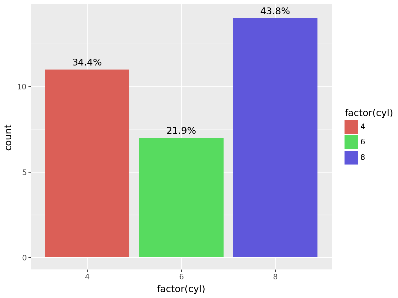
(
    ggplot(mtcars, aes("factor(cyl)", fill="factor(cyl)"))
    + geom_bar()
    + geom_text(
        aes(label=after_stat("prop*100"), group=1),
        stat="count",
        nudge_y=0.125,
        va="bottom",
        format_string="{:.1f}%",
    )
)
Without group=1, you can calculate the proportion / percentage after statistics have been calculated. This works because mapping expressions are evaluated across the whole panel. It can work when you have more than 1 categorical.
(
    ggplot(mtcars, aes("factor(cyl)", fill="factor(cyl)"))
    + geom_bar()
    + geom_text(
        aes(label=after_stat("count / sum(count) * 100")),
        stat="count",
        nudge_y=0.125,
        va="bottom",
        format_string="{:.1f}%",
    )
)
For more on why automatic grouping may work the way you want, see this tutorial.
We can get the counts and we can get the percentages we need to print both. We can do that in two ways,
- Using two
geom_textlayers.
(
    ggplot(mtcars, aes("factor(cyl)", fill="factor(cyl)"))
    + geom_bar()
    + geom_text(
        aes(label=after_stat("count")),
        stat="count",
        nudge_x=-0.14,
        nudge_y=0.125,
        va="bottom",
    )
    + geom_text(
        aes(label=after_stat("prop*100"), group=1),
        stat="count",
        nudge_x=0.14,
        nudge_y=0.125,
        va="bottom",
        format_string="({:.1f}%)",
    )
)
- Using a function to combine the counts and percentages
def combine(counts, percentages):
    fmt = "{} ({:.1f}%)".format
    return [fmt(c, p) for c, p in zip(counts, percentages)]


(
    ggplot(mtcars, aes("factor(cyl)", fill="factor(cyl)"))
    + geom_bar()
    + geom_text(
        aes(label=after_stat("combine(count, prop*100)"), group=1),
        stat="count",
        nudge_y=0.125,
        va="bottom",
    )
)
It works with facetting.
(
    ggplot(mtcars, aes("factor(cyl)", fill="factor(cyl)"))
    + geom_bar()
    + geom_text(
        aes(label=after_stat("combine(count, prop*100)"), group=1),
        stat="count",
        nudge_y=0.125,
        va="bottom",
        size=9,
    )
    + facet_wrap("am")
)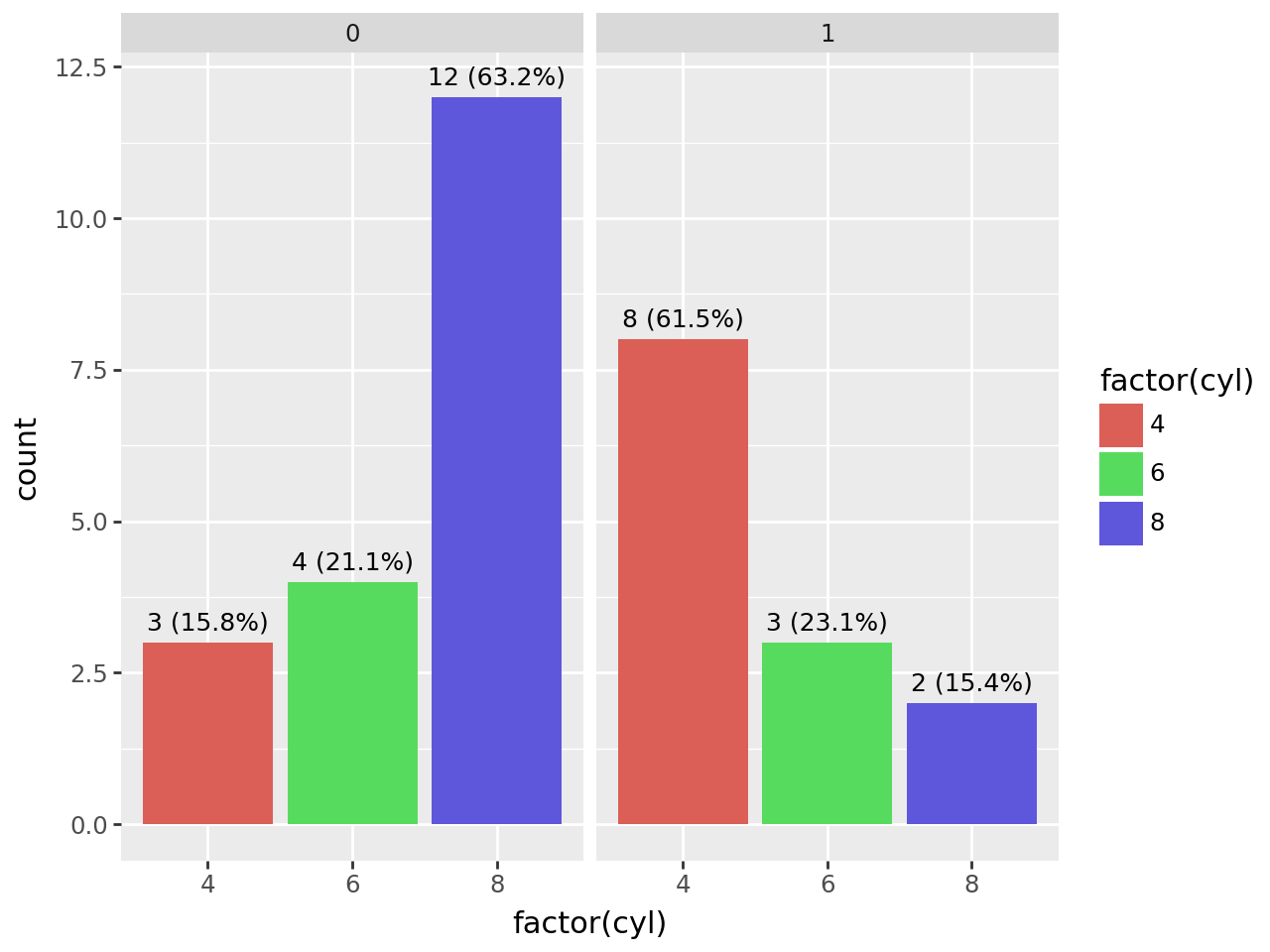
Credit: This example was motivated by the github user Fandekasp (Adrien Lemaire) and difficulty he faced in displaying percentages of bar plots.
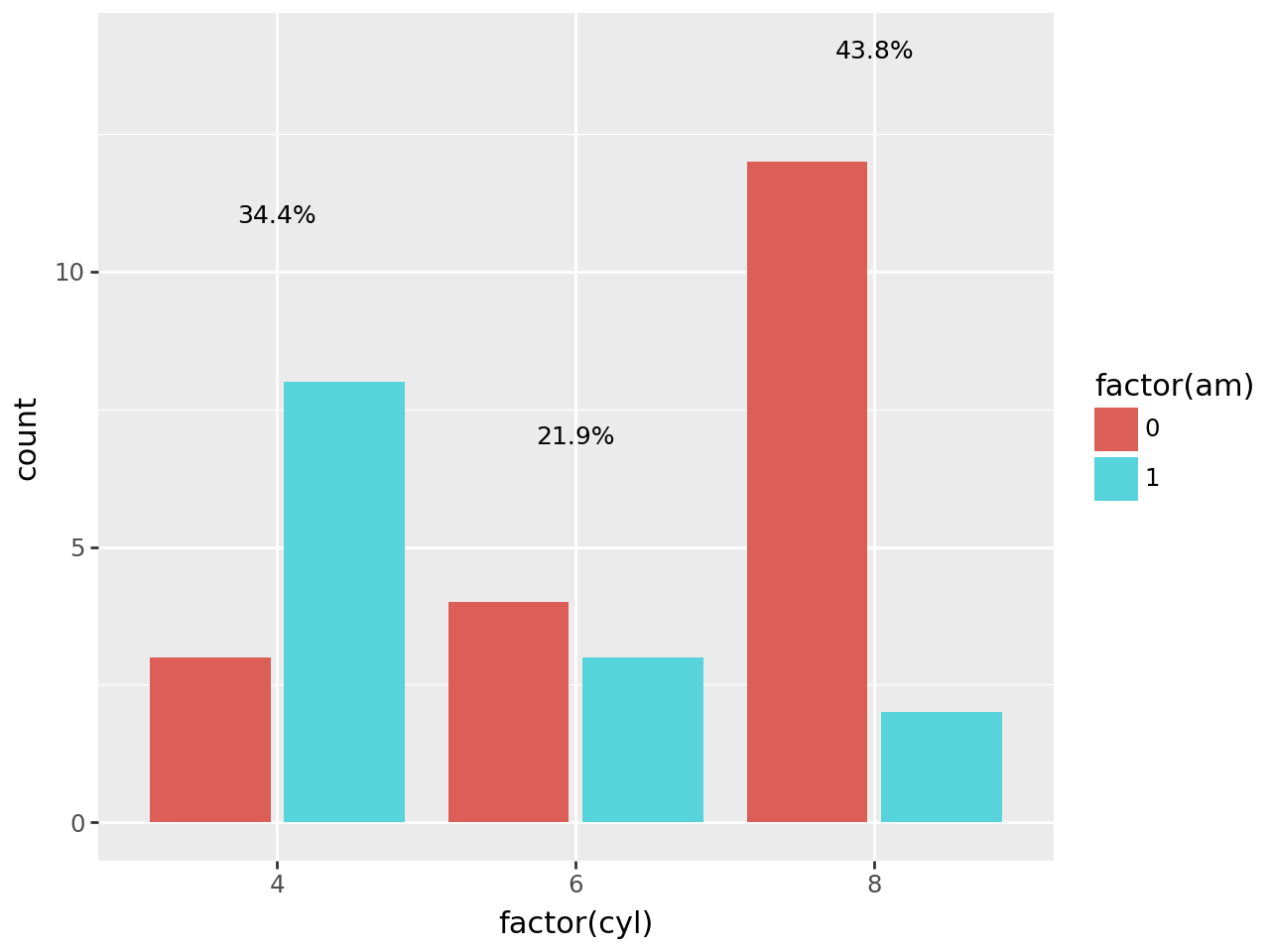
Percentages when you have more than one categorical.
group = 1 does not work when you have more than one categories per x location.
(
    ggplot(mtcars, aes("factor(cyl)", fill="factor(am)"))
    + geom_bar(position="dodge2")
    + geom_text(
        aes(label=after_stat("prop * 100"), group=1),
        stat="count",
        position=position_dodge2(width=0.9),
        format_string="{:.1f}%",
        size=9,
    )
)
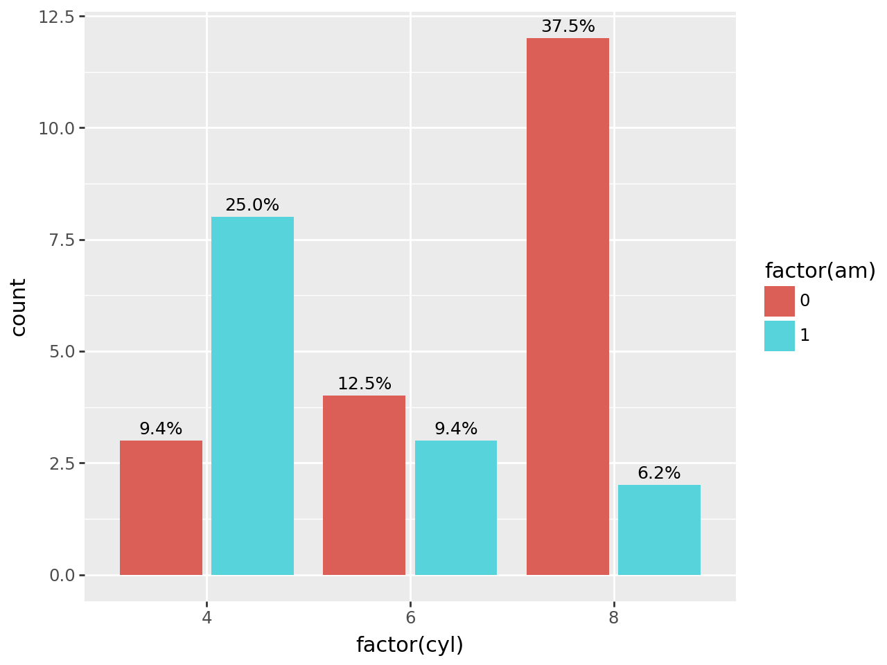
You have to calculate the percentages after statistics for the panel have been calculated.
(
    ggplot(mtcars, aes("factor(cyl)", fill="factor(am)"))
    + geom_bar(position="dodge2")
    + geom_text(
        aes(
            label=after_stat("count / sum(count) * 100"),
            y=stage(after_stat="count", after_scale="y + 0.25"),
        ),
        stat="count",
        position=position_dodge2(width=0.9),
        format_string="{:.1f}%",
        size=9,
    )
)
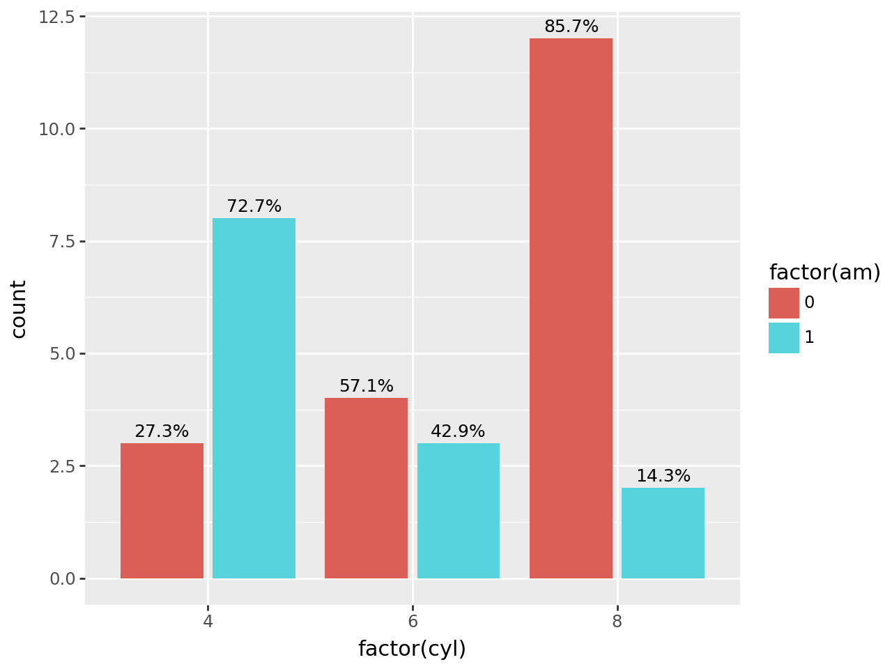
For percentages per bar at each x location, you have to group the counts per location can compute the proportions.
Bars with Group Percentages
# Gallery, bars

def prop_per_x(x, count):
    """
    Compute the proportion of the counts for each value of x
    """
    df = pd.DataFrame({"x": x, "count": count})
    prop = df["count"] / df.groupby("x")["count"].transform("sum")
    return prop


(
    ggplot(mtcars, aes("factor(cyl)", fill="factor(am)"))
    + geom_bar(position="dodge2")
    + geom_text(
        aes(
            label=after_stat("prop_per_x(x, count) * 100"),
            y=stage(after_stat="count", after_scale="y+.25"),
        ),
        stat="count",
        position=position_dodge2(width=0.9),
        format_string="{:.1f}%",
        size=9,
    )
)
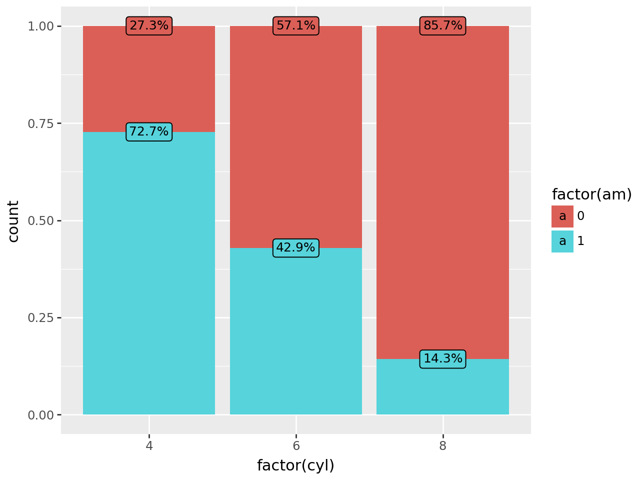
Stacked Bars with Group Percentages
# Gallery, bars
(
    ggplot(mtcars, aes("factor(cyl)", fill="factor(am)"))
    + geom_bar(position="fill")
    + geom_label(
        aes(label=after_stat("prop_per_x(x, count) * 100")),
        stat="count",
        position="fill",
        format_string="{:.1f}%",
        size=9,
    )
)
NOTE
With more categories, if it becomes harder get the right groupings withing plotnine, the solution is to do all (or most) the data manipulation in pandas then plot using geom_col + geom_text.