import numpy as np
import pandas as pd
from plotnine import (
ggplot,
aes,
geom_boxplot,
geom_jitter,
scale_x_discrete,
coord_flip,
)
from plotnine.data import pageviews
Box and whiskers plot
geom_boxplot(
    mapping=None,
    data=None,
    *,
    stat="boxplot",
    position="dodge2",
    na_rm=False,
    inherit_aes=True,
    show_legend=None,
    raster=False,
    width=None,
    outlier_alpha=1,
    outlier_color=None,
    outlier_shape="o",
    outlier_size=1.5,
    outlier_stroke=0.5,
    notch=False,
    varwidth=False,
    notchwidth=0.5,
    fatten=2,
    **kwargs
)
Parameters
mapping : aes = None-
Aesthetic mappings created with aes. If specified and
inherit_aes=True, it is combined with the default mapping for the plot. You must supply mapping if there is no plot mapping.Aesthetic Default value lower middle upper x ymax ymin alpha 1color '#333333'fill 'white'group linetype 'solid'shape 'o'size 0.5weight 1The bold aesthetics are required.
data : DataFrame = None-
The data to be displayed in this layer. If
None, the data from from theggplot()call is used. If specified, it overrides the data from theggplot()call. stat : str | stat = "boxplot"-
The statistical transformation to use on the data for this layer. If it is a string, it must be the registered and known to Plotnine.
position : str | position = "dodge2"-
Position adjustment. If it is a string, it must be registered and known to Plotnine.
na_rm : bool = False-
If
False, removes missing values with a warning. IfTruesilently removes missing values. inherit_aes : bool = True-
If
False, overrides the default aesthetics. show_legend : bool | dict = None-
Whether this layer should be included in the legends.
Nonethe default, includes any aesthetics that are mapped. If abool,Falsenever includes andTruealways includes. Adictcan be used to exclude specific aesthetis of the layer from showing in the legend. e.gshow_legend={'color': False}, any other aesthetic are included by default. raster : bool = False-
If
True, draw onto this layer a raster (bitmap) object even ifthe final image is in vector format. width : float = None-
Box width. If
None, the width is set to90%of the resolution of the data. Note that if the stat has a width parameter, that takes precedence over this one. outlier_alpha : float = 1-
Transparency of the outlier points.
outlier_color : str | tuple = None-
Color of the outlier points.
outlier_shape : str = "o"-
Shape of the outlier points. An empty string hides the outliers.
outlier_size : float = 1.5-
Size of the outlier points.
outlier_stroke : float = 0.5-
Stroke-size of the outlier points.
notch : bool = False-
Whether the boxes should have a notch.
varwidth : bool = False-
If
True, boxes are drawn with widths proportional to the square-roots of the number of observations in the groups. notchwidth : float = 0.5-
Width of notch relative to the body width.
fatten : float = 2-
A multiplicative factor used to increase the size of the middle bar across the box.
**kwargs : Any-
Aesthetics or parameters used by the
stat.
See Also
stat_boxplot-
The default
statfor thisgeom.
Examples
A box and whiskers plot
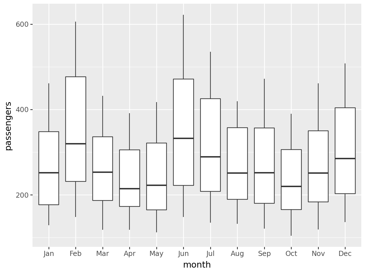
The boxplot compactly displays the distribution of a continuous variable.
Read more: + wikipedia + ggplot2 docs
flights = pd.read_csv("data/flights.csv")
flights.head()| year | month | passengers | |
|---|---|---|---|
| 0 | 1949 | January | 112 |
| 1 | 1949 | February | 118 |
| 2 | 1949 | March | 132 |
| 3 | 1949 | April | 129 |
| 4 | 1949 | May | 121 |
Basic boxplot
months = [month[:3] for month in flights.month[:12]]
print(months)
['Jan', 'Feb', 'Mar', 'Apr', 'May', 'Jun', 'Jul', 'Aug', 'Sep', 'Oct', 'Nov', 'Dec']A Basic Boxplot
# Gallery, distributions
(
    ggplot(flights)
    + geom_boxplot(aes(x="factor(month)", y="passengers"))
    + scale_x_discrete(labels=months, name="month")  # change ticks labels on OX
)
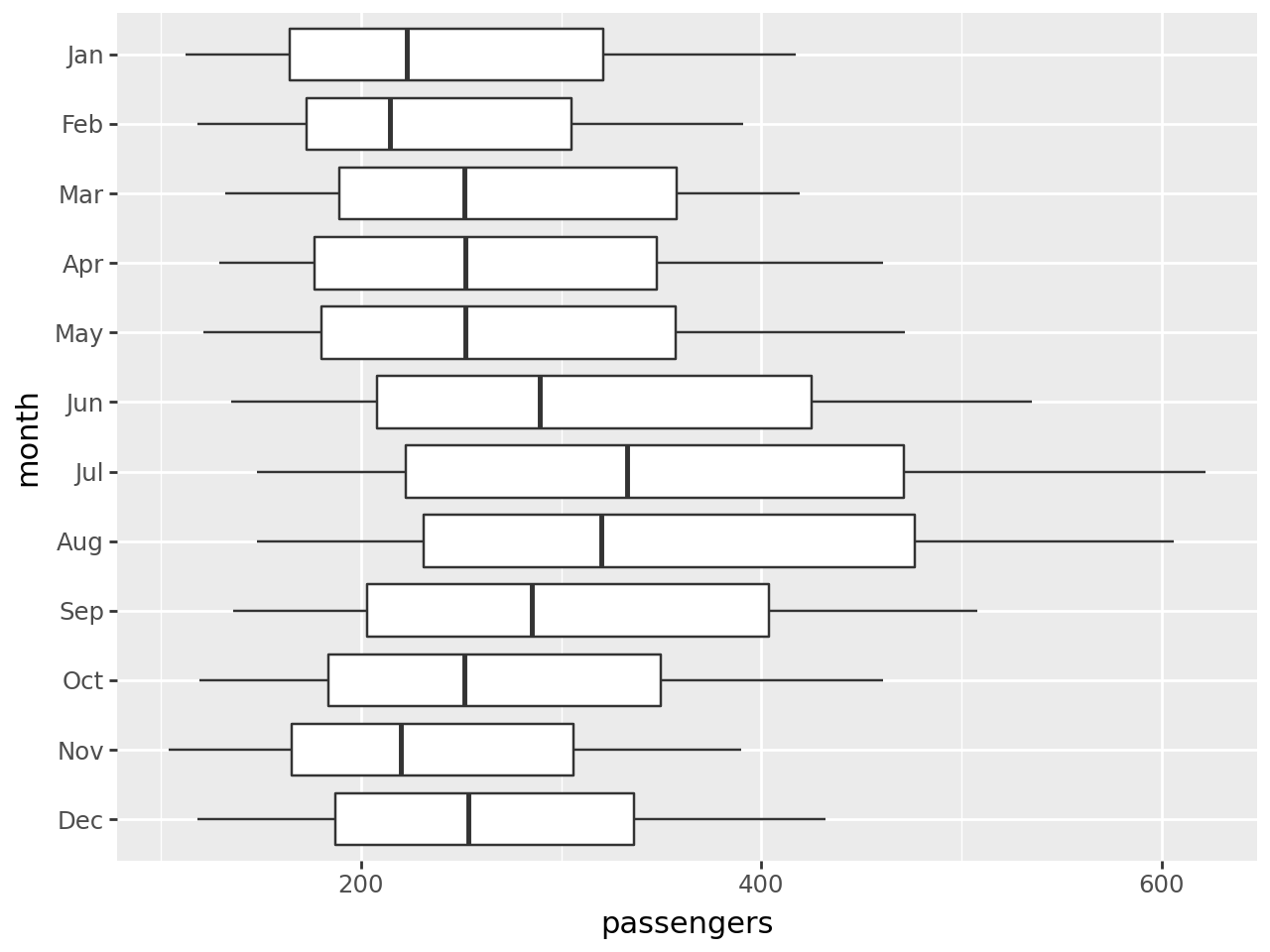
Horizontal boxplot
(
    ggplot(flights)
    + geom_boxplot(aes(x="factor(month)", y="passengers"))
    + coord_flip()
    + scale_x_discrete(
        labels=months[::-1],
        limits=flights.month[11::-1],
        name="month",
    )
)
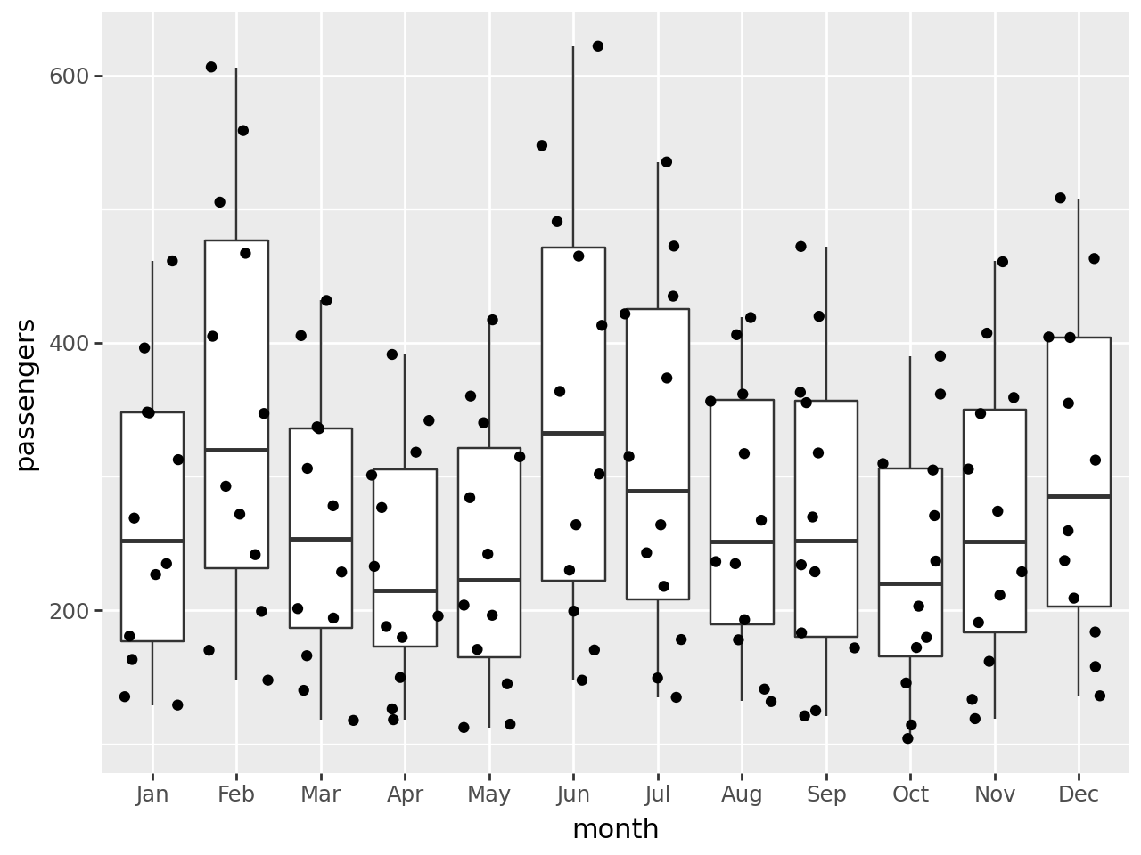
Boxplot with jittered points:
(
    ggplot(flights, aes(x="factor(month)", y="passengers"))
    + geom_boxplot()
    + geom_jitter()
    + scale_x_discrete(labels=months, name="month")  # change ticks labels on OX
)
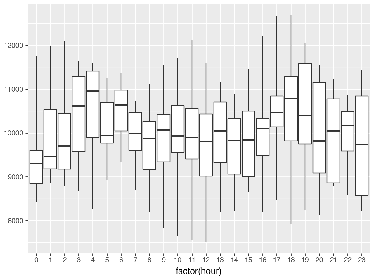
Precomputed boxplots
For datasets that do not fit in memory, you can precompute the boxplot metrics (for example by aggregating the statistics using database queries) and then use geom_boxplot with stat="identity".
# Precompute the metrics
def q25(x):
    return x.quantile(0.25)

def q75(x):
    return x.quantile(0.75)

pageviews["hour"] = pageviews.date_hour.dt.hour
precomputed_metrics = pageviews.groupby("hour").agg({'pageviews': ["min", q25, "median", q75, "max"]})
precomputed_metrics.columns = [col_name[1] for col_name in precomputed_metrics.columns]
precomputed_metrics = precomputed_metrics.reset_index()
precomputed_metrics.head()| hour | min | q25 | median | q75 | max | |
|---|---|---|---|---|---|---|
| 0 | 0 | 8437.500380 | 8842.109077 | 9297.046035 | 9600.362430 | 11762.446233 |
| 1 | 1 | 8852.123978 | 9177.938537 | 9457.821814 | 10530.072887 | 11974.437292 |
| 2 | 2 | 8793.076686 | 9176.462389 | 9704.885172 | 10446.315276 | 12105.406628 |
| 3 | 3 | 8683.606449 | 9574.722286 | 10615.670464 | 11290.246605 | 11651.443193 |
| 4 | 4 | 8252.974951 | 9898.998785 | 10959.909095 | 11409.657288 | 11603.711837 |
(
    ggplot(precomputed_metrics)
    + geom_boxplot(
        aes(x="factor(hour)", ymin="min", lower="q25", middle="median", upper="q75", ymax="max"),
        stat="identity"
    )
)