# NOTE: This notebook uses the polars package
import numpy as np

from plotnine import *
import polars as pl
from polars import colAn Elaborate Range Plot
segment

Comparing the point to point difference of many similar variables
Read the data.
Source: Pew Research Global Attitudes Spring 2015
!head -n 20 "data/survey-social-media.csv"PSRAID,COUNTRY,Q145,Q146,Q70,Q74
100000,Ethiopia,Female,35,No,
100001,Ethiopia,Female,25,No,
100002,Ethiopia,Male,40,Don’t know,
100003,Ethiopia,Female,30,Don’t know,
100004,Ethiopia,Male,22,No,
100005,Ethiopia,Male,40,No,
100006,Ethiopia,Female,20,No,
100007,Ethiopia,Female,18,No,No
100008,Ethiopia,Male,50,No,
100009,Ethiopia,Male,35,No,
100010,Ethiopia,Female,20,No,
100011,Ethiopia,Female,30,Don’t know,
100012,Ethiopia,Male,60,No,
100013,Ethiopia,Male,18,No,
100014,Ethiopia,Male,40,No,
100015,Ethiopia,Male,28,Don’t know,
100016,Ethiopia,Female,55,Don’t know,
100017,Ethiopia,Male,30,Don’t know,
100018,Ethiopia,Female,22,No, columns = dict(
COUNTRY="country",
Q145="gender",
Q146="age",
Q70="use_internet",
Q74="use_social_media",
)
data = (
pl.scan_csv(
"data/survey-social-media.csv",
dtypes=dict(Q146=pl.Utf8),
)
.rename(columns)
.select(["country", "age", "use_social_media"])
.collect()
)
data.sample(10, seed=123)
shape: (10, 3)
| country | age | use_social_media |
|---|---|---|
| str | str | str |
| "India" | "23" | " " |
| "Pakistan" | "18" | " " |
| "Peru" | "39" | "Yes" |
| "Jordan" | "56" | " " |
| "United Kingdom" | "35" | "Yes" |
| "Chile" | "24" | "Yes" |
| "Israel" | "32" | "No" |
| "Pakistan" | "39" | "No" |
| "Chile" | "26" | "Yes" |
| "Nigeria" | "43" | "Yes" |
Create age groups for users of social media
yes_no = ["Yes", "No"]
valid_age_groups = ["18-34", "35-49", "50+"]

rdata = (
    data.with_columns(
        age_group=pl.when(col("age") <= "34")
        .then(pl.lit("18-34"))
        .when(col("age") <= "49")
        .then(pl.lit("35-49"))
        .when(col("age") < "98")
        .then(pl.lit("50+"))
        .otherwise(pl.lit("")),
        country_count=pl.count().over("country"),
    )
    .filter(
        col("age_group").is_in(valid_age_groups) & col("use_social_media").is_in(yes_no)
    )
    .group_by(["country", "age_group"])
    .agg(
        # social media use percentage
        sm_use_percent=(col("use_social_media") == "Yes").sum() * 100 / pl.count(),
        # social media question response rate
        smq_response_rate=col("use_social_media").is_in(yes_no).sum()
        * 100
        / col("country_count").first(),
    )
    .sort(["country", "age_group"])
)

rdata.head()
shape: (5, 4)
| country | age_group | sm_use_percent | smq_response_rate |
|---|---|---|---|
| str | str | f64 | f64 |
| "Argentina" | "18-34" | 90.883191 | 35.1 |
| "Argentina" | "35-49" | 84.40367 | 21.8 |
| "Argentina" | "50+" | 67.333333 | 15.0 |
| "Australia" | "18-34" | 90.862944 | 19.621514 |
| "Australia" | "35-49" | 78.04878 | 20.418327 |
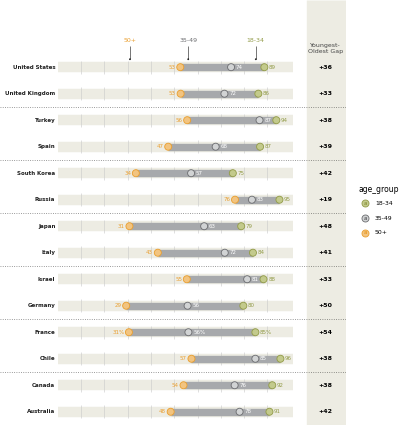
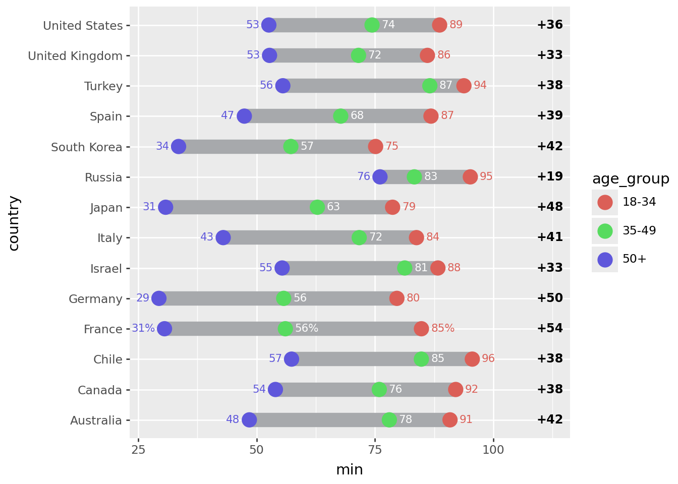
Top 14 countries by response rate to the social media question.
def col_format(name, fmt):
    # Format useing python formating
    # for more control over
    return col(name).map_elements(lambda x: fmt.format(x=x))


def float_to_str_round(name):
    return col_format(name, "{x:.0f}")


n = 14

top = (
    rdata.group_by("country")
    .agg(r=col("smq_response_rate").sum())
    .sort("r", descending=True)
    .head(n)
)
top_countries = top["country"]

expr = float_to_str_round("sm_use_percent")
expr_pct = expr + "%"

point_data = rdata.filter(col("country").is_in(top_countries)).with_columns(
    col("country").cast(pl.Categorical),
    sm_use_percent_str=pl.when(col("country") == "France")
    .then(expr_pct)
    .otherwise(expr),
)

point_data.head()
shape: (5, 5)
| country | age_group | sm_use_percent | smq_response_rate | sm_use_percent_str |
|---|---|---|---|---|
| cat | str | f64 | f64 | str |
| "Australia" | "18-34" | 90.862944 | 19.621514 | "91" |
| "Australia" | "35-49" | 78.04878 | 20.418327 | "78" |
| "Australia" | "50+" | 48.479087 | 52.390438 | "48" |
| "Canada" | "18-34" | 92.063492 | 25.099602 | "92" |
| "Canada" | "35-49" | 75.925926 | 21.513944 | "76" |
segment_data = (
    point_data.group_by("country")
    .agg(
        min=col("sm_use_percent").min(),
        max=col("sm_use_percent").max(),
    )
    .with_columns(gap=(col("max") - col("min")))
    .sort(
        "gap",
    )
    .with_columns(
        min_str=float_to_str_round("min"),
        max_str=float_to_str_round("max"),
        gap_str=float_to_str_round("gap"),
    )
)

segment_data.head()
shape: (5, 7)
| country | min | max | gap | min_str | max_str | gap_str |
|---|---|---|---|---|---|---|
| cat | f64 | f64 | f64 | str | str | str |
| "Russia" | 76.07362 | 95.151515 | 19.077896 | "76" | "95" | "19" |
| "Israel" | 55.405405 | 88.311688 | 32.906283 | "55" | "88" | "33" |
| "United Kingdom" | 52.74463 | 86.096257 | 33.351627 | "53" | "86" | "33" |
| "United States" | 52.597403 | 88.669951 | 36.072548 | "53" | "89" | "36" |
| "Canada" | 53.986333 | 92.063492 | 38.077159 | "54" | "92" | "38" |
Format the floating point data that will be plotted into strings
First plot
# The right column (youngest-oldest gap) location
xgap = 112

(
    ggplot()
    # Range strip
    + geom_segment(
        segment_data,
        aes(x="min", xend="max", y="country", yend="country"),
        size=6,
        color="#a7a9ac",
    )
    # Age group markers
    + geom_point(
        point_data,
        aes("sm_use_percent", "country", color="age_group", fill="age_group"),
        size=5,
        stroke=0.7,
    )
    # Age group percentages
    + geom_text(
        point_data.filter(col("age_group") == "50+"),
        aes(
            x="sm_use_percent-2",
            y="country",
            label="sm_use_percent_str",
            color="age_group",
        ),
        size=8,
        ha="right",
    )
    + geom_text(
        point_data.filter(col("age_group") == "35-49"),
        aes(x="sm_use_percent+2", y="country", label="sm_use_percent_str"),
        size=8,
        ha="left",
        va="center",
        color="white",
    )
    + geom_text(
        point_data.filter(col("age_group") == "18-34"),
        aes(
            x="sm_use_percent+2",
            y="country",
            label="sm_use_percent_str",
            color="age_group",
        ),
        size=8,
        ha="left",
    )
    # gap difference
    + geom_text(
        segment_data,
        aes(x=xgap, y="country", label="gap_str"),
        size=9,
        fontweight="bold",
        format_string="+{}",
    )
)
Tweak it
# The right column (youngest-oldest gap) location
xgap = 115

(
    ggplot()
    # Background Strips                                     # new
    + geom_segment(
        segment_data,
        aes(y="country", yend="country"),
        x=0,
        xend=101,
        size=8.5,
        color="#edece3",
    )
    # vertical grid lines along the strips                  # new
    + annotate(
        "segment",
        x=list(range(10, 100, 10)) * n,
        xend=list(range(10, 100, 10)) * n,
        y=np.tile(np.arange(1, n + 1), 9) - 0.25,
        yend=np.tile(np.arange(1, n + 1), 9) + 0.25,
        color="#CCCCCC",
    )
    # Range strip
    + geom_segment(
        segment_data,
        aes(x="min", xend="max", y="country", yend="country"),
        size=6,
        color="#a7a9ac",
    )
    # Age group markers
    + geom_point(
        point_data,
        aes("sm_use_percent", "country", color="age_group", fill="age_group"),
        size=5,
        stroke=0.7,
    )
    # Age group percentages
    + geom_text(
        point_data.filter(col("age_group") == "50+"),
        aes(
            x="sm_use_percent-2",
            y="country",
            label="sm_use_percent_str",
            color="age_group",
        ),
        size=8,
        ha="right",
    )
    + geom_text(
        point_data.filter(col("age_group") == "35-49"),
        aes(x="sm_use_percent+2", y="country", label="sm_use_percent_str"),
        size=8,
        ha="left",
        va="center",
        color="white",
    )
    + geom_text(
        point_data.filter(col("age_group") == "18-34"),
        aes(
            x="sm_use_percent+2",
            y="country",
            label="sm_use_percent_str",
            color="age_group",
        ),
        size=8,
        ha="left",
    )
    # countries right-hand-size (instead of y-axis)         # new
    + geom_text(
        segment_data,
        aes(y="country", label="country"),
        x=-1,
        size=8,
        ha="right",
        fontweight="bold",
        color="#222222",
    )
    # gap difference
    + geom_vline(xintercept=xgap, color="#edece3", size=32)  # new
    + geom_text(
        segment_data,
        aes(x=xgap, y="country", label="gap_str"),
        size=9,
        fontweight="bold",
        format_string="+{}",
    )
    # Annotations                                            # new
    + annotate("text", x=31, y=n + 1.1, label="50+", size=9, color="#ea9f2f", va="top")
    + annotate(
        "text", x=56, y=n + 1.1, label="35-49", size=9, color="#6d6e71", va="top"
    )
    + annotate(
        "text", x=85, y=n + 1.1, label="18-34", size=9, color="#939c49", va="top"
    )
    + annotate(
        "text",
        x=xgap,
        y=n + 0.5,
        label="Youngest-\nOldest Gap",
        size=9,
        color="#444444",
        va="bottom",
        ha="center",
    )
    + annotate("point", x=[31, 56, 85], y=n + 0.3, alpha=0.85, stroke=0)
    + annotate(
        "segment",
        x=[31, 56, 85],
        xend=[31, 56, 85],
        y=n + 0.3,
        yend=n + 0.8,
        alpha=0.85,
    )
    + annotate(
        "hline",
        yintercept=[x + 0.5 for x in range(2, n, 2)],
        alpha=0.5,
        linetype="dotted",
        size=0.7,
    )
    # Better spacing and color                              # new
    + scale_x_continuous(limits=(-18, xgap + 2))
    + scale_y_discrete(expand=(0, 0.25, 0.1, 0))
    + scale_fill_manual(values=["#c3ca8c", "#d1d3d4", "#f2c480"])
    + scale_color_manual(values=["#939c49", "#6d6e71", "#ea9f2f"])
    + guides(color=None, fill=None)
    + theme_void()
    + theme(figure_size=(8, 8.5))
)
Instead of looking at this plot as having a country variable on the y-axis and a percentage variable on the x-axis, we can view it as having vertically stacked up many indepedent variables, the values of which have a similar scale.