from plotnine import (
    ggplot,
    aes,
    geom_point,
    scale_x_datetime,
    labs,
    theme_set,
    theme_linedraw,
)
from plotnine.data import economics

from mizani.breaks import breaks_date_width
from mizani.formatters import label_date

theme_set(theme_linedraw()) # default themeManipulating Date Breaks and Labels
date
tutorial
Using the economics dataset
economics.head()| date | pce | pop | psavert | uempmed | unemploy | |
|---|---|---|---|---|---|---|
| 0 | 1967-07-01 | 507.4 | 198712 | 12.5 | 4.5 | 2944 |
| 1 | 1967-08-01 | 510.5 | 198911 | 12.5 | 4.7 | 2945 |
| 2 | 1967-09-01 | 516.3 | 199113 | 11.7 | 4.6 | 2958 |
| 3 | 1967-10-01 | 512.9 | 199311 | 12.5 | 4.9 | 3143 |
| 4 | 1967-11-01 | 518.1 | 199498 | 12.5 | 4.7 | 3066 |
How does the saving rate vary with time?
(
    ggplot(economics)
    + geom_point(aes("date", "psavert"))
    + labs(y="personal saving rate")
)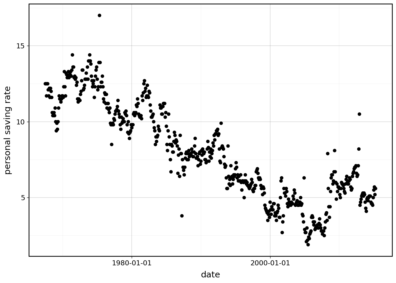
Yikes! the calculated breaks are awful, we need to intervene. We do so using the breaks_date_width and label_date
functions from mizani.
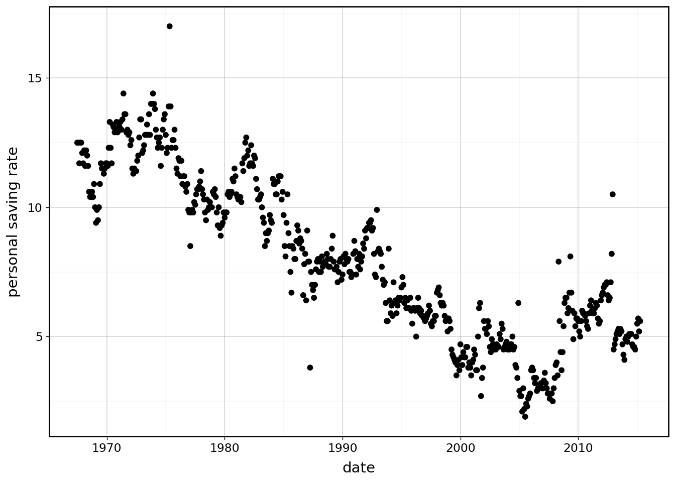
Set breaks every 10 years
(
    ggplot(economics)
    + geom_point(aes("date", "psavert"))
    + scale_x_datetime(breaks=breaks_date_width("10 years"))  # new
    + labs(y="personal saving rate")
)
That is better. Since all the breaks are at the beginning of the year, we can omit the month and day. Using label_date we override the format string. For more on the options for the format string see the strftime behavior.
(
    ggplot(economics)
    + geom_point(aes("date", "psavert"))
    + scale_x_datetime(
        breaks=breaks_date_width("10 years"), labels=label_date("%Y")
    )  # modified
    + labs(y="personal saving rate")
)
We can achieve the same result with a custom formating function.
def custom_label_date1(breaks):
    """
    Function to format the date
    """
    return [x.year if x.month == 1 and x.day == 1 else "" for x in breaks]


(
    ggplot(economics)
    + geom_point(aes("date", "psavert"))
    + scale_x_datetime(  # modified
        breaks=breaks_date_width("10 years"), labels=custom_label_date1
    )
    + labs(y="personal saving rate")
)
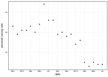
We can use a custom formatting function to get results that are not obtainable with the label_date function. For example if we have monthly breaks over a handful of years we can mix date formats as follows; specify beginning of the year and every other month. Such tricks can be used reduce overcrowding.
from datetime import date


def custom_label_date2(breaks):
    """
    Function to format the date
    """
    res = []
    for x in breaks:
        # First day of the year
        if x.month == 1 and x.day == 1:
            fmt = "%Y"
        # Every other month
        elif x.month % 2 != 0:
            fmt = "%b"
        else:
            fmt = ""

        res.append(date.strftime(x, fmt))

    return res


(
    ggplot(economics.loc[40:60, :])  # modified
    + geom_point(aes("date", "psavert"))
    + scale_x_datetime(
        breaks=breaks_date_width("1 months"), labels=custom_label_date2, minor_breaks=[]
    )
    + labs(y="personal saving rate")
)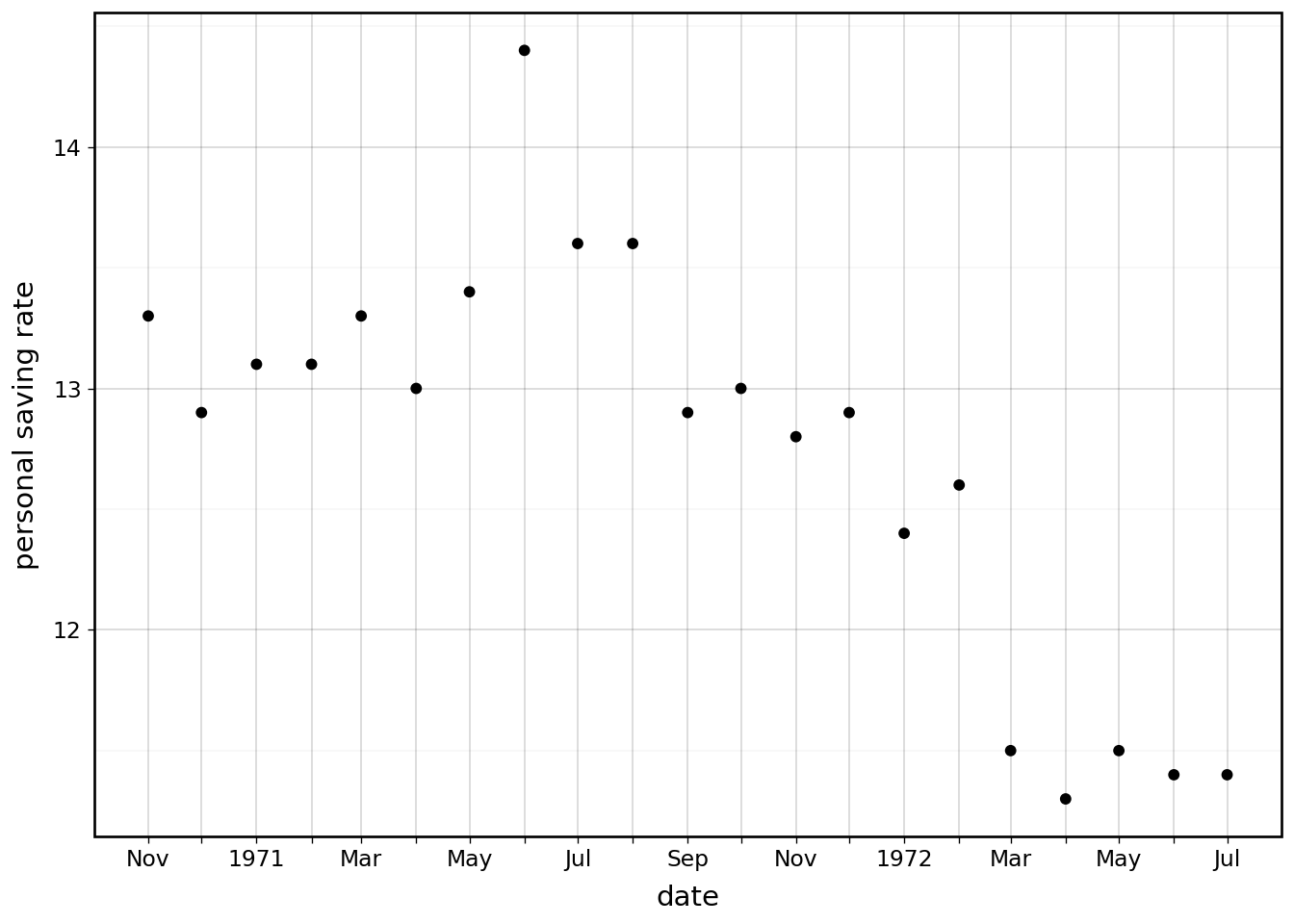
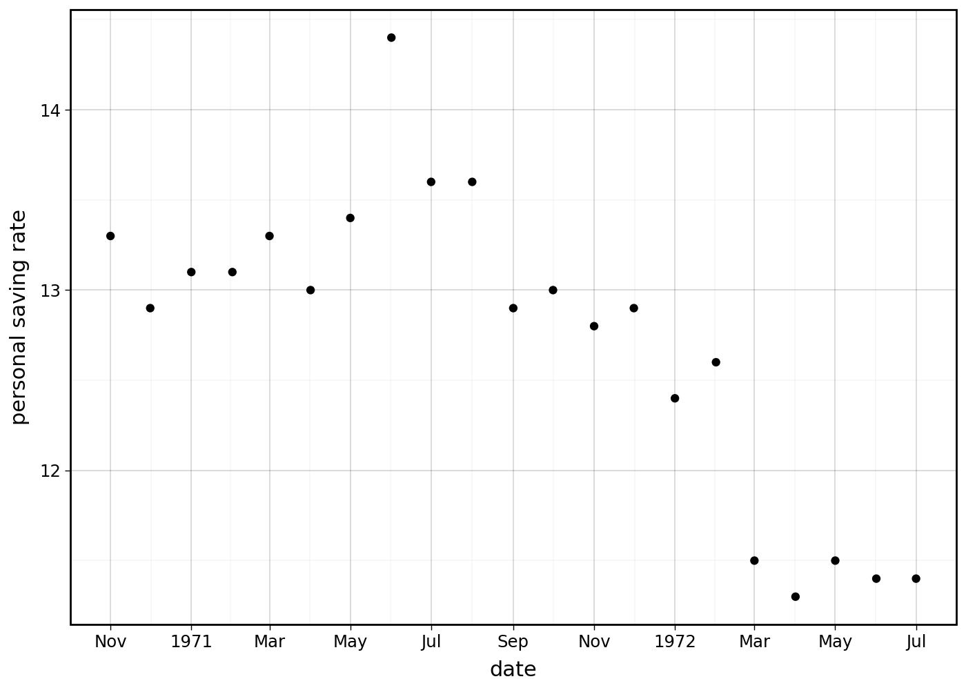
We removed the labels but not the breaks, leaving behind dangling ticks for the skipped months. We can fix that by wrapping breaks_date_width around a filtering function.
def custom_label_date3(breaks):
    """
    Function to format the date
    """
    res = []
    for x in breaks:
        # First day of the year
        if x.month == 1:
            fmt = "%Y"
        else:
            fmt = "%b"

        res.append(date.strftime(x, fmt))

    return res


def custom_breaks_date_width(width=None):
    """
    Create a function that calculates date breaks

    It delegates the work to `breaks_date_width`
    """

    def filter_func(limits):
        breaks = breaks_date_width(width)(limits)
        # filter
        return [x for x in breaks if x.month % 2]

    return filter_func


(
    ggplot(economics.loc[40:60, :])
    + geom_point(aes("date", "psavert"))
    + scale_x_datetime(  # modified
        breaks=custom_breaks_date_width("1 months"), labels=custom_label_date3
    )
    + labs(y="personal saving rate")
)
The breaks and labels functions are tightly coupled to give us exactly what we want.
Credit: This example was motivated by the github user lorin (Lorin Hochstein) and his endeavor to control date breaks and date labels.