from plotnine import ggplot, aes, geom_bar, labs, coord_flip, theme_classic
from plotnine.data import mpg
geom_bar(mapping=None, data=None, **kwargs)Bar plot
{usage}
Parameters
just : float = 0.5-
How to align the column with respect to the axis breaks. The default
0.5aligns the center of the column with the break.0aligns the left of the of the column with the break and1aligns the right of the column with the break. width : float = None-
Bar width. If
None, the width is set to90%of the resolution of the data.
See Also
geom_histogramstat_count-
The default
statfor thisgeom.
Examples
Bar chart
geom_bar() makes the height of the bar proportional to the number of cases in each group
mpg.head()| manufacturer | model | displ | year | cyl | trans | drv | cty | hwy | fl | class | |
|---|---|---|---|---|---|---|---|---|---|---|---|
| 0 | audi | a4 | 1.8 | 1999 | 4 | auto(l5) | f | 18 | 29 | p | compact |
| 1 | audi | a4 | 1.8 | 1999 | 4 | manual(m5) | f | 21 | 29 | p | compact |
| 2 | audi | a4 | 2.0 | 2008 | 4 | manual(m6) | f | 20 | 31 | p | compact |
| 3 | audi | a4 | 2.0 | 2008 | 4 | auto(av) | f | 21 | 30 | p | compact |
| 4 | audi | a4 | 2.8 | 1999 | 6 | auto(l5) | f | 16 | 26 | p | compact |
Bar Plot with Counts
# Gallery, distributions
ggplot(mpg) + geom_bar(aes(x="class"))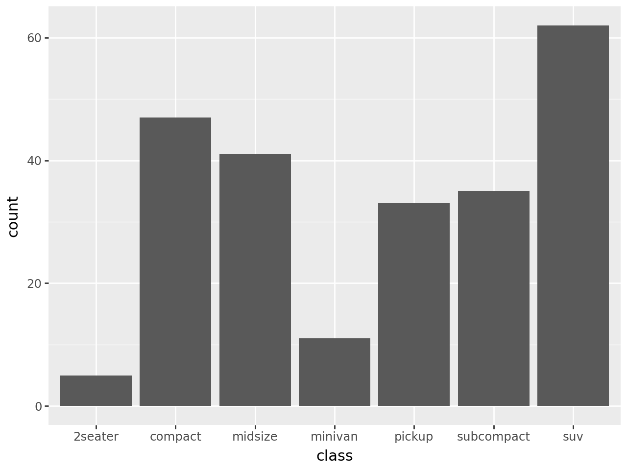
Sorting the bars
We can use the internal function reorder to sort the bars depending on the size of each group. In this case we create a variable class2 with values equal to those of class so because class is a reserved name and:
reorder(class, class, len)is not a valid python expression, while:
reorder(class2, class2, len)is a valid python expression.
mpg["class2"] = mpg["class"]

(
    ggplot(mpg)
    + geom_bar(aes(x="reorder(class2, class2, len)"))
    + labs(x="class")
)
And in descending order
(
    ggplot(mpg)
    + geom_bar(
        aes(x="reorder(class2, class2, len, ascending=False)")
    )
    + labs(x="class")
)
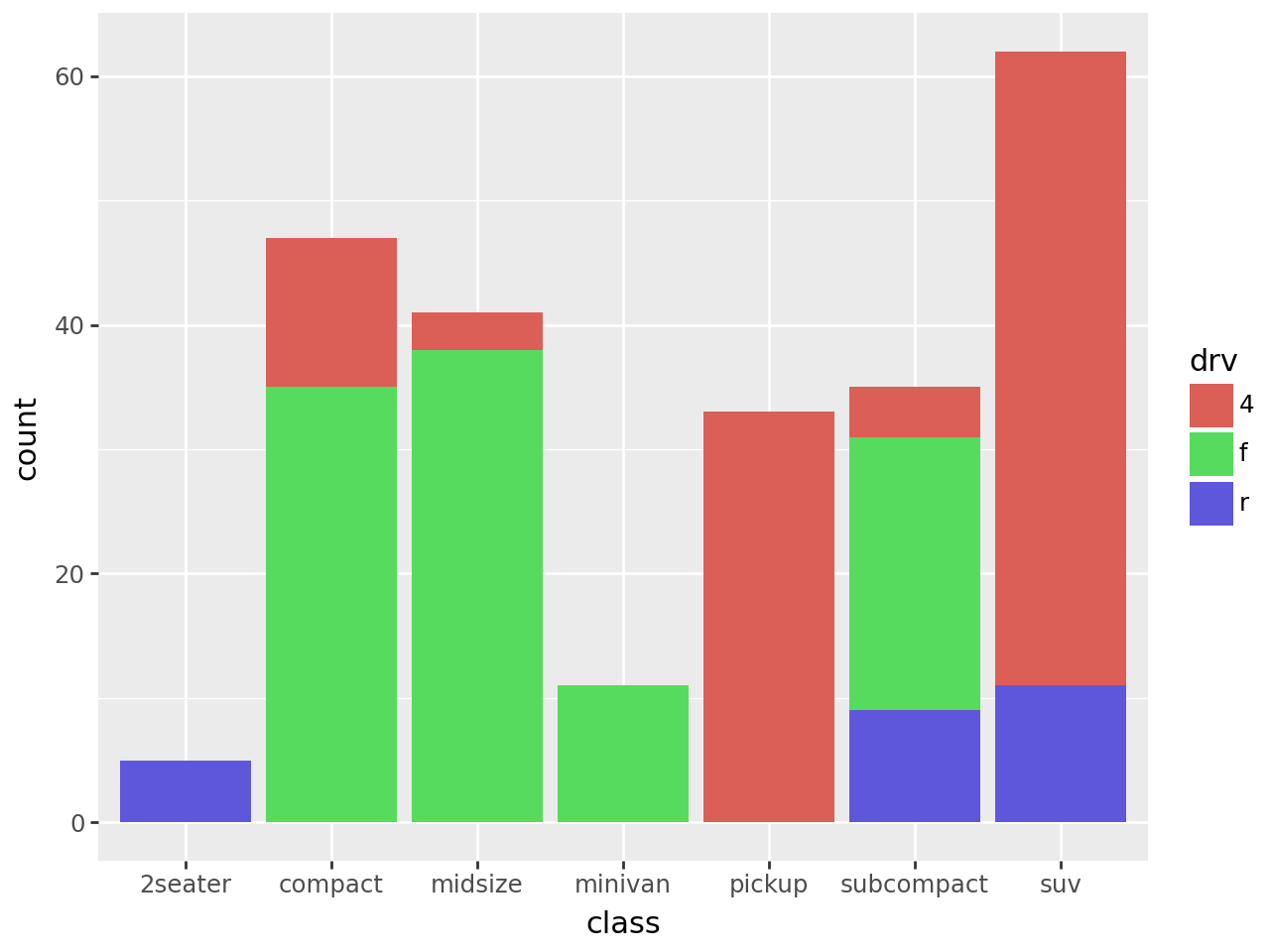
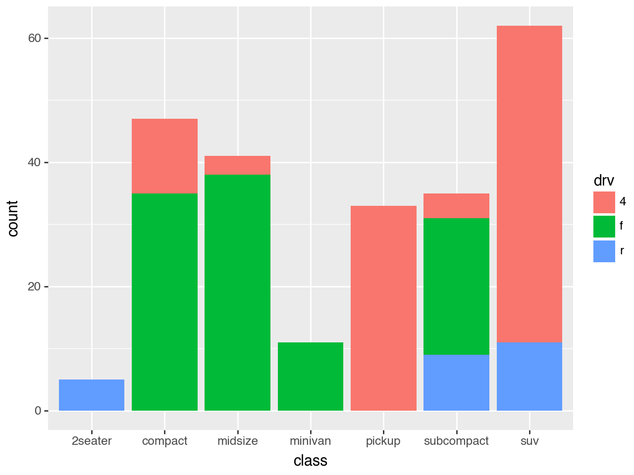
(
    ggplot(mpg)
    + geom_bar(aes(x="class", fill="drv"))
)
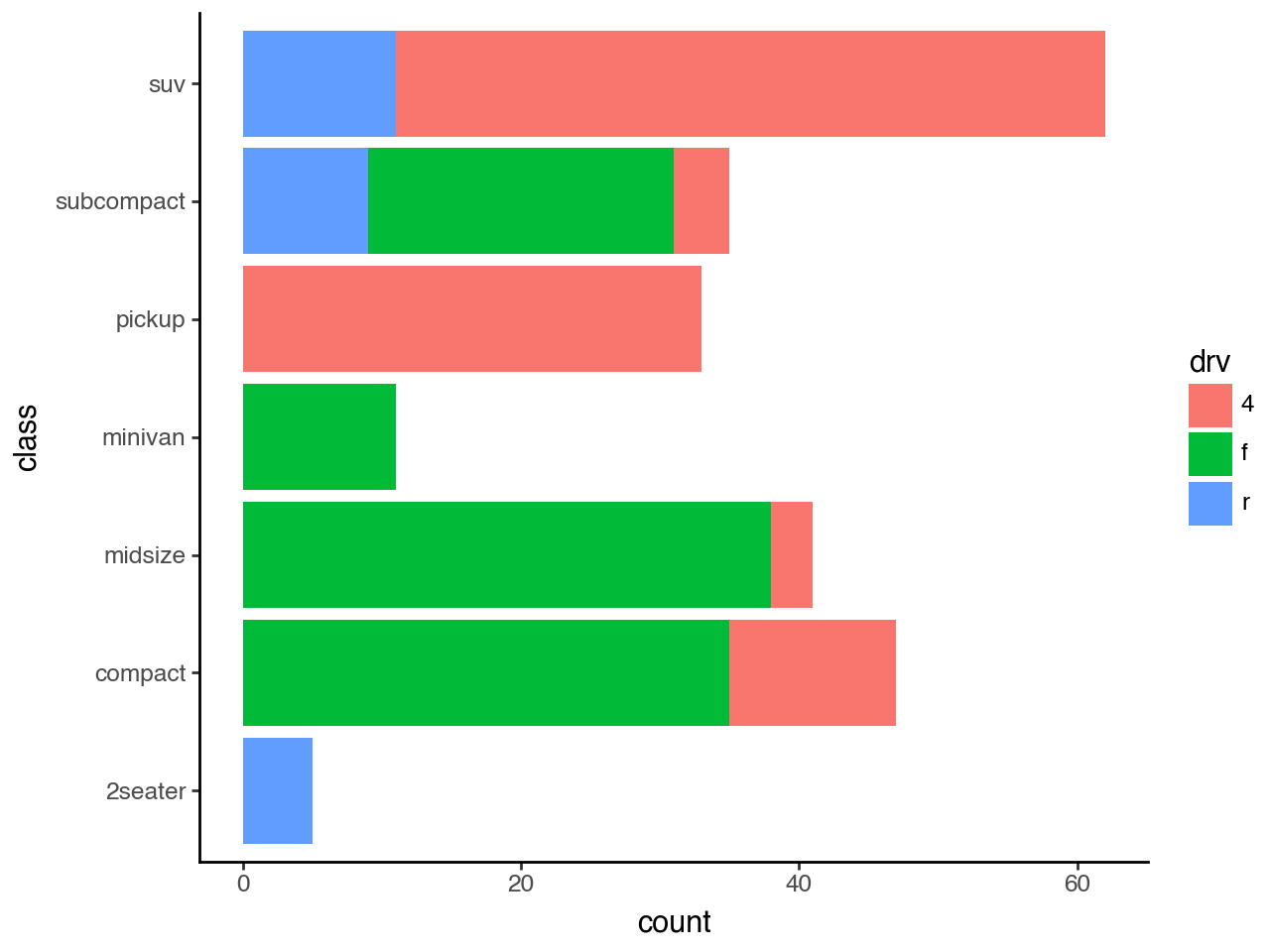
Horizontal Bar Plot with Counts
# Gallery, distributions
(
    ggplot(mpg)
    + geom_bar(aes(x="class", fill="drv"))
    + coord_flip()
    + theme_classic()
)