from plotnine import (
ggplot,
aes,
geom_line,
facet_wrap,
labs,
scale_x_datetime,
element_text,
theme_538
)
from plotnine.data import meat
Connected points
geom_line(
    mapping=None,
    data=None,
    *,
    stat="identity",
    position="identity",
    na_rm=False,
    inherit_aes=True,
    show_legend=None,
    raster=False,
    lineend="butt",
    linejoin="round",
    arrow=None,
    **kwargs
)
Parameters
mapping : aes = None-
Aesthetic mappings created with aes. If specified and
inherit_aes=True, it is combined with the default mapping for the plot. You must supply mapping if there is no plot mapping.Aesthetic Default value x y alpha 1color 'black'group linetype 'solid'size 0.5The bold aesthetics are required.
data : DataFrame = None-
The data to be displayed in this layer. If
None, the data from from theggplot()call is used. If specified, it overrides the data from theggplot()call. stat : str | stat = "identity"-
The statistical transformation to use on the data for this layer. If it is a string, it must be the registered and known to Plotnine.
position : str | position = "identity"-
Position adjustment. If it is a string, it must be registered and known to Plotnine.
na_rm : bool = False-
If
False, removes missing values with a warning. IfTruesilently removes missing values. inherit_aes : bool = True-
If
False, overrides the default aesthetics. show_legend : bool | dict = None-
Whether this layer should be included in the legends.
Nonethe default, includes any aesthetics that are mapped. If abool,Falsenever includes andTruealways includes. Adictcan be used to exclude specific aesthetis of the layer from showing in the legend. e.gshow_legend={'color': False}, any other aesthetic are included by default. raster : bool = False-
If
True, draw onto this layer a raster (bitmap) object even ifthe final image is in vector format. **kwargs : Any-
Aesthetics or parameters used by the
stat.
See Also
geom_path-
For documentation of other parameters.
Examples
Line plots
geom_line() connects the dots, and is useful for time series data.
meat.head()| date | beef | veal | pork | lamb_and_mutton | broilers | other_chicken | turkey | |
|---|---|---|---|---|---|---|---|---|
| 0 | 1944-01-01 | 751.0 | 85.0 | 1280.0 | 89.0 | NaN | NaN | NaN |
| 1 | 1944-02-01 | 713.0 | 77.0 | 1169.0 | 72.0 | NaN | NaN | NaN |
| 2 | 1944-03-01 | 741.0 | 90.0 | 1128.0 | 75.0 | NaN | NaN | NaN |
| 3 | 1944-04-01 | 650.0 | 89.0 | 978.0 | 66.0 | NaN | NaN | NaN |
| 4 | 1944-05-01 | 681.0 | 106.0 | 1029.0 | 78.0 | NaN | NaN | NaN |
Make it tidy.
meat_long = meat.melt(
    id_vars="date",
    value_vars=["beef", "veal", "pork", "lamb_and_mutton", "broilers", "turkey"],
    var_name="animal",
    value_name="weight"
).dropna()

meat_long.head()| date | animal | weight | |
|---|---|---|---|
| 0 | 1944-01-01 | beef | 751.0 |
| 1 | 1944-02-01 | beef | 713.0 |
| 2 | 1944-03-01 | beef | 741.0 |
| 3 | 1944-04-01 | beef | 650.0 |
| 4 | 1944-05-01 | beef | 681.0 |
First try
p = (
    ggplot(meat_long, aes(x="date", y="weight"))
    + geom_line()
)
p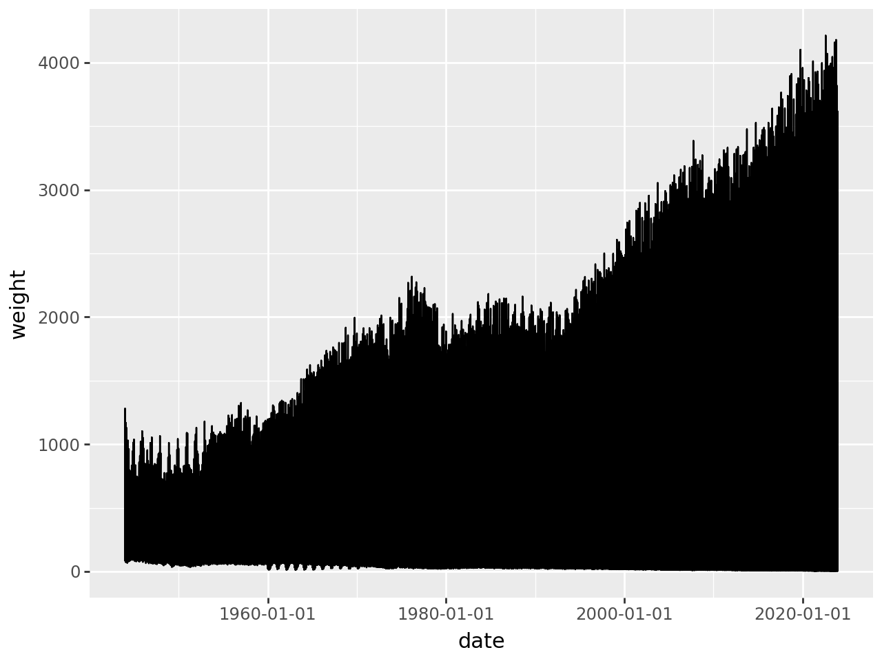
It looks crowded because each there is more than one monthly entry at each x-point. We can get a single trend line by getting a monthly aggregate of the weights.
meat_long_monthly_agg = meat_long.groupby("date").agg({"weight": "sum"}).reset_index()
meat_long_monthly_agg| date | weight | |
|---|---|---|
| 0 | 1944-01-01 | 2205.0 |
| 1 | 1944-02-01 | 2031.0 |
| 2 | 1944-03-01 | 2034.0 |
| 3 | 1944-04-01 | 1783.0 |
| 4 | 1944-05-01 | 1894.0 |
| ... | ... | ... |
| 955 | 2023-08-01 | 9319.1 |
| 956 | 2023-09-01 | 8586.1 |
| 957 | 2023-10-01 | 9452.5 |
| 958 | 2023-11-01 | 8951.1 |
| 959 | 2023-12-01 | 8555.1 |
960 rows × 2 columns
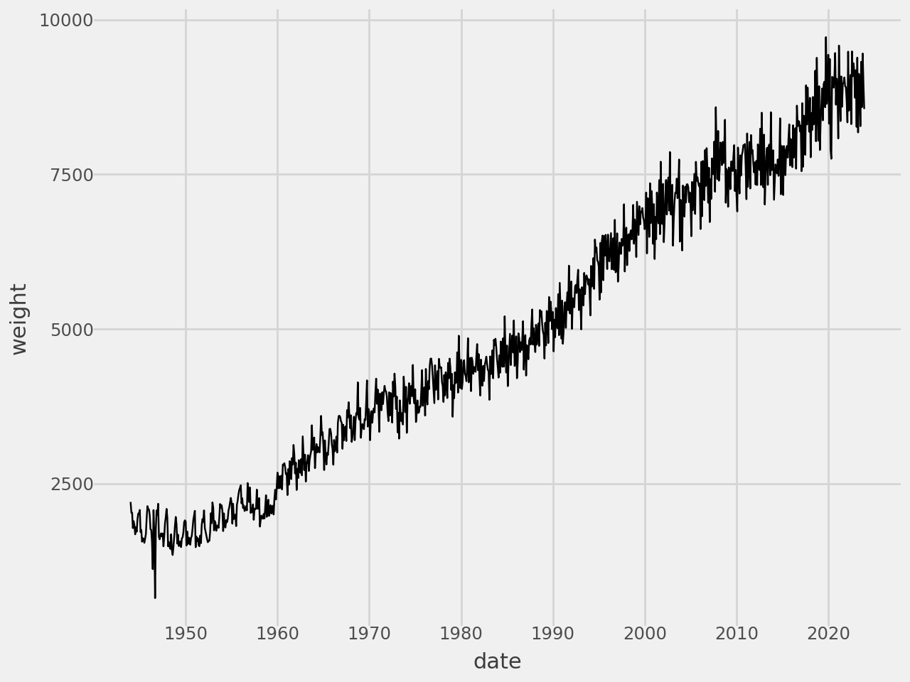
A Single Trend Line
(
    ggplot(meat_long_monthly_agg, aes(x="date", y="weight"))
    + geom_line()
)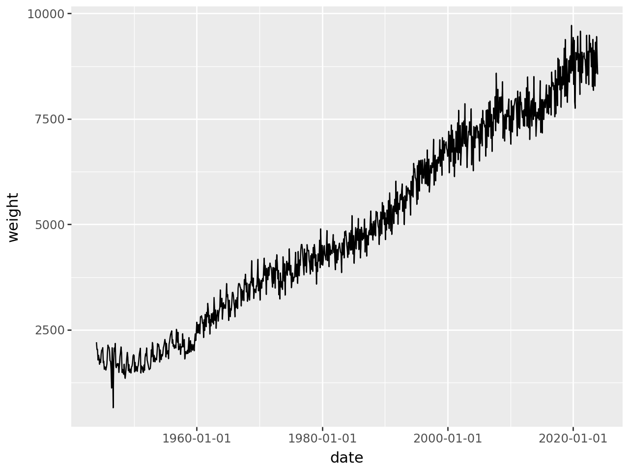
Add some style
# Gallery, lines
(
    ggplot(meat_long_monthly_agg, aes(x="date", y="weight"))
    + geom_line()
    # Styling
    + scale_x_datetime(date_breaks="10 years", date_labels="%Y")
    + theme_538()
)
Or we can group by the animals to get a trend line for each animal
Multiple Trend Lines
(
    ggplot(meat_long, aes(x="date", y="weight", group="animal"))
    + geom_line()
    # Styling
    + scale_x_datetime(date_breaks="10 years", date_labels="%Y")
    + theme_538()
)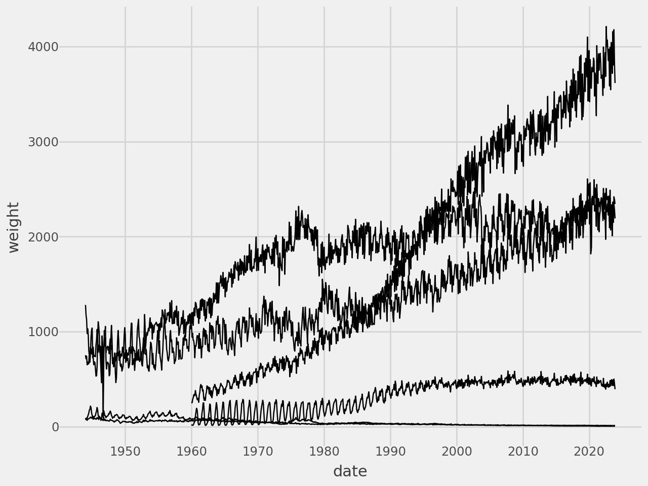
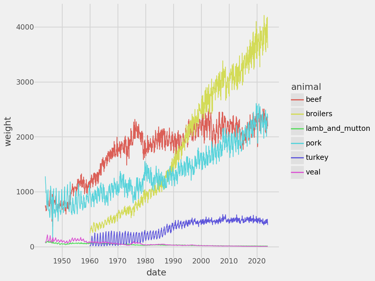
Make each group be a different color.
# Gallery, lines
(
    ggplot(meat_long, aes(x="date", y="weight", color="animal"))
    + geom_line()
    # Styling
    + scale_x_datetime(date_breaks="10 years", date_labels="%Y")
    + theme_538()
)
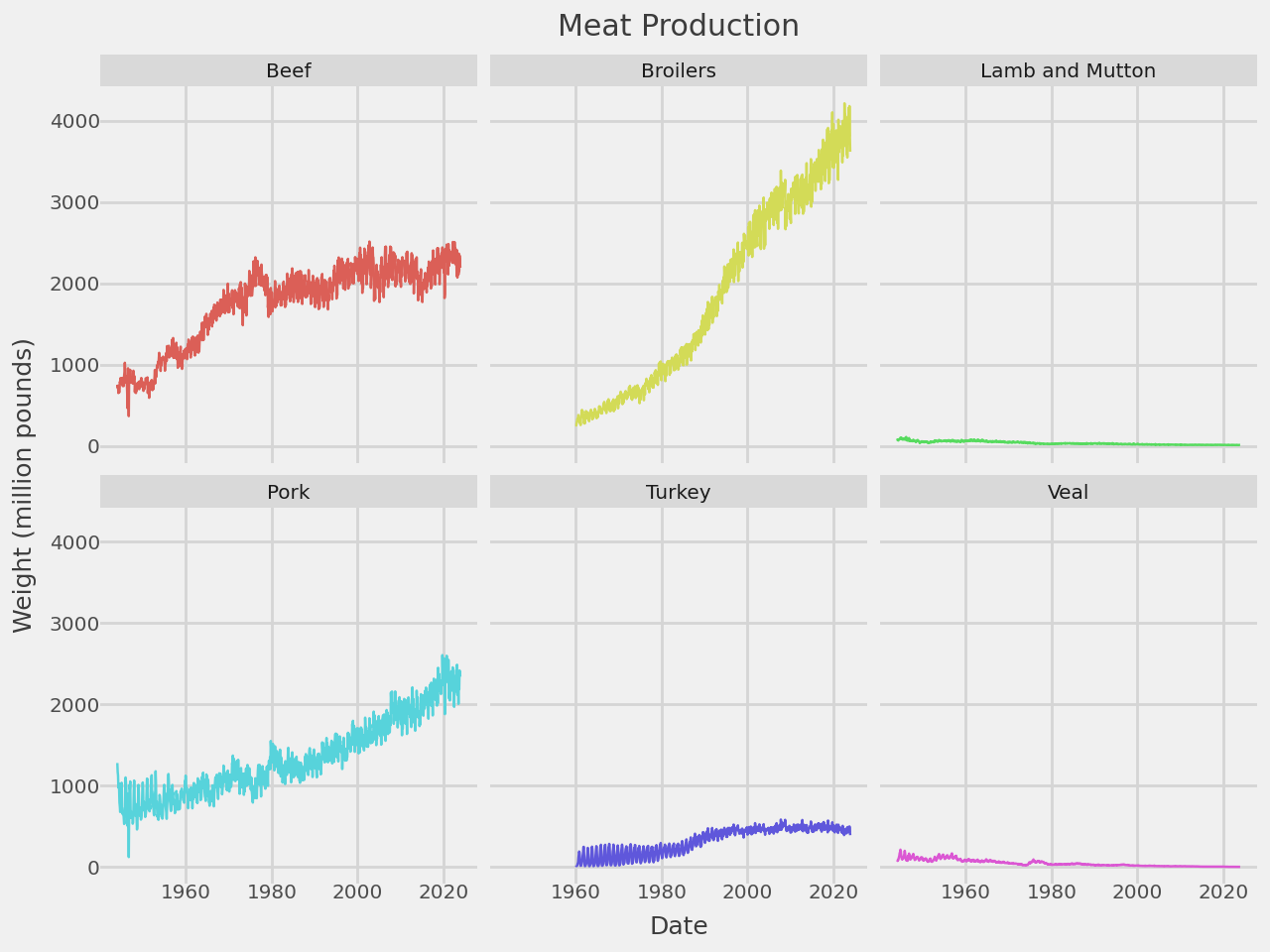
A Trend Line Per Facet
Plot each group on a separate panel. The legend is no longer required and we adjust to the smaller panels by reducing the size of the line, size of the text and the number of grid lines.
# Gallery, lines
def titled(strip_title):
    return " ".join(s.title() if s != "and" else s for s in strip_title.split("_"))

(
    ggplot(meat_long, aes("date", "weight", color="animal"))
    + geom_line(size=.5, show_legend=False)
    + facet_wrap("animal", labeller=titled)
    + scale_x_datetime(date_breaks="20 years", date_labels="%Y")
    + labs(
        x="Date",
        y="Weight (million pounds)",
        title="Meat Production"
    )
    + theme_538(base_size=9)
)