import pandas as pd

from plotnine import (
    ggplot,
    aes,
    geom_boxplot,
    geom_jitter,
    scale_x_discrete,
    coord_flip,
)Whisker Wars: The Outliers are Out of the Box
box plot
The boxplot compactly displays the distribution of a continuous variable.
Read more: + wikipedia + ggplot2 docs
flights = pd.read_csv("data/flights.csv")
flights.head()| year | month | passengers | |
|---|---|---|---|
| 0 | 1949 | January | 112 |
| 1 | 1949 | February | 118 |
| 2 | 1949 | March | 132 |
| 3 | 1949 | April | 129 |
| 4 | 1949 | May | 121 |
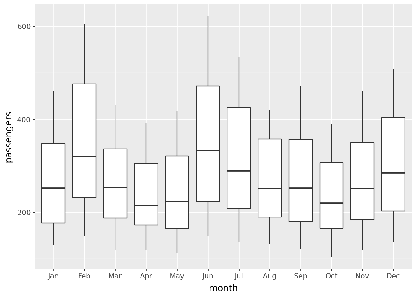
Basic boxplot
months = [month[:3] for month in flights.month[:12]]
print(months)
['Jan', 'Feb', 'Mar', 'Apr', 'May', 'Jun', 'Jul', 'Aug', 'Sep', 'Oct', 'Nov', 'Dec']A Basic Boxplot
(
    ggplot(flights)
    + geom_boxplot(aes(x="factor(month)", y="passengers"))
    + scale_x_discrete(labels=months, name="month")  # change ticks labels on OX
)
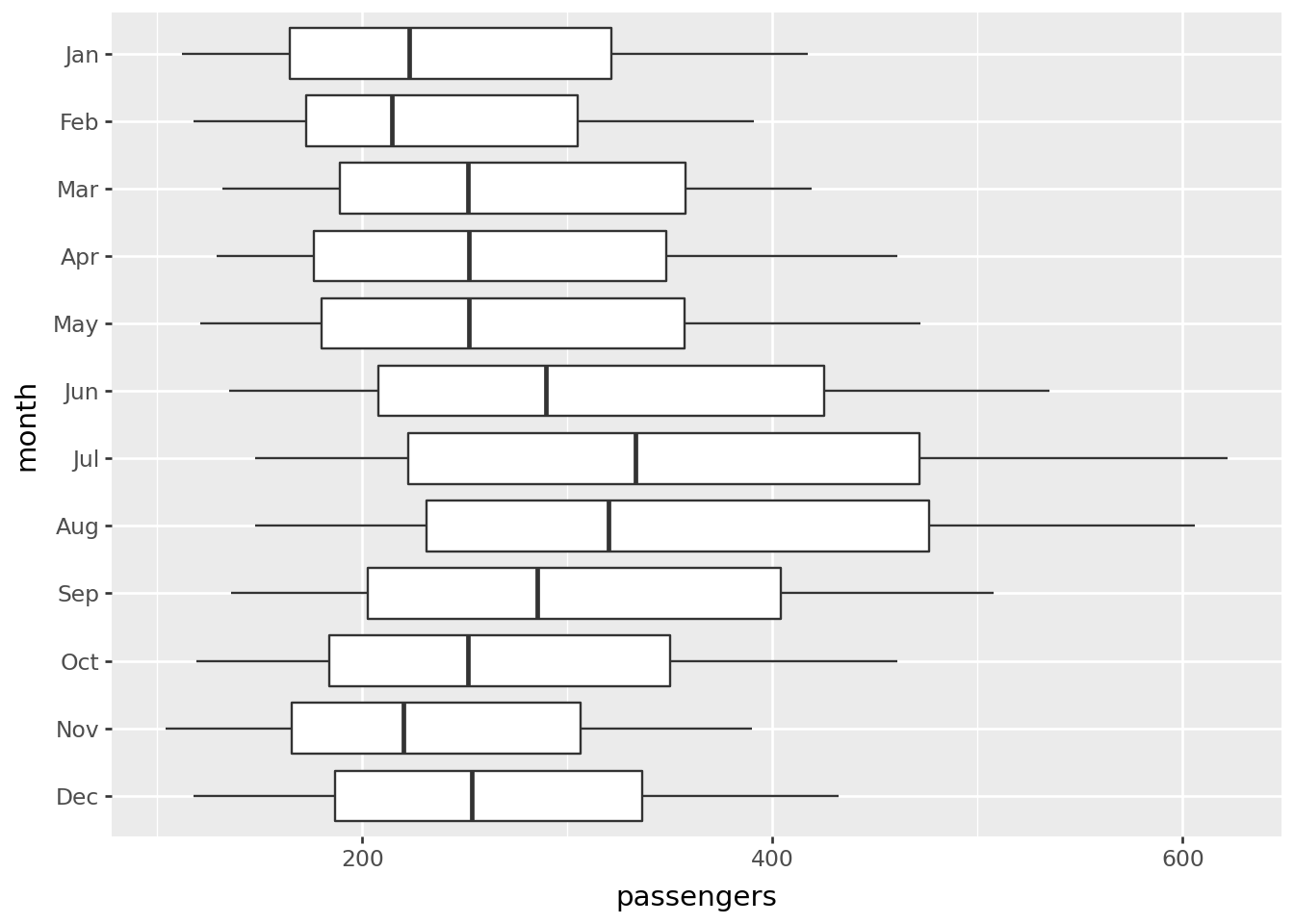
Horizontal boxplot
(
    ggplot(flights)
    + geom_boxplot(aes(x="factor(month)", y="passengers"))
    + coord_flip()
    + scale_x_discrete(
        labels=months[::-1],
        limits=flights.month[11::-1],
        name="month",
    )
)
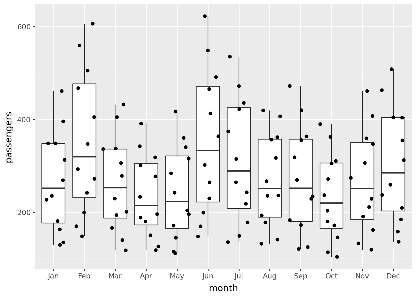
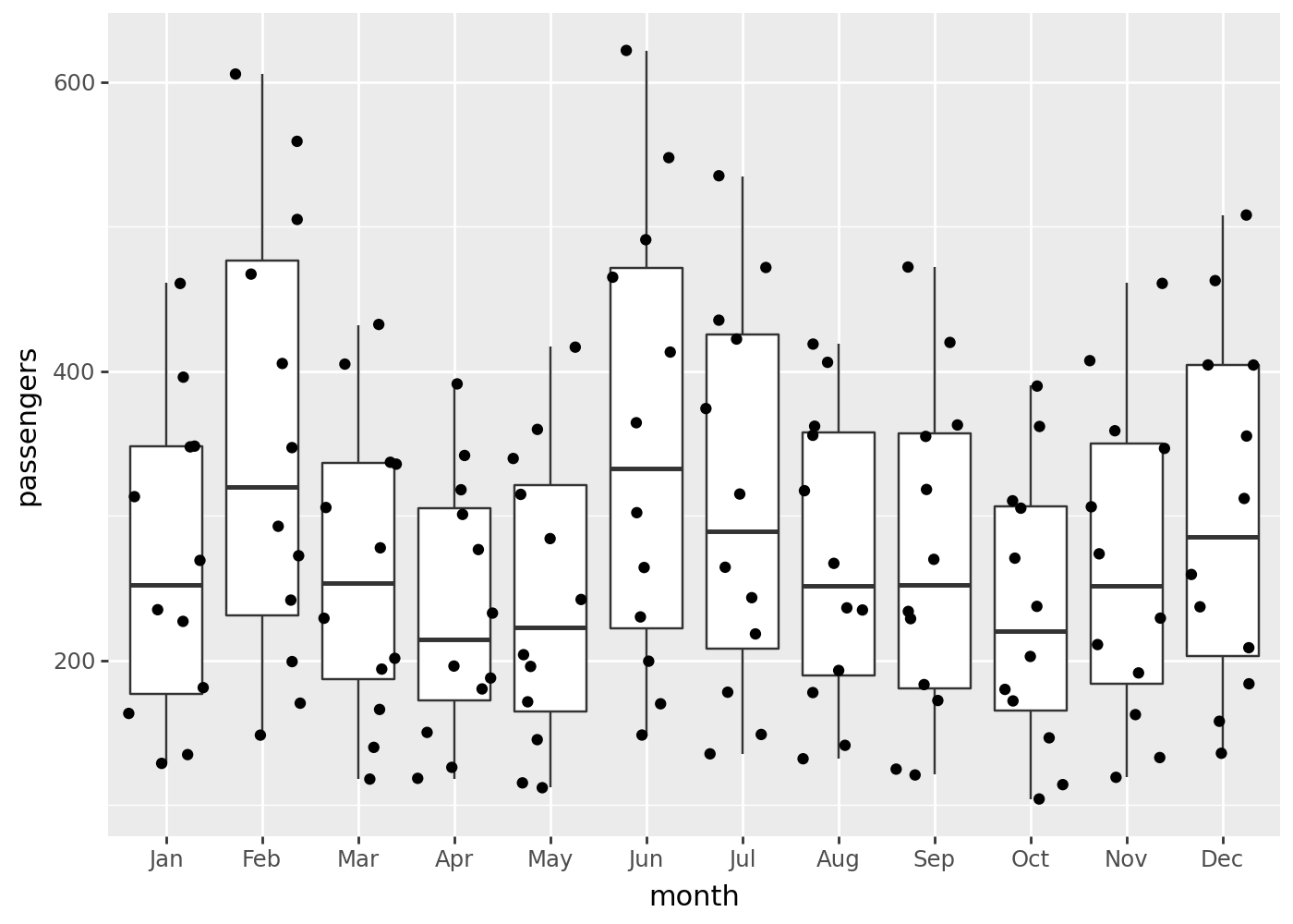
Boxplot with jittered points:
(
    ggplot(flights, aes(x="factor(month)", y="passengers"))
    + geom_boxplot()
    + geom_jitter()
    + scale_x_discrete(labels=months, name="month")  # change ticks labels on OX
)