import datetime
import numpy as np
import pandas as pd
from mizani.labels import label_custom
from plotnine import (
    ggplot,
    aes,
    geom_violin,
    geom_sina,
    labs,
    coord_flip,
    scale_x_discrete,
    scale_y_continuous,
    scale_fill_gradient,
    element_text,
    element_line,
    element_rect,
    element_blank,
    theme
)Temperature over the Year
ridgeline
density plot
Create the data
np.random.seed(1234)
averages = [10, 11, 14, 18, 23, 26, 29, 32, 25 ,18, 14, 6]
sd = [3, 3, 4, 6, 7, 8, 5, 5, 4, 7, 4, 3]
date = [datetime.date(2022, 1, 1) + datetime.timedelta(days=i) for i in range(365)]

data = pd.DataFrame({
    "date": date,
    "month": [f"{d:%B}" for d in date],
    "temperature": [
        round(np.random.normal(averages[d.month-1], sd[d.month-1]))
        for d in date
    ]
})
months = data["month"].unique().tolist()[::-1]
data["month"] = data["month"].astype(pd.CategoricalDtype(categories=months))
data["mean_temperature"] = data.groupby("month", observed=True)["temperature"].transform("mean")

data.head()| date | month | temperature | mean_temperature | |
|---|---|---|---|---|
| 0 | 2022-01-01 | January | 11 | 9.967742 |
| 1 | 2022-01-02 | January | 6 | 9.967742 |
| 2 | 2022-01-03 | January | 14 | 9.967742 |
| 3 | 2022-01-04 | January | 9 | 9.967742 |
| 4 | 2022-01-05 | January | 8 | 9.967742 |
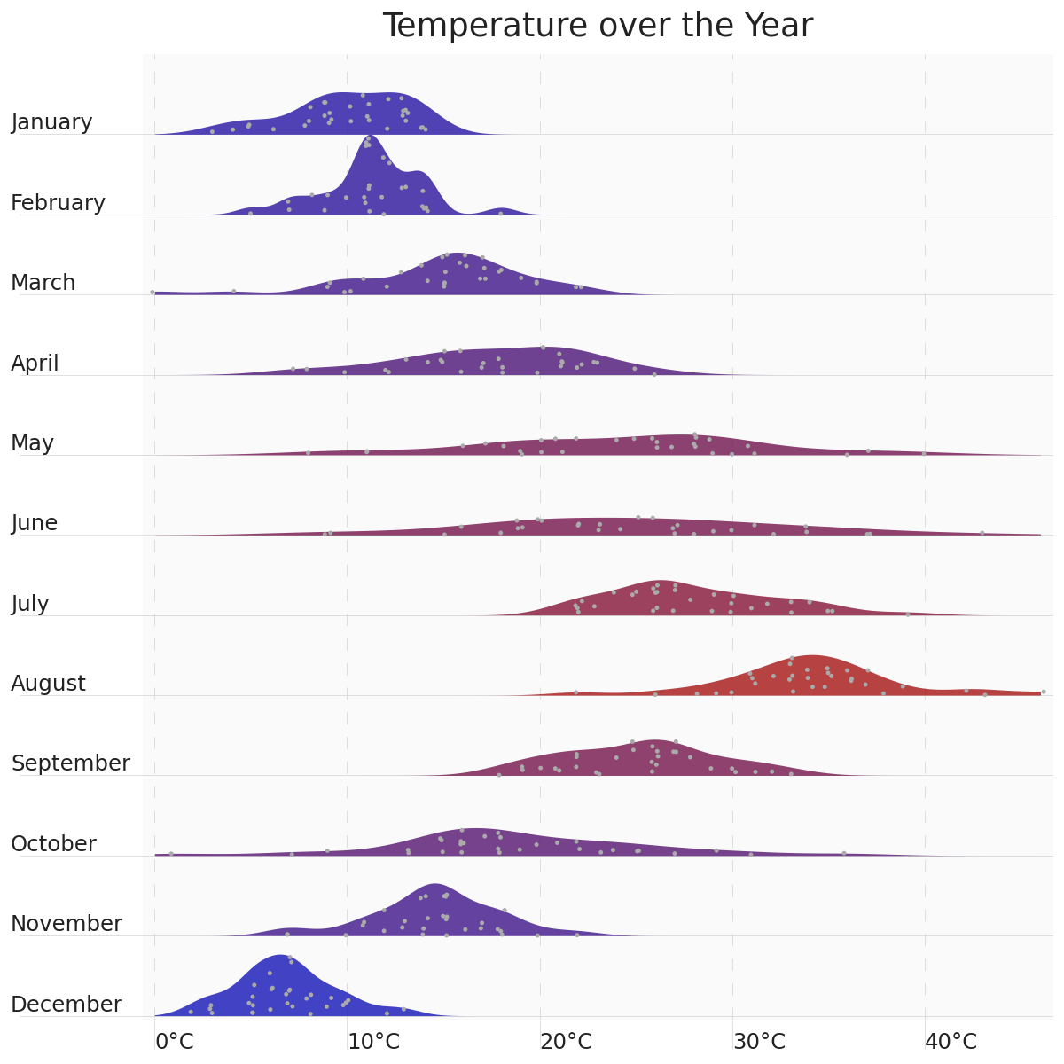
To achieve the ridgeline effect, we create right sided violin and sina plots, with both geoms set to an equivalent width / maxwidth. We then flip the coordinate system for a vertical layout and theme the plot for a better look.
line_color = "#D2D2D2"
line_size = 0.25

(
    ggplot(data, aes("month", "temperature", fill="mean_temperature"))
    + geom_violin(
        position="identity",
        style="right",
        width=2,
        color="none",
        size=line_size,
        trim=False,
        alpha=.85,
    )
    + geom_sina(
        position="identity",
        style="right",
        fill="#AAAAAA",
        size=1,
        stroke=0,
        maxwidth=2,
        random_state=123
    )
    + labs(title="Temperature over the Year")
    + scale_y_continuous(
        expand=(0, 0.5),
        labels=label_custom("{:.0f}°C")
    )
    + scale_x_discrete(expand=(0, -.95, 0, 0))
    + scale_fill_gradient("#2222BB", "#AA2222")
    + coord_flip()
    + theme(
        figure_size=(6, 6),
        legend_position="none",
        text=element_text(color="#222222"),
        line=element_line(size=line_size, color=line_color),
        axis_line=element_blank(),
        panel_grid_major_x=element_line(linetype=(0, (20, 20))),
        panel_grid_minor=element_blank(),
        axis_ticks_minor=element_blank(),
        axis_ticks_length_major_y=50,
        axis_title=element_blank(),
        axis_text_y=element_text(va="bottom", ha="left", margin={"t": 5, "r": -45}),
        axis_text_x=element_text(ha="left", margin={"t": -7}),
        axis_ticks_length=12,
        panel_background=element_rect(fill="#FAFAFA"),
        panel_border=element_blank(),
    )
)