import pandas as pd

from plotnine import (
    ggplot,
    aes,
    geom_path,
    geom_line,
    labs,
    scale_color_continuous,
    element_text,
    theme,
)
from plotnine.data import economicsPath plots
In [1]:
geom_path() connects the observations in the order in which they appear in the data, this is different from geom_line() which connects observations in order of the variable on the x axis.
In [2]:
economics.head(10) # notice the rows are ordered by date| date | pce | pop | psavert | uempmed | unemploy | |
|---|---|---|---|---|---|---|
| 0 | 1967-07-01 | 507.4 | 198712 | 12.5 | 4.5 | 2944 |
| 1 | 1967-08-01 | 510.5 | 198911 | 12.5 | 4.7 | 2945 |
| 2 | 1967-09-01 | 516.3 | 199113 | 11.7 | 4.6 | 2958 |
| 3 | 1967-10-01 | 512.9 | 199311 | 12.5 | 4.9 | 3143 |
| 4 | 1967-11-01 | 518.1 | 199498 | 12.5 | 4.7 | 3066 |
| 5 | 1967-12-01 | 525.8 | 199657 | 12.1 | 4.8 | 3018 |
| 6 | 1968-01-01 | 531.5 | 199808 | 11.7 | 5.1 | 2878 |
| 7 | 1968-02-01 | 534.2 | 199920 | 12.2 | 4.5 | 3001 |
| 8 | 1968-03-01 | 544.9 | 200056 | 11.6 | 4.1 | 2877 |
| 9 | 1968-04-01 | 544.6 | 200208 | 12.2 | 4.6 | 2709 |
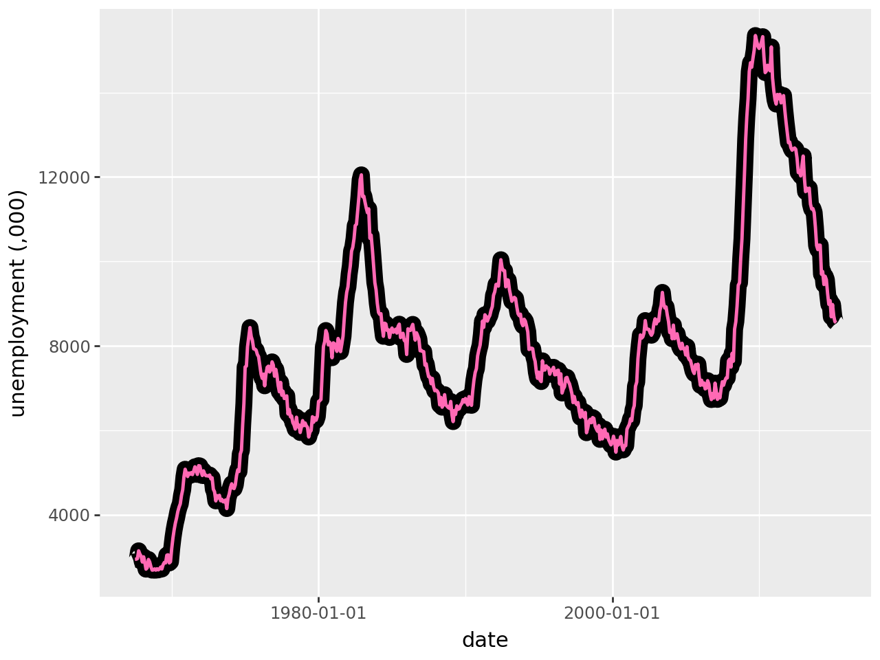
Because the data is in date order geom_path() (in pint) produces the same result as geom_line() (in black):
In [3]:
(
    ggplot(economics, aes(x="date", y="unemploy"))
    + geom_line(size=5)  # plot geom_line as the first layer
    + geom_path(
        colour="#ff69b4",  # plot a path - colour pink
        size=1,
    )
    + labs(x="date", y="unemployment (,000)")  # label x & y-axis
)
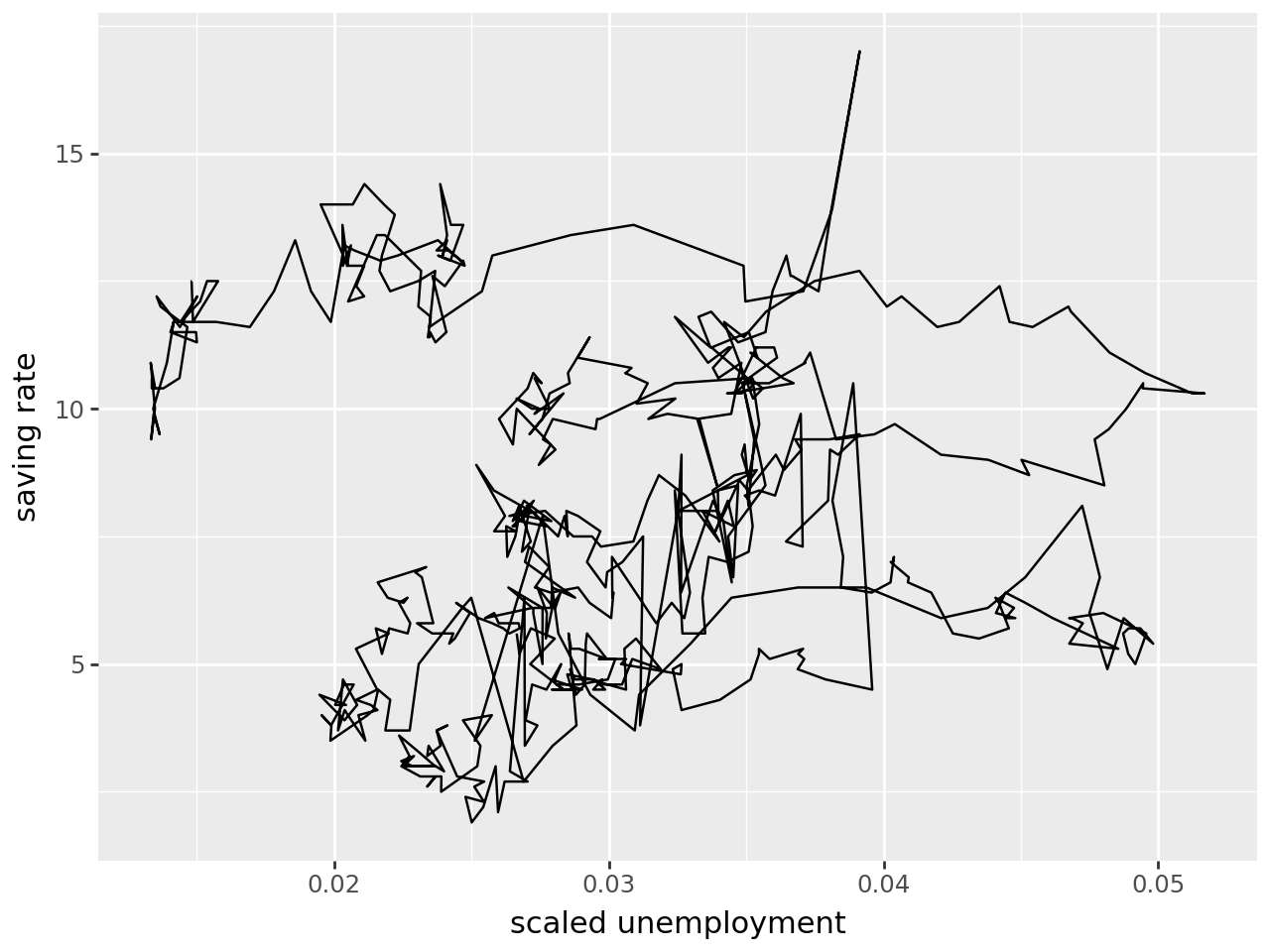
Plotting unemployment (scaled by population) versus savings rate shows how geom_path() differs from geom_line(). Because geom_path() connects the observations in the order in which they appear in the data, this line is like a “journey through time”:
In [4]:
(
    ggplot(economics, aes(x="unemploy/pop", y="psavert"))
    + geom_path()  # plot geom path
    + labs(x="scaled unemployment", y="saving rate")  # label x & y-axis
)
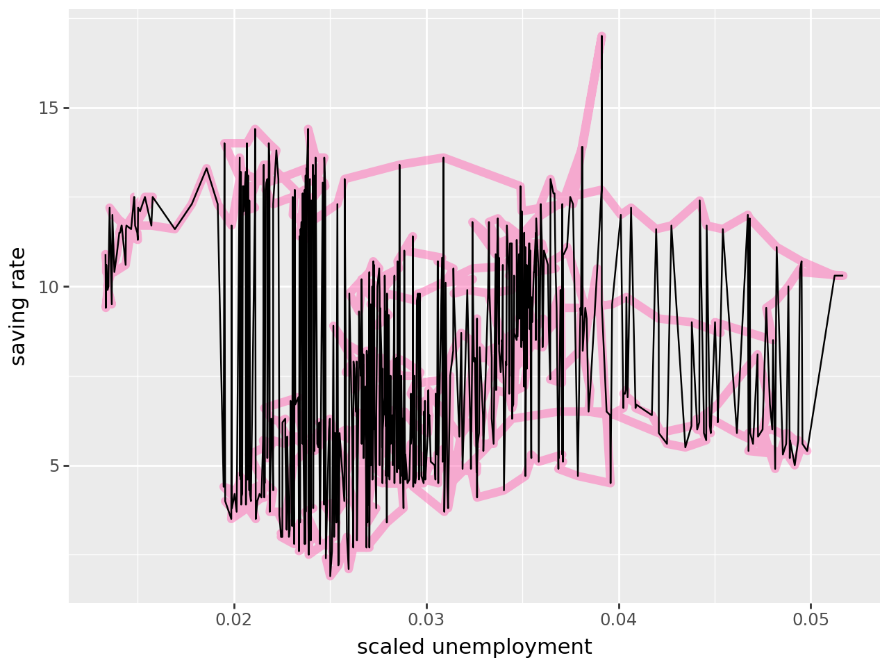
Comparing geom_line() (black) to geom_path() (pink) shows how these two plots differ in what they can show: geom_path() shows the savings rate has gone down over time, which is not evident with geom_path().
In [5]:
(
    ggplot(economics, aes(x="unemploy/pop", y="psavert"))
    + geom_path(
        colour="#ff69b4",  # plot geom_path as the first layer - colour pink
        alpha=0.5,  # line transparency
        size=2.5,
    )  # line thickness
    + geom_line()  # layer geom_line
    + labs(x="scaled unemployment", y="saving rate")  # label x & y-axis
)
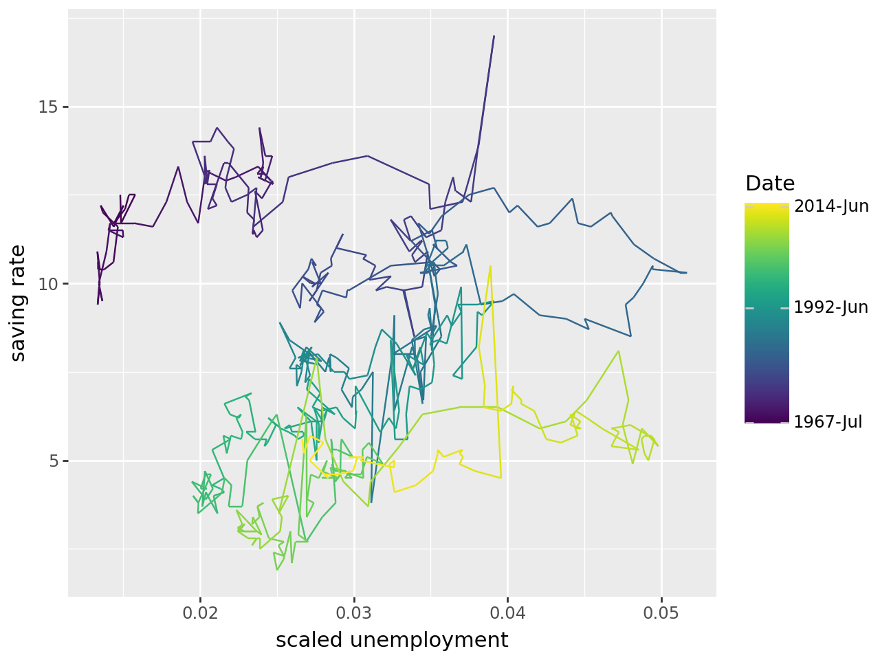
The geom_path can be easier to interpret if time is coloured in. First convert time to a number, and use this number to colour the path:
In [6]:
# convert date to a number
economics["date_as_number"] = pd.to_numeric(economics["date"])
In [7]:
# inspect new column
economics.head()| date | pce | pop | psavert | uempmed | unemploy | date_as_number | |
|---|---|---|---|---|---|---|---|
| 0 | 1967-07-01 | 507.4 | 198712 | 12.5 | 4.5 | 2944 | -79056000000000000 |
| 1 | 1967-08-01 | 510.5 | 198911 | 12.5 | 4.7 | 2945 | -76377600000000000 |
| 2 | 1967-09-01 | 516.3 | 199113 | 11.7 | 4.6 | 2958 | -73699200000000000 |
| 3 | 1967-10-01 | 512.9 | 199311 | 12.5 | 4.9 | 3143 | -71107200000000000 |
| 4 | 1967-11-01 | 518.1 | 199498 | 12.5 | 4.7 | 3066 | -68428800000000000 |
The path is coloured such that it changes with time using the command aes(colour='date_as_number') within geom_path().
In [8]:
# input
legend_breaks = [
    -79056000000000000,
    709948800000000000,
    1401580800000000000,
]  # used to modify colour-graded legend
legend_labels = ["1967-Jul", "1992-Jun", "2014-Jun"]

# plot
(
    ggplot(economics, aes(x="unemploy/pop", y="psavert"))
    + geom_path(
        aes(colour="date_as_number")
    )  # colour geom_path using time variable "date_as_number"
    + labs(x="scaled unemployment", y="saving rate")
    + scale_color_continuous(
        breaks=legend_breaks,  # set legend breaks (where labels will appear)
        labels=legend_labels,
    )  # set labels on legend
    + theme(legend_title=element_text(text="Date"))  # set title of legend
)