from plotnine import *
from plotnine.data import economics
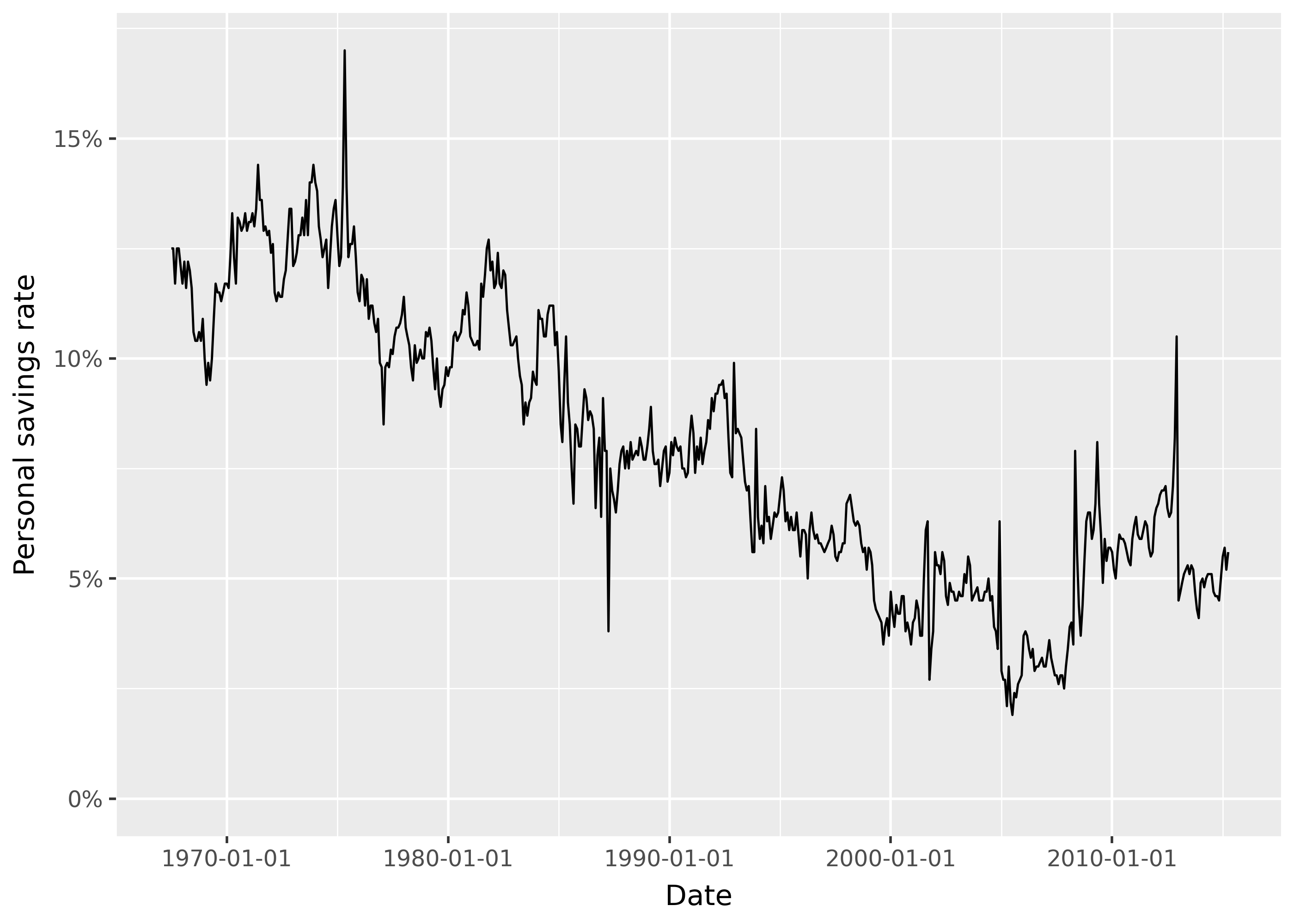
p = ggplot(economics, aes("date", "psavert")) + geom_line()Scale x and y
- continuous
- discrete
- date, datetime, timedelta
- log10, sqrt, symlog
- reverse
Common formatting:
- percentages
- dates
Full example
from mizani.labels import percent_format

(
    ggplot(economics, aes("date", "psavert"))
    + geom_line()
    + labs(title="")
    + scale_y_continuous(
        name="Personal savings rate",
        limits=[0, None],
        labels=percent_format(scale=1),
    )
    + scale_x_date(
        name="Date",
        date_breaks="10 years",
        date_minor_breaks="5 year",
    )
)
Expanding limits to include zero
p + scale_y_continuous(limits=[0, None])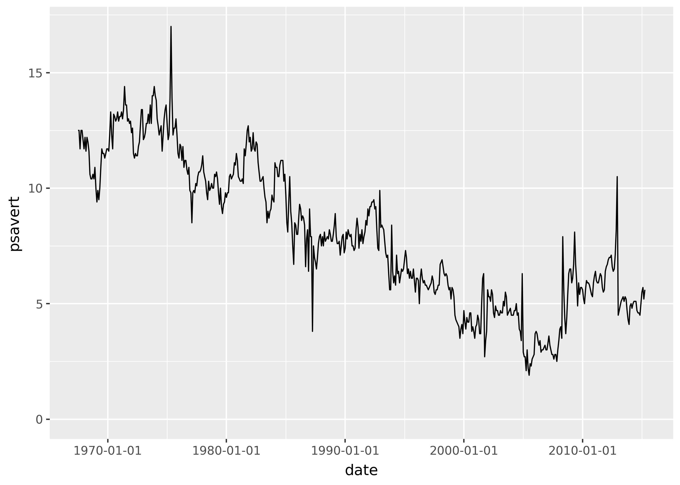
Labelling percentages
(
    ggplot(economics, aes("date", "psavert"))
    + geom_line()
    + scale_y_continuous(labels=lambda arr: [f"{x}%" for x in arr])
)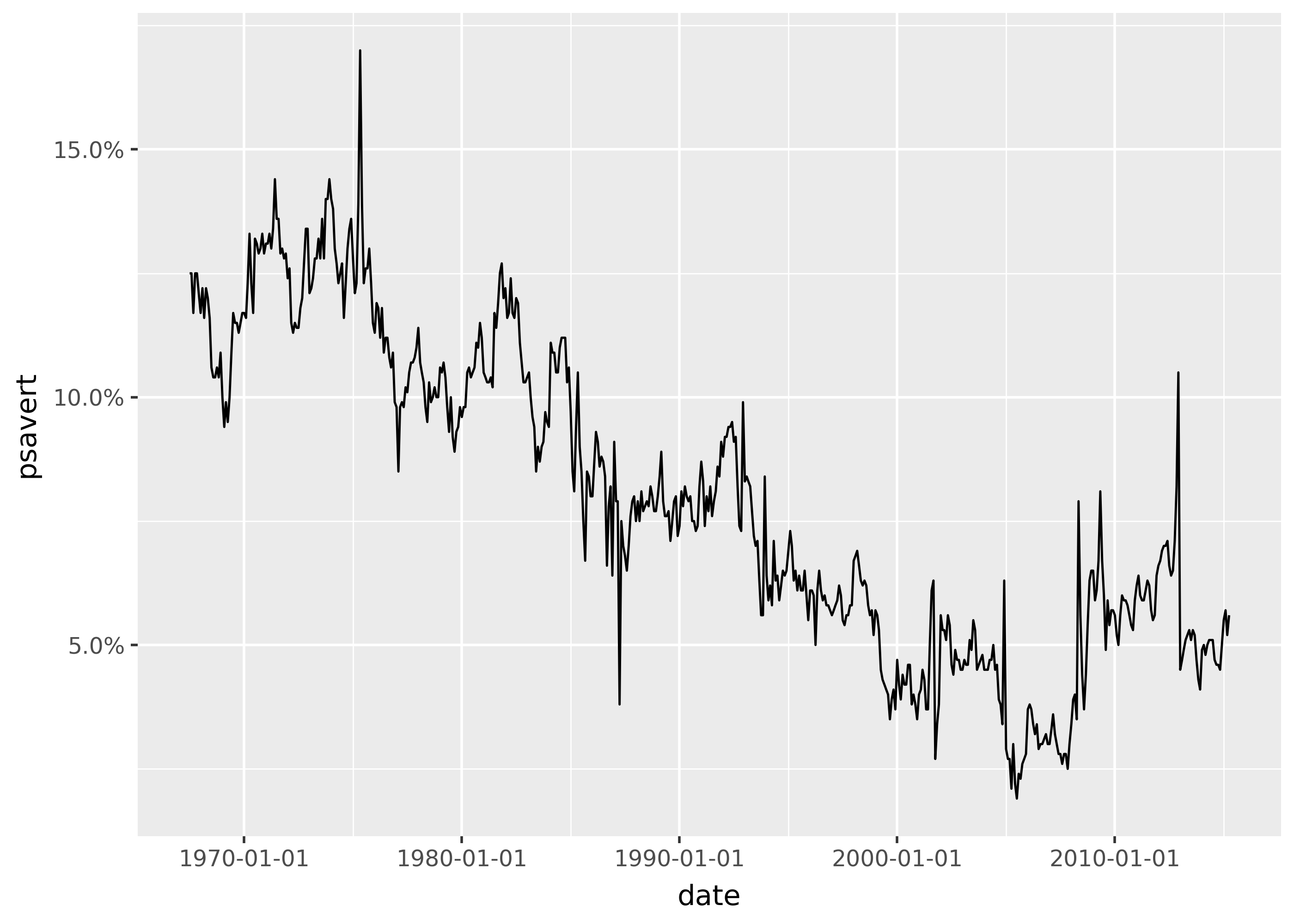
from mizani.labels import percent_format

(
    ggplot(economics, aes("date", "psavert"))
    + geom_line()
    + scale_y_continuous(labels=percent_format(scale=1))
)
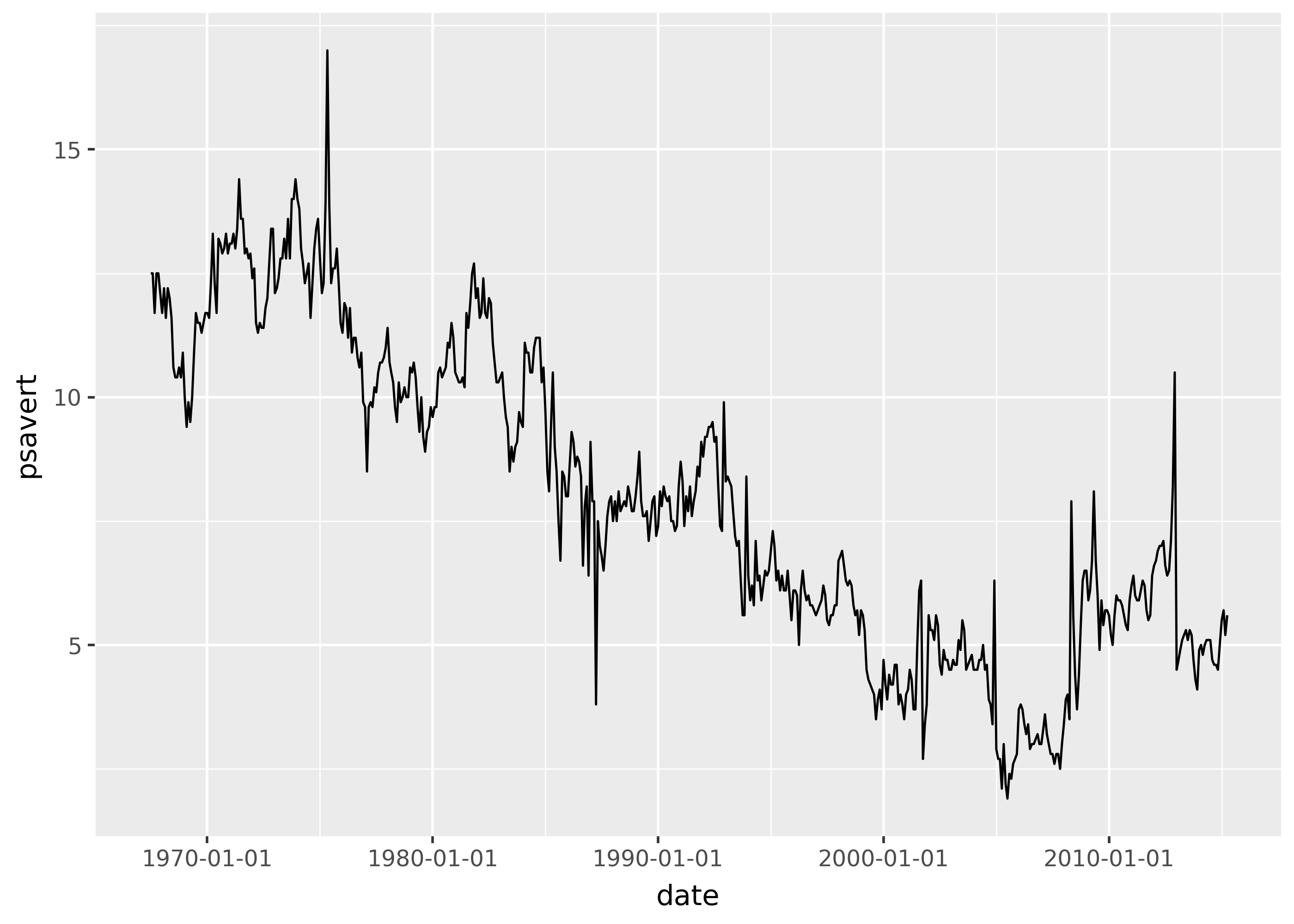
Specifying date breaks
(
    ggplot(economics, aes("date", "psavert"))
    + geom_line()
    + scale_x_date(date_breaks="10 years", date_minor_breaks="5 year")
)
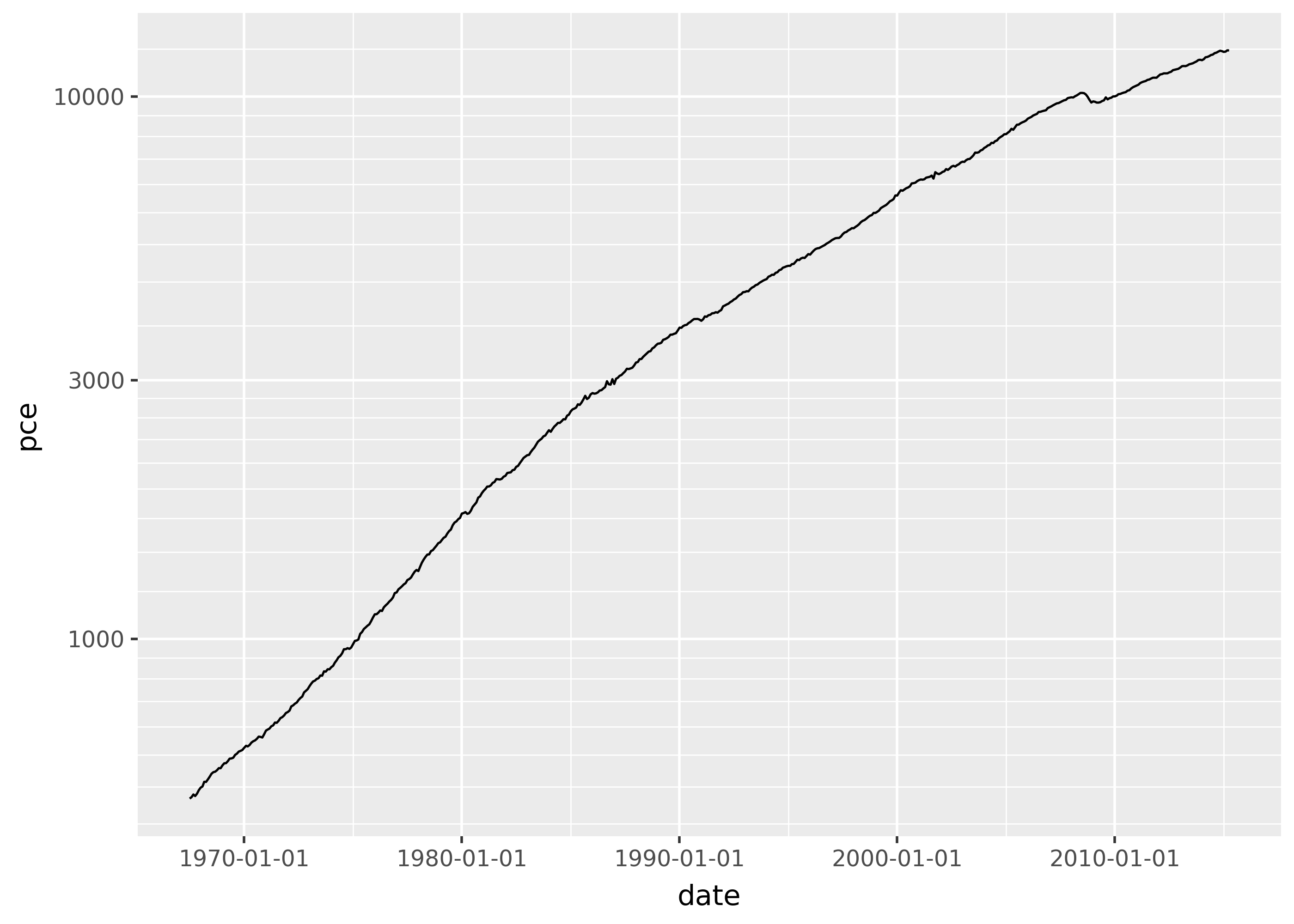
Applying log scale
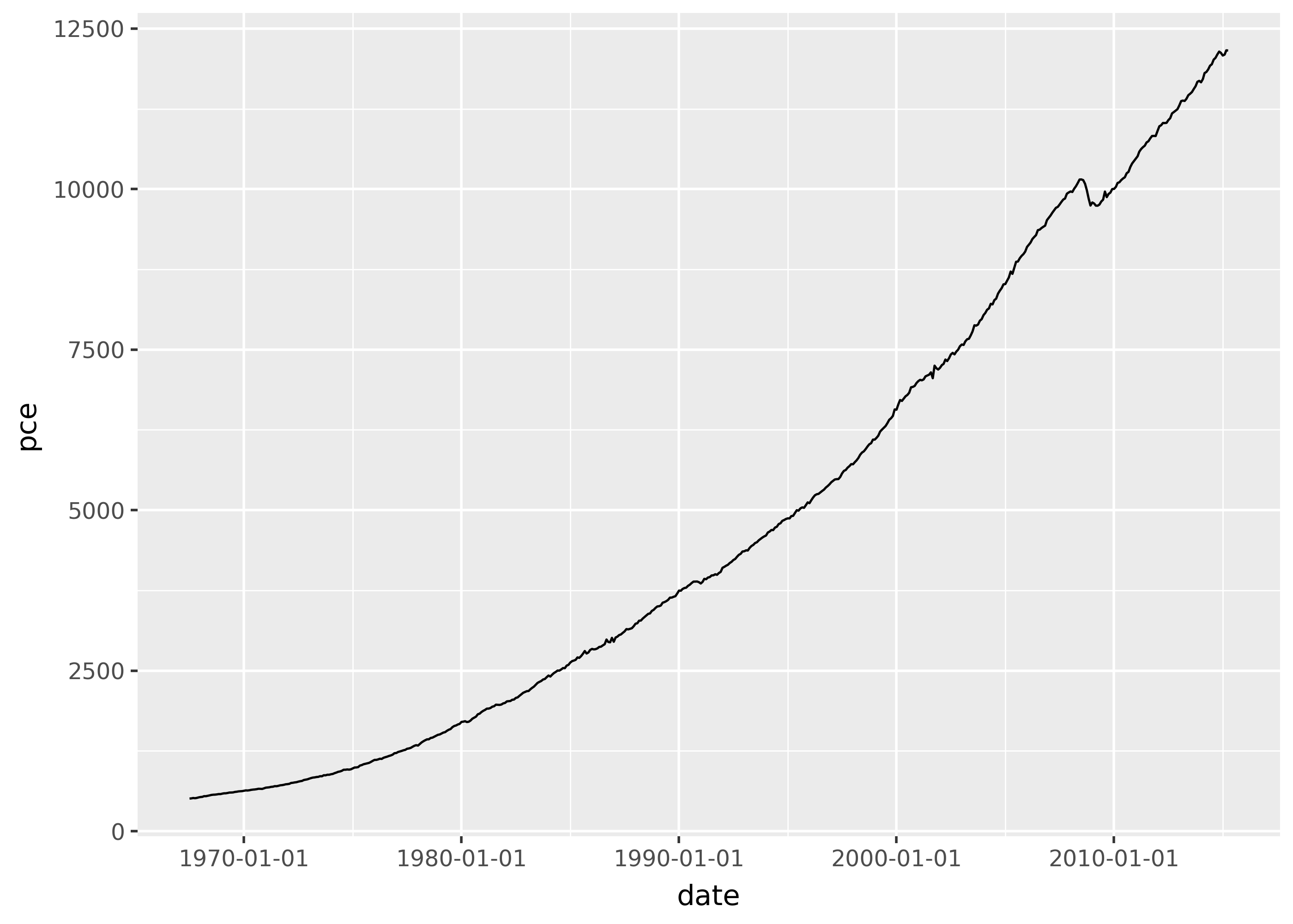
p = ggplot(economics, aes("date", "pce")) + geom_line()

p
p + scale_y_log10()