from plotnine import ggplot, aes, geom_point, labs
from plotnine.data import penguins
(
ggplot(penguins, aes("bill_length_mm", "bill_depth_mm", color="species"))
+ geom_point()
)
Plotnine is a Python package for data visualization, based on the grammar of graphics. It implements a wide range of plots—including barcharts, linegraphs, scatterplots, maps, and much more.
This guide goes from a basic overview of Plotnine code, to explaining each piece of its grammar in more detail. While getting started is quick, learning the full grammar takes time. But it’s worth it! The grammar of graphics shows how even plots that look very different share the same underlying structure.
The rest of this page provides brief instructions for installing and starting with Plotnine, followed by some example use cases.
# simple install
pip install plotnine

# with dependencies used in examples
pip install 'plotnine[extra]'
# simple install
uv add plotnine
# with dependencies used in examples
uv add 'plotnine[extra]'# simple install
pixi init name-of-project
cd name-of-project
pixi add plotnine
# with dependencies uses in examples
pixi init name-of-project
cd name-of-project
pixi add 'plotnine[extra]' --pypi# simple install
conda install -c conda-forge plotnine
# with dependencies used in examples
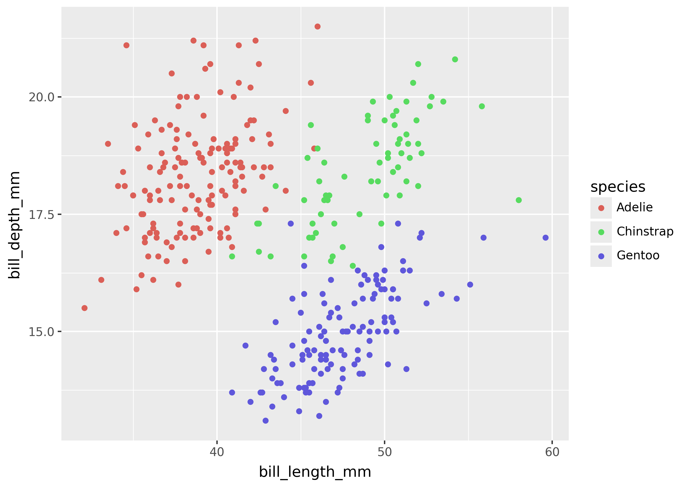
conda install -c conda-forge 'plotnine[extra]'Plotnine comes with over a dozen example datasets, in order to quickly illustrate a wide range of plots. For example, the Palmer’s Penguins dataset (plotnine.data.penguins) contains data on three different penguin species.
The scatterplot below shows the relationship between bill length and bill depth for each penguin species.
from plotnine import ggplot, aes, geom_point, labs
from plotnine.data import penguins

(
    ggplot(penguins, aes("bill_length_mm", "bill_depth_mm", color="species"))
    + geom_point()
)
Plotnine supports both Pandas and Polars DataFrames. It also provides simple a >> operator to pipe data into a plot.
The example below shows a Polars DataFrame being filtered, then piped into a plot.
import polars as pl

pl_penguins = pl.from_pandas(penguins)

(
    # polars: subset rows  ----
    pl_penguins.filter(pl.col("species") == "Adelie")
    #
    # pipe to plotnine ----
    >> ggplot(aes("bill_length_mm", "bill_depth_mm", fill="species"))
    + geom_point()
    + labs(title="Adelie penguins")
)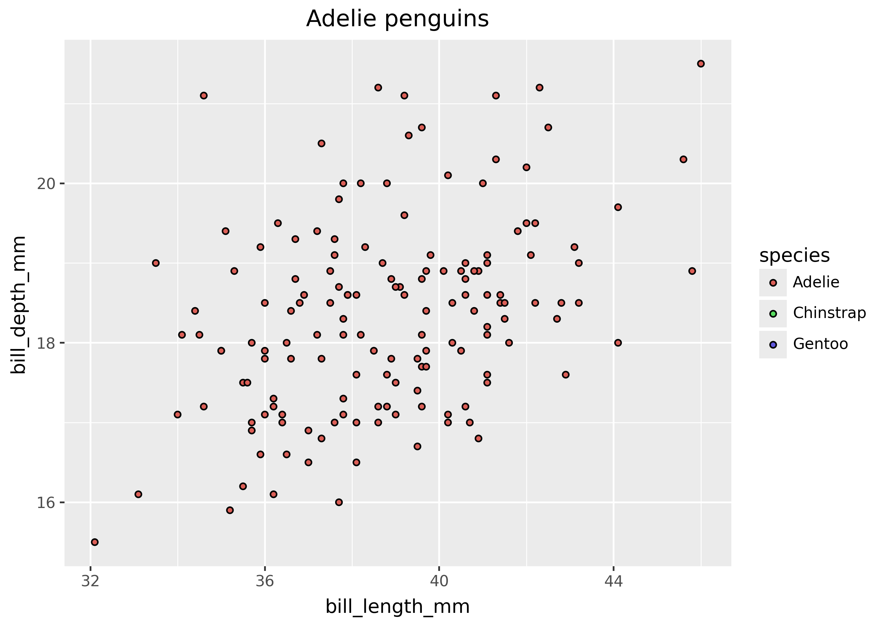
Notice that the code above keeps the Polars filter code and plotting code together (inside the parentheses). This makes it easy to quickly create plots, without needing a bunch of intermediate variables.
See the Plotnine gallery for more examples.
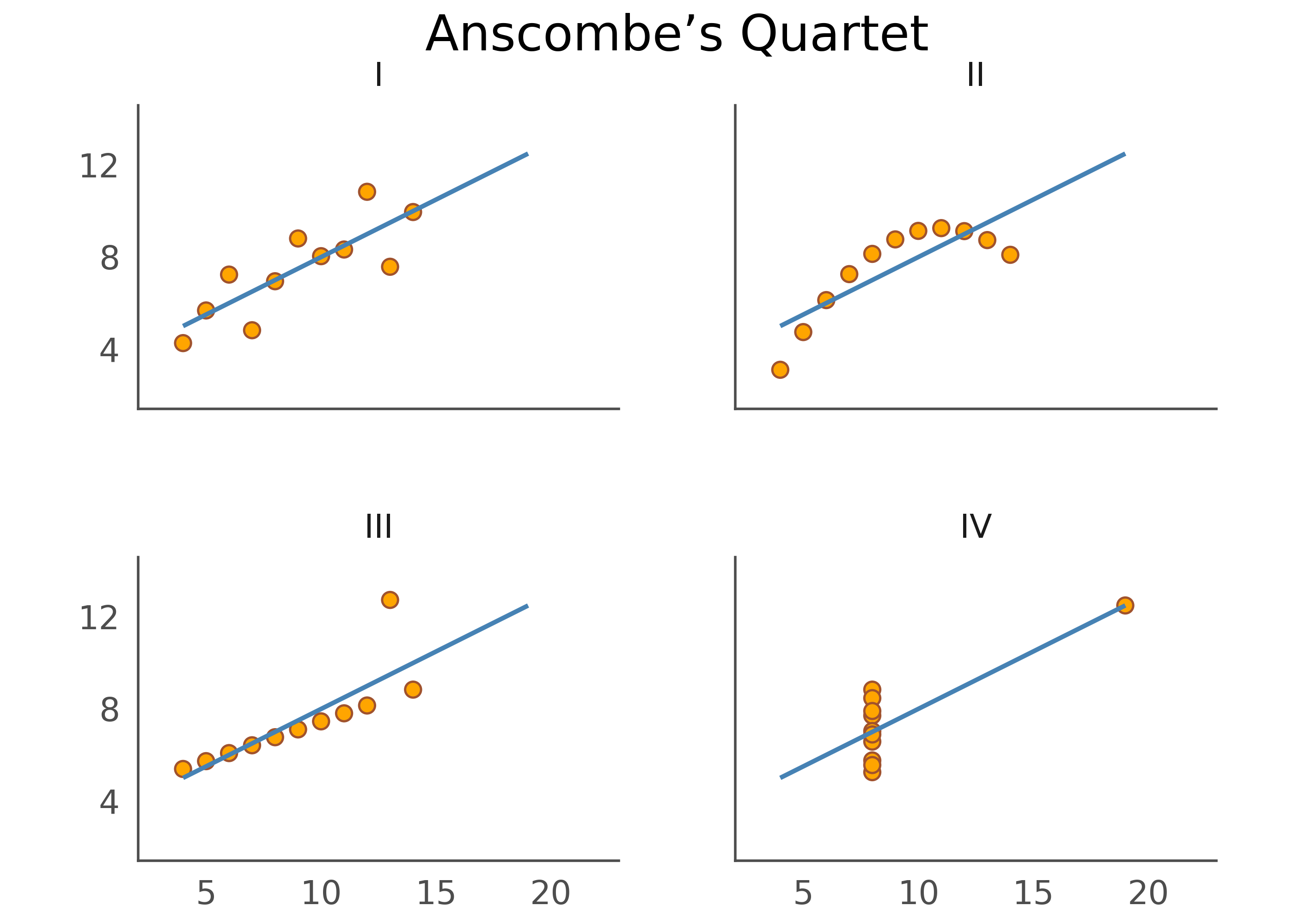
from plotnine import *
from plotnine.data import anscombe_quartet

(
    ggplot(anscombe_quartet, aes("x", "y"))
    + geom_point(color="sienna", fill="orange", size=3)
    + geom_smooth(method="lm", se=False, fullrange=True, color="steelblue", size=1)
    + facet_wrap("dataset")
    + labs(title="Anscombe’s Quartet")
    + scale_y_continuous(breaks=(4, 8, 12))
    + coord_fixed(xlim=(3, 22), ylim=(2, 14))
    + theme_tufte(base_size=16)
    + theme(
        axis_line=element_line(color="#4d4d4d"),
        axis_ticks_major=element_line(color="#00000000"),
        axis_title=element_blank(),
        panel_spacing=0.09,
    )
)
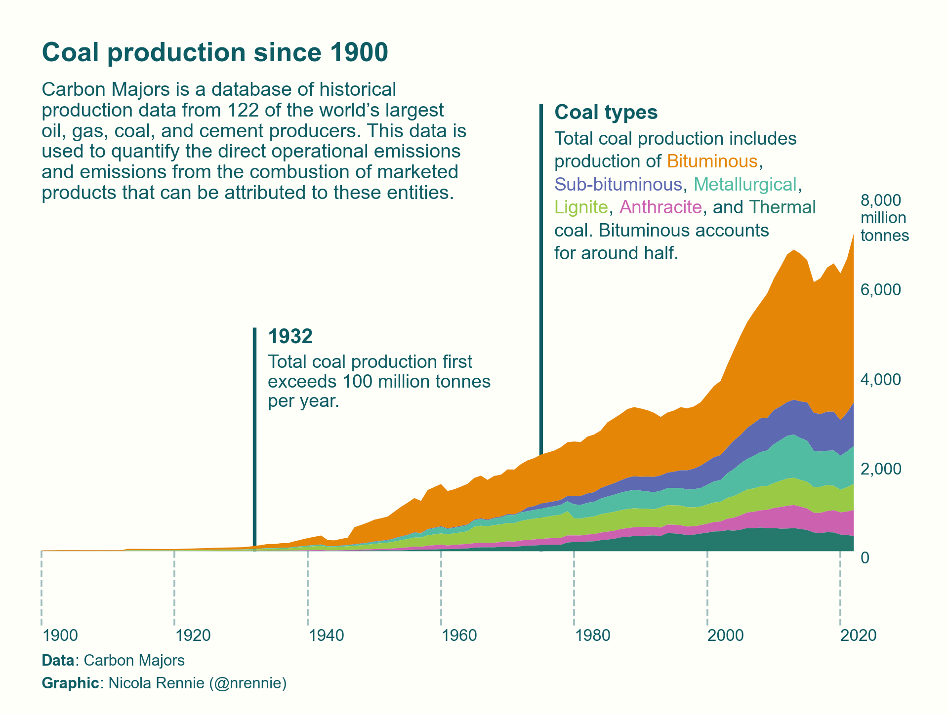
The plot below makes heavy use of annotation, in order to illustrate coal production over the past century. The chart is largely Plotnine code, with matplotlib for some of the fancier text annotations. Learn more on in this blog post by the author, Nicola Rennie.
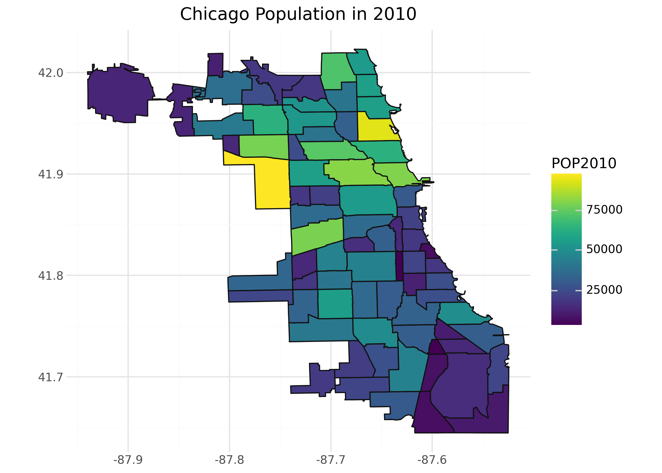
from plotnine import *
import geodatasets
import geopandas as gp

chicago = gp.read_file(geodatasets.get_path("geoda.chicago_commpop"))

(
    ggplot(chicago, aes(fill="POP2010"))
    + geom_map()
    + coord_fixed()
    + theme_minimal()
    + labs(title="Chicago Population in 2010")
)
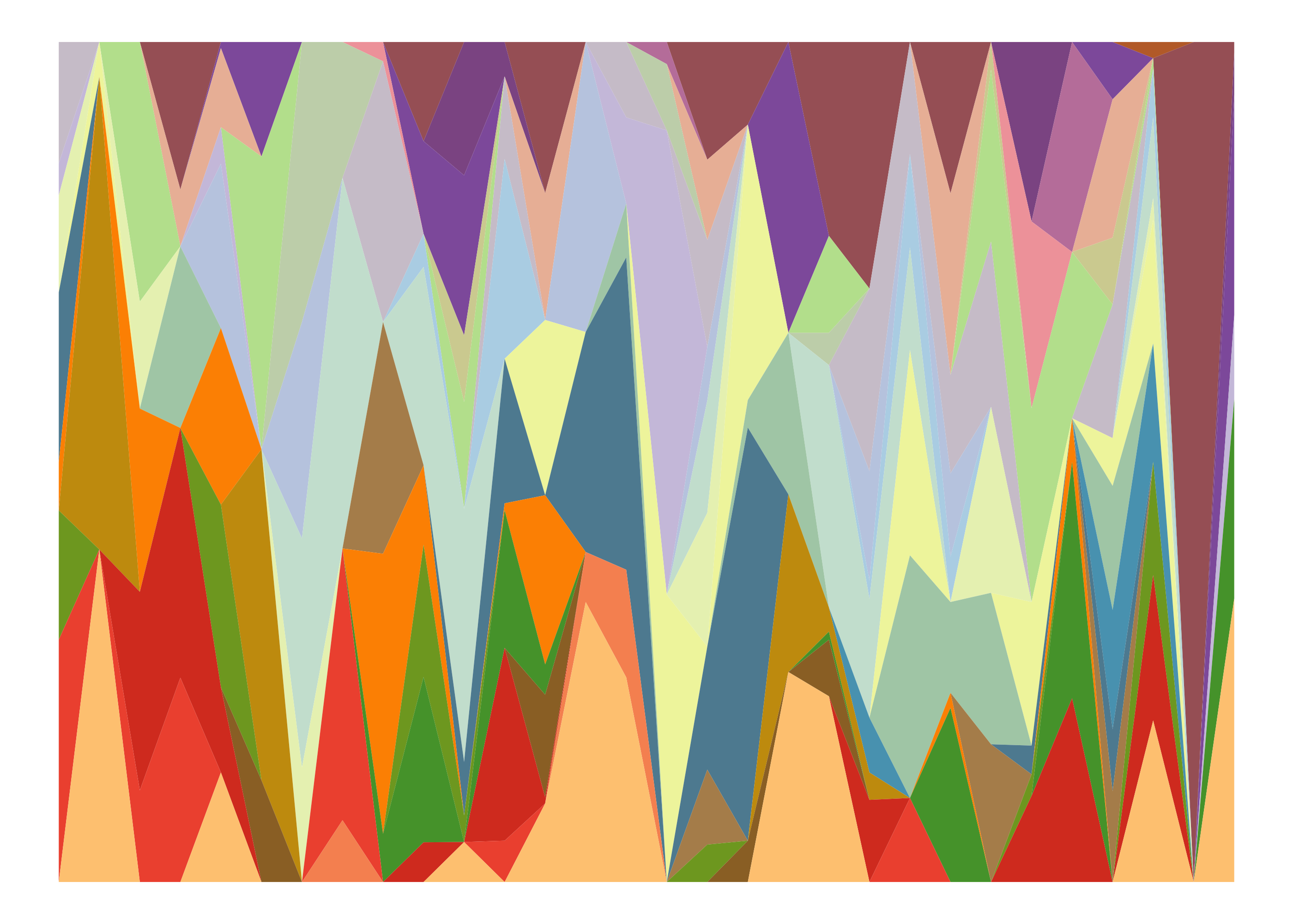
import polars as pl
import numpy as np

from plotnine import *
from mizani.palettes import brewer_pal, gradient_n_pal

np.random.seed(345678)

# generate random areas for each group to fill per year ---------
# Note that in the data the x-axis is called Year, and the
# filled bands are called Group(s)

opts = [0] * 100 + list(range(1, 31))
values = []
for ii in range(30):
    values.extend(np.random.choice(opts, 30, replace=False))


# Put all the data together -------------------------------------
years = pl.DataFrame({"Year": list(range(30))})
groups = pl.DataFrame({"Group": [f"grp_{ii}" for ii in range(30)]})

df = (
    years.join(groups, how="cross")
    .with_columns(Values=pl.Series(values))
    .with_columns(prop=pl.col("Values") / pl.col("Values").sum().over("Year"))
)


# Generate color palette ----------------------------------------
# this uses 12 colors interpolated to all 30 Groups
pal = brewer_pal("qual", "Paired")

colors = pal(12)
np.random.shuffle(colors)

all_colors = gradient_n_pal(colors)(np.linspace(0, 1, 30))


# Plot ---------------------------------------------------------
(
    df
    >> ggplot(aes("Year", "prop", fill="Group"))
    + geom_area()
    + scale_fill_manual(values=all_colors)
    + theme(
        axis_text=element_blank(),
        line=element_blank(),
        title=element_blank(),
        legend_position="none",
        plot_margin=0,
        panel_border=element_blank(),
        panel_background=element_blank(),
    )
)
Continue to the Overview for a worked example breaking down each piece of Plotnine’s grammar of graphics.