from plotnine import *
from plotnine.data import diamondsPosition adjustments
Position adjustments determine the placement of overlapping geoms. For example, they can jitter points by applying a small amount of noise, or dodge bars to put them side-by-side. Use the position= argument to geoms to specify adjustments.
TipYou will learn
- How to avoid overplotting by jittering points.
- How to make side-by-side bar charts.
- How to make stacked bar charts with equal heights.
- How to apply the same position adjustment to multiple geoms.
NoteKey points
- Use the
position=argument to geoms to specify position adjustments. position_jitter()adds a small amount of noise to points.position_dodge()places bars side-by-side.position_fill()stacks bars to the same height.- Explicitly add rows for missing data when dodging bars.
- Often, setting parameters like
position_dodge(width=...)is necessary to align adjustments across geoms.
Setup
Jittering points
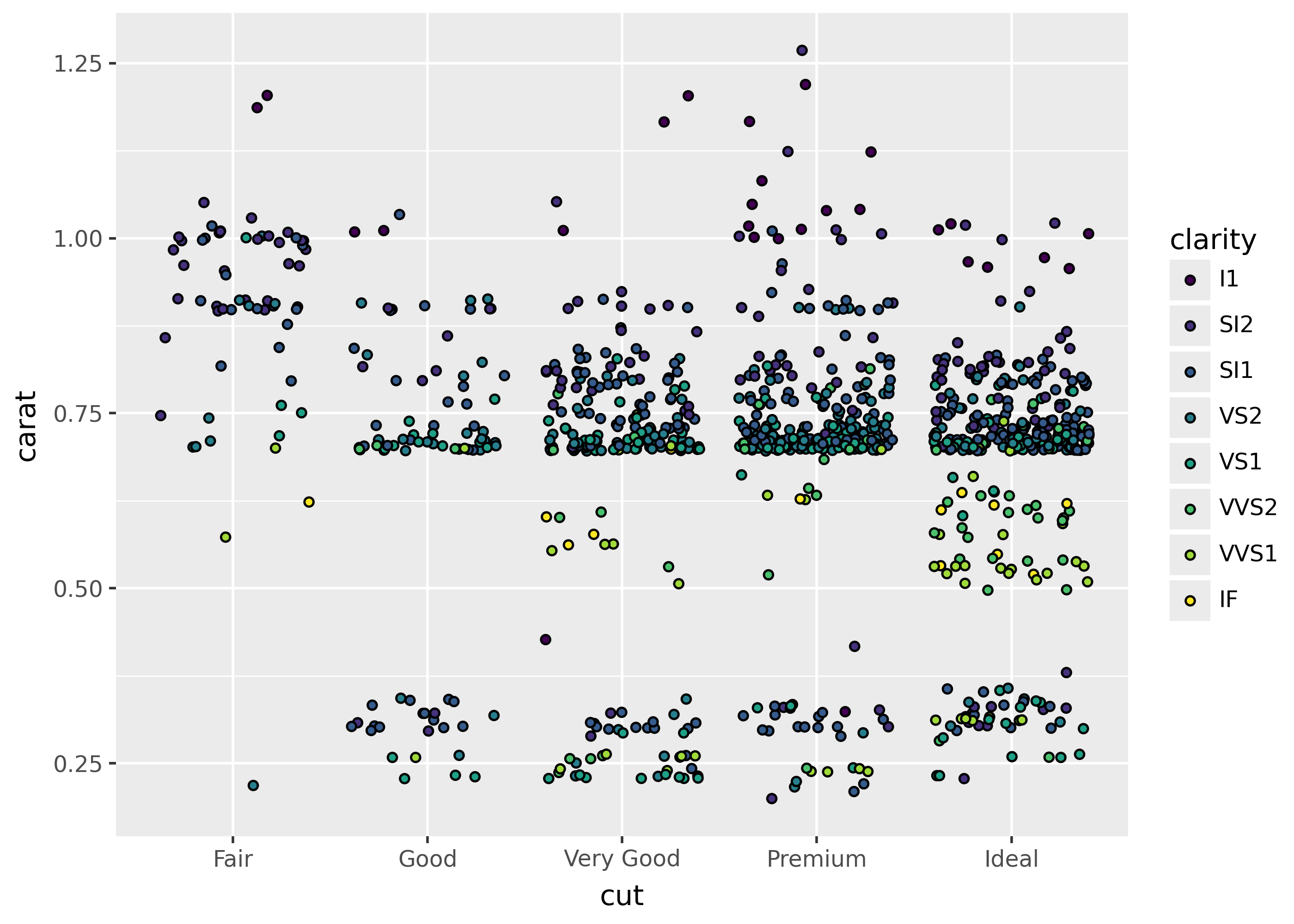
Use position_jitter() to add a small amount of noise to the x- and y-axis for geoms like points. This enables viewers to see overlapping items on dense plots.
The plots below show points before and after applying jitter.
p = ggplot(diamonds.head(1000), aes("cut", "carat", fill="clarity"))

p + geom_point()
p + geom_point(position=position_jitter())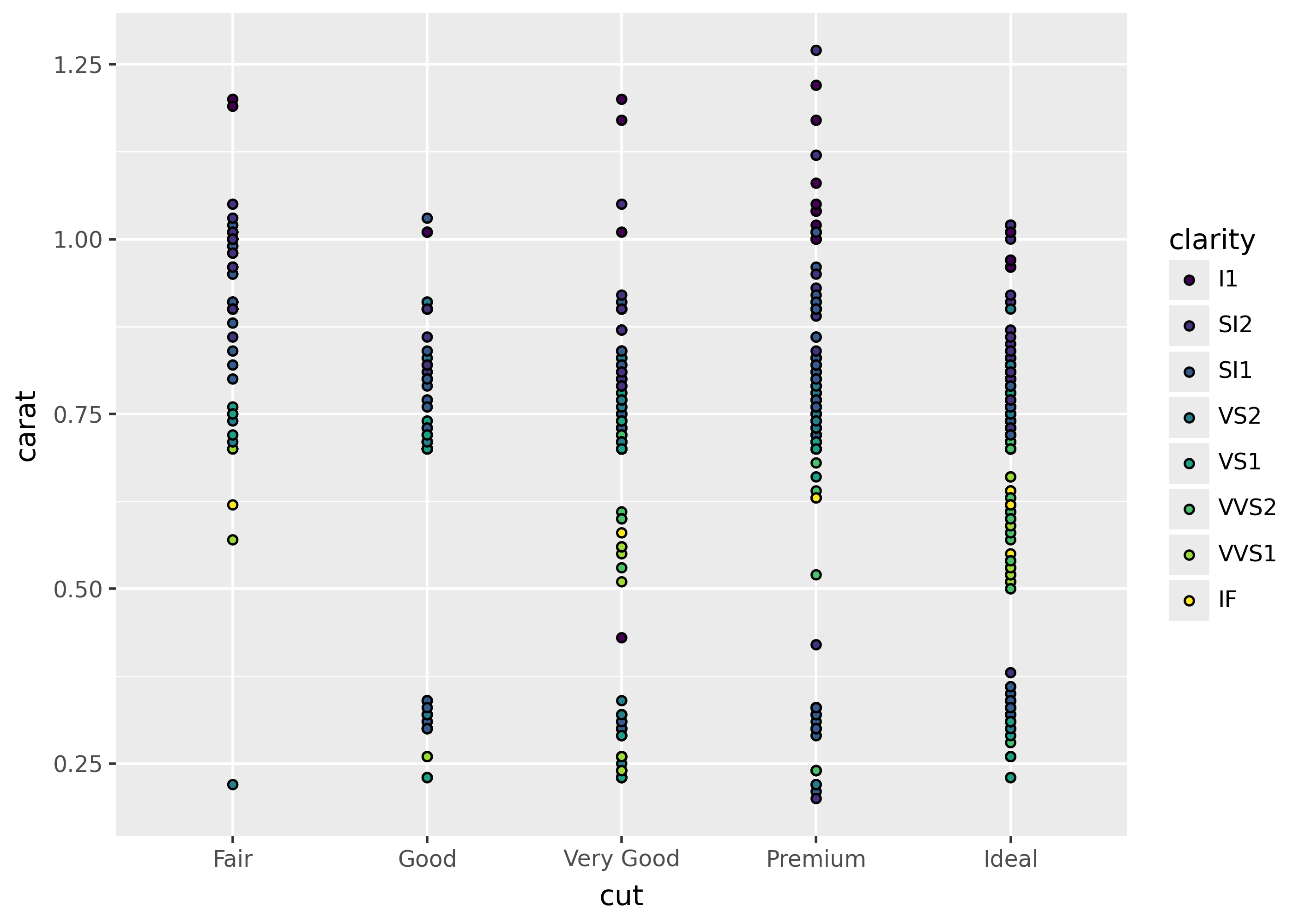
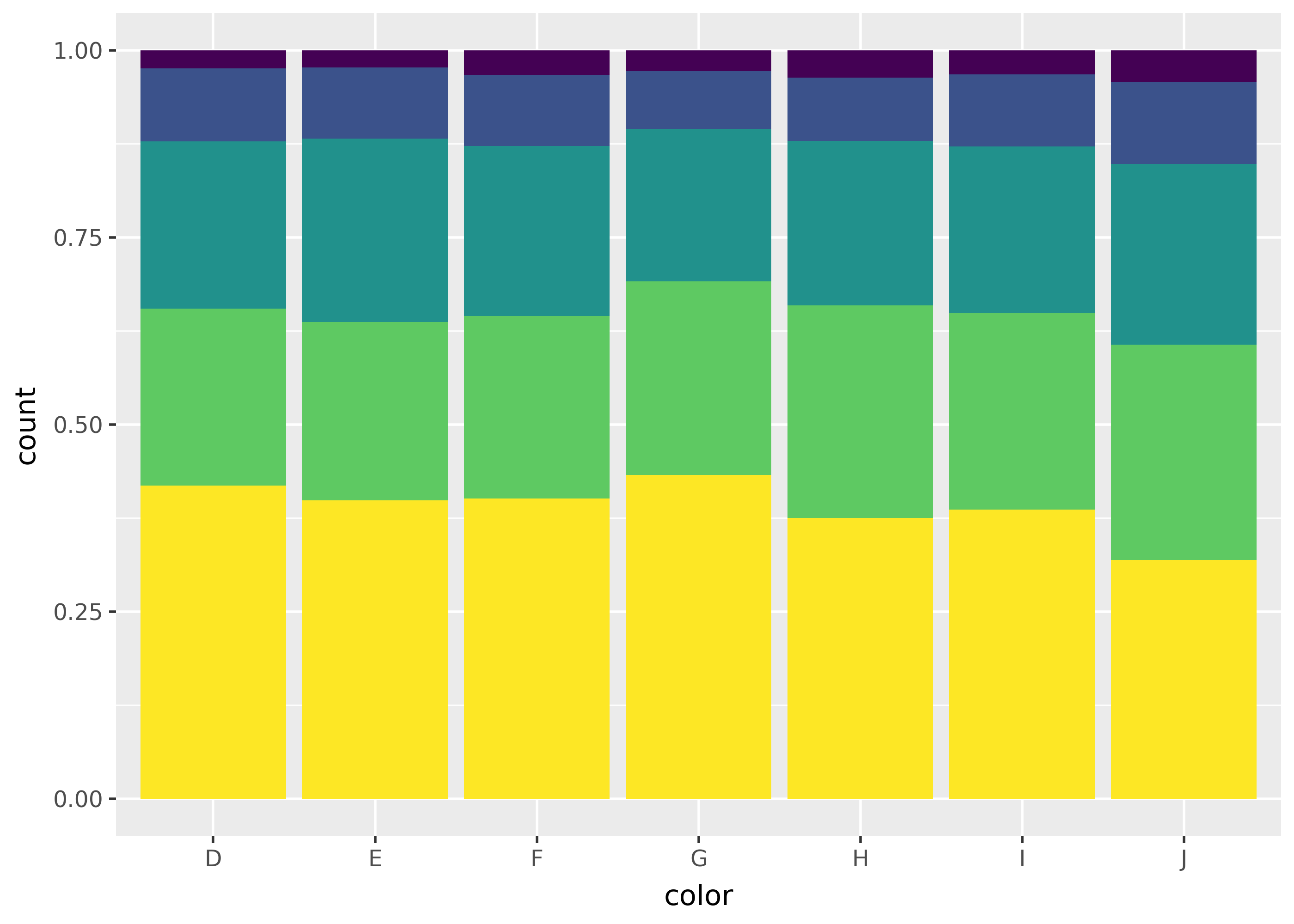
Stacking, filling, and dodging bars
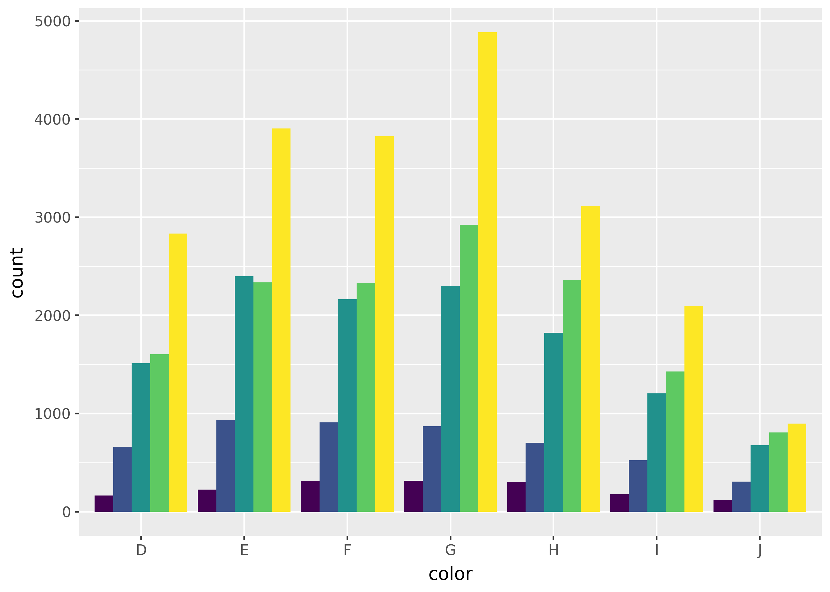
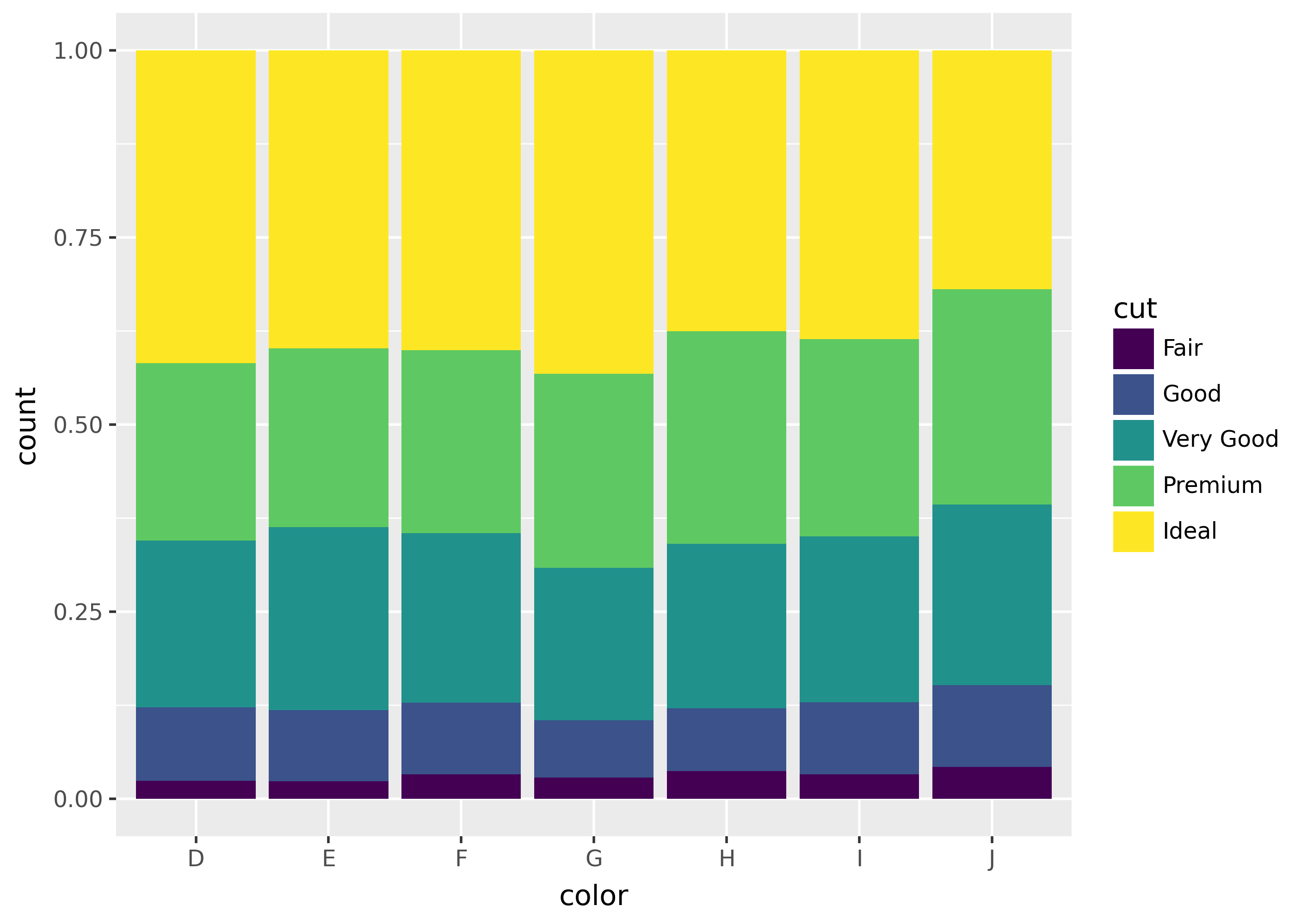
By default, geoms like geom_bar() stack bars on top of each other (position_stack()). Use position_fill() to make the stacked bars all together the same height (set at 1), and position_dodge() to move bars side-by-side.
from plotnine.data import diamonds

p = ggplot(diamonds, aes("color", fill="cut")) + theme(legend_position="none")

p + geom_bar(position=position_stack())  # default
p + geom_bar(position=position_fill())
p + geom_bar(position=position_dodge())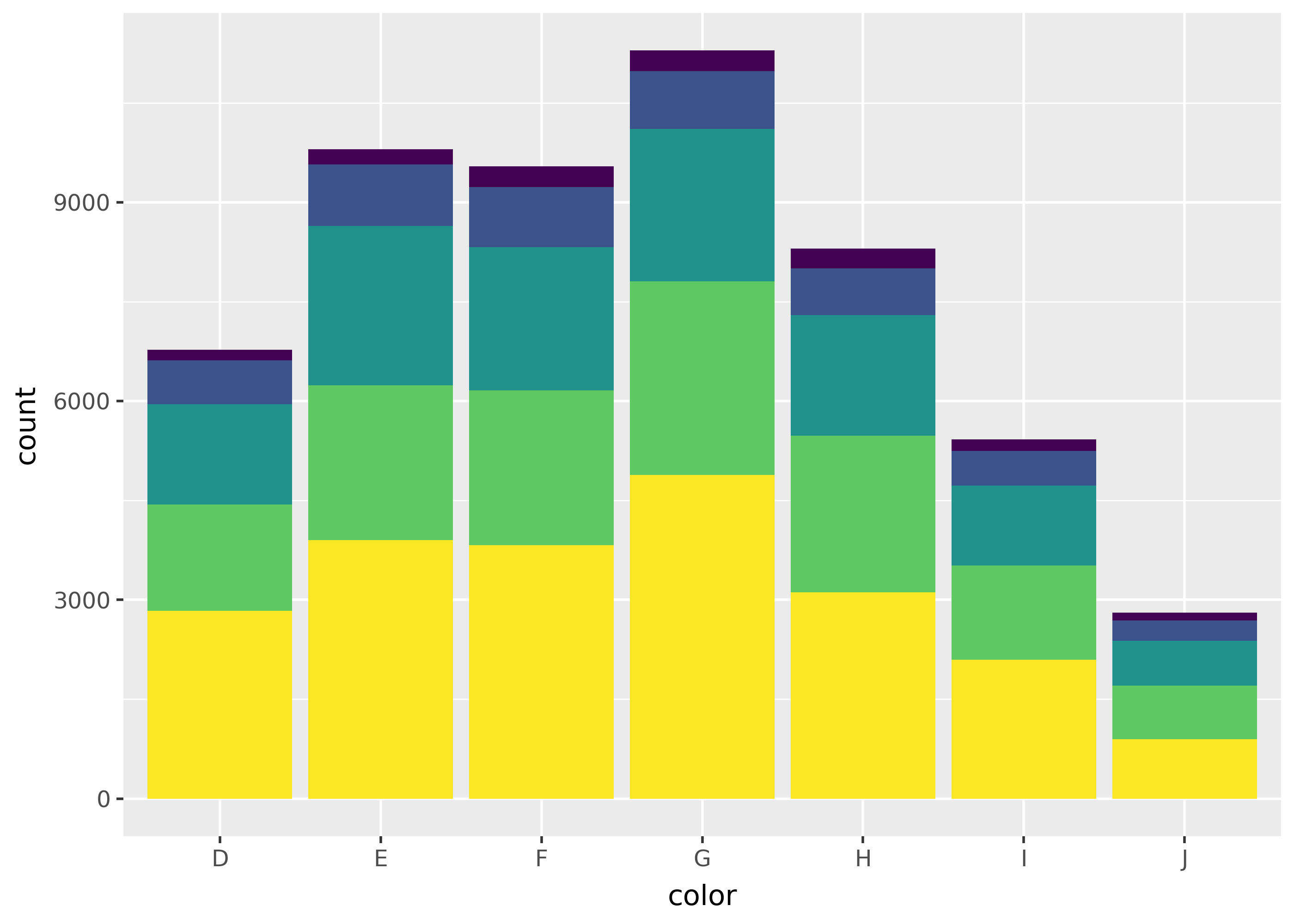
Reversing order
The position_stack() and position_fill() functions supports a reverse argument. This reverses the order within stacked bars.
p = ggplot(diamonds, aes("color", fill="cut"))

p + geom_bar(position=position_fill())
p + geom_bar(position=position_fill(reverse=True))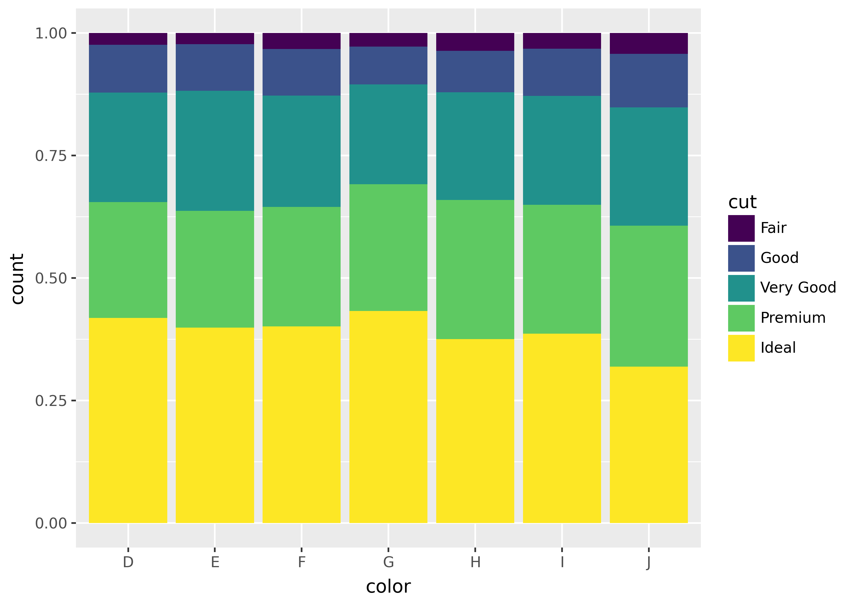
Spacing between dodged bars
Use the width argument to position_dodge() to increase or decrease the spacing between dodged bars.
import pandas as pd
df = pd.DataFrame({"x": [1, 1, 2, 2], "n": [1, 2, 3, 4], "fill": ["A", "B"] * 2})
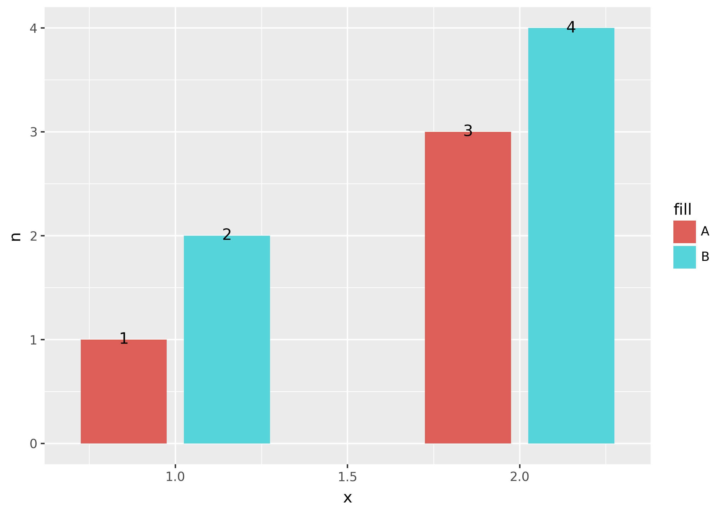
ggplot(df, aes("x", "n", fill="fill")) + geom_col(position=position_dodge(width=0.5))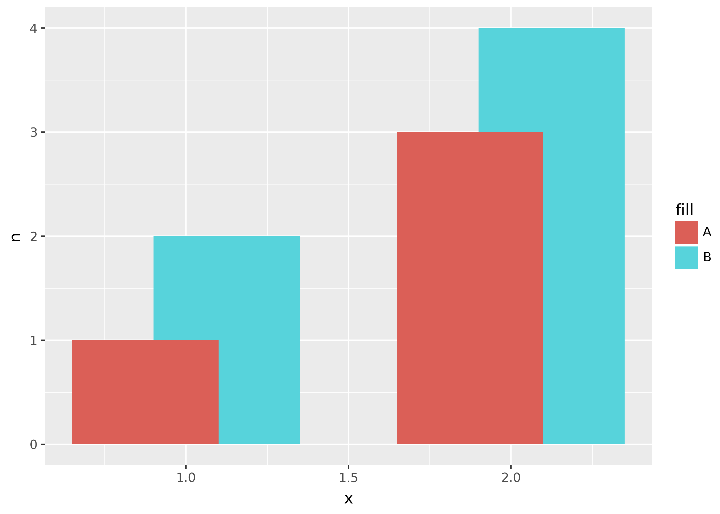
Notice that setting width=0.5 caused the bars to overlap. Setting width higher increases the distance between the center of the bars.
Labelling bars
If you want to add a label to dodged bars, it’s often necessary to set the dodge width for both the bars and the text.
dodge = position_dodge(width=0.6)
(
    ggplot(df, aes("x", "n", fill="fill", label="n"))
    + geom_col(position=dodge, width=0.5)
    + geom_text(position=dodge)
)
Jitterdodging
If you want to combine jittering and dodging, use position_jitterdodge().
Dodging with missing bars
When dodging bars, if a bar is missing from the plot (e.g. due to missing data), it often shows up by making another bar especially wide.
from plotnine.data import mpg

ggplot(mpg, aes("class", fill="factor(cyl)")) + geom_bar(position=position_dodge())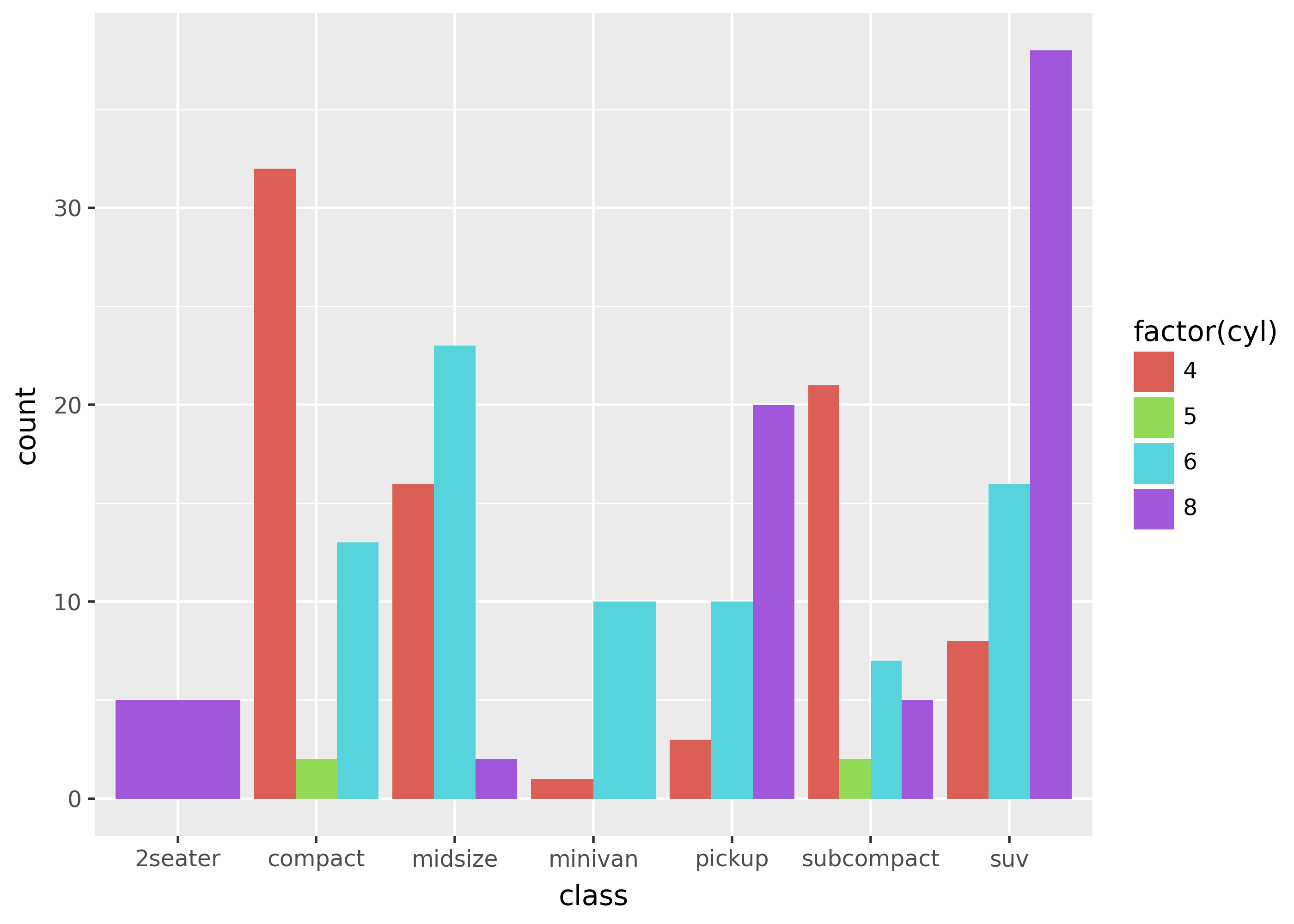
Notice that 2seater on the left has only a single bar that’s as wide as car classes with 4 bars. This is because bars occupy the same amount of room within an x-axis grouping.
In order to preserve space within a grouping for missing bars, you can calculate counts yourself, and add explicit rows for missing combinations in the data.
df_crossed = mpg[["cyl"]].merge(mpg[["class"]], how="cross")

# count rows, then explicitly add 0 counts for missing combinations
full_counts = (
    mpg.groupby(["cyl", "class"])
    .size()
    .reset_index(name="n")
    .merge(df_crossed, how="right")
    .fillna(0)
)

(
    ggplot(
        full_counts,
        aes("class", "n", color="factor(cyl)", fill="factor(cyl)"),
    )
    + geom_col(position=position_dodge())
)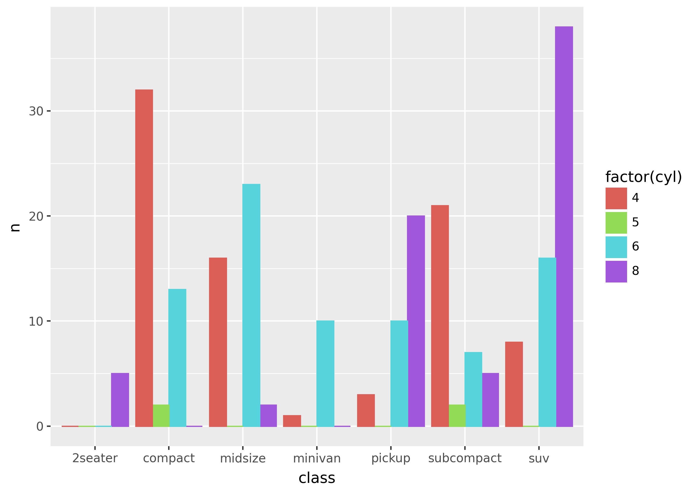
Note that setting the color= aesthetic makes the bars with height 0 visible (by setting the color of the rectangle border).
Dodging lines and points
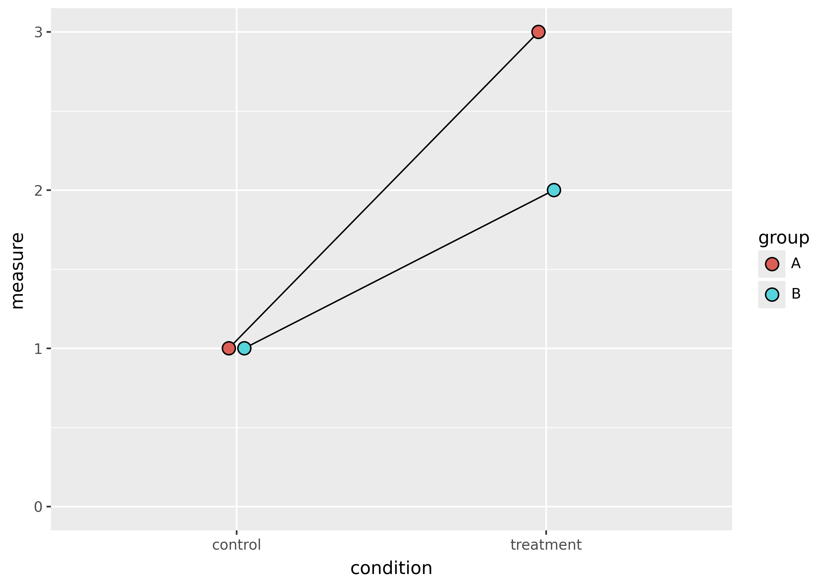
When dodging lines and points, the width= argument to position_dodge() is necessary.
df = pd.DataFrame(
    {
        "group": ["A"] * 2 + ["B"] * 2,
        "condition": ["treatment", "control"] * 2,
        "measure": [3, 1, 2, 1],
    }
)


dodge = position_dodge(width=0.1)

(
    ggplot(df, aes("condition", "measure", fill="group", group="group"))
    + geom_line(position=dodge)
    + geom_point(size=4, position=dodge)
    + expand_limits(y=0)
)
Nudge a fixed amount
Use position_nudge() to move points or text a fixed amount in the x- and y-directions.
highest_mpg = mpg[(mpg["hwy"] == mpg["hwy"].max()) & (mpg["cty"] == mpg["cty"].max())]

(
    ggplot(mpg, aes("cty", "hwy"))
    + geom_point()
    + geom_text(
        aes(label="model"),
        position=position_nudge(x=-1, y=-2),
        data=highest_mpg,
    )
)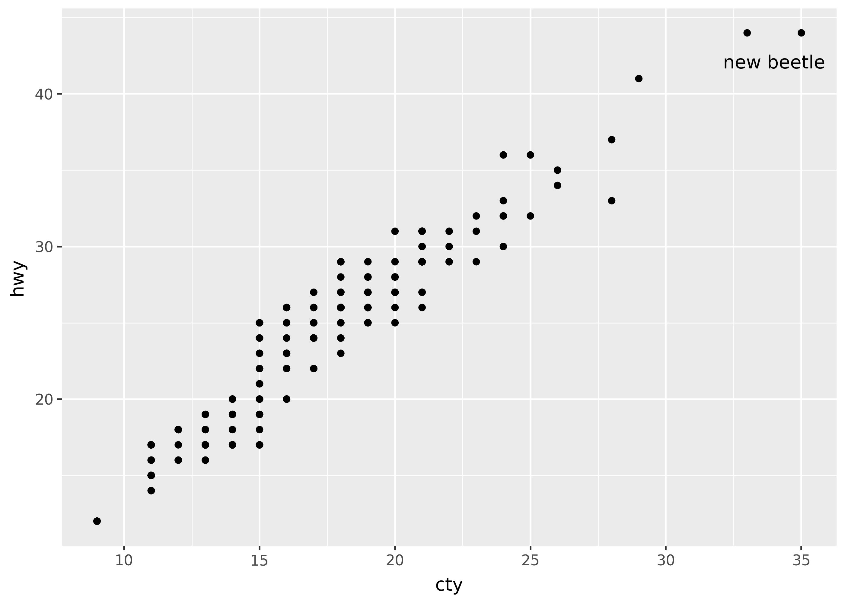
Note however that geoms like geom_text() provide nudge_x and nudge_y arguments that are more convenient for nudging text.