Plot composition is the process of combining multiple plots together. Plotnine overloads the | and / operators for putting plots side-by-side or stacked vertically. It also provides the &, *, and + operators for adding components to parts of composed plots.
This page covers the basics of plot composition. See the Compose Reference page for more details.
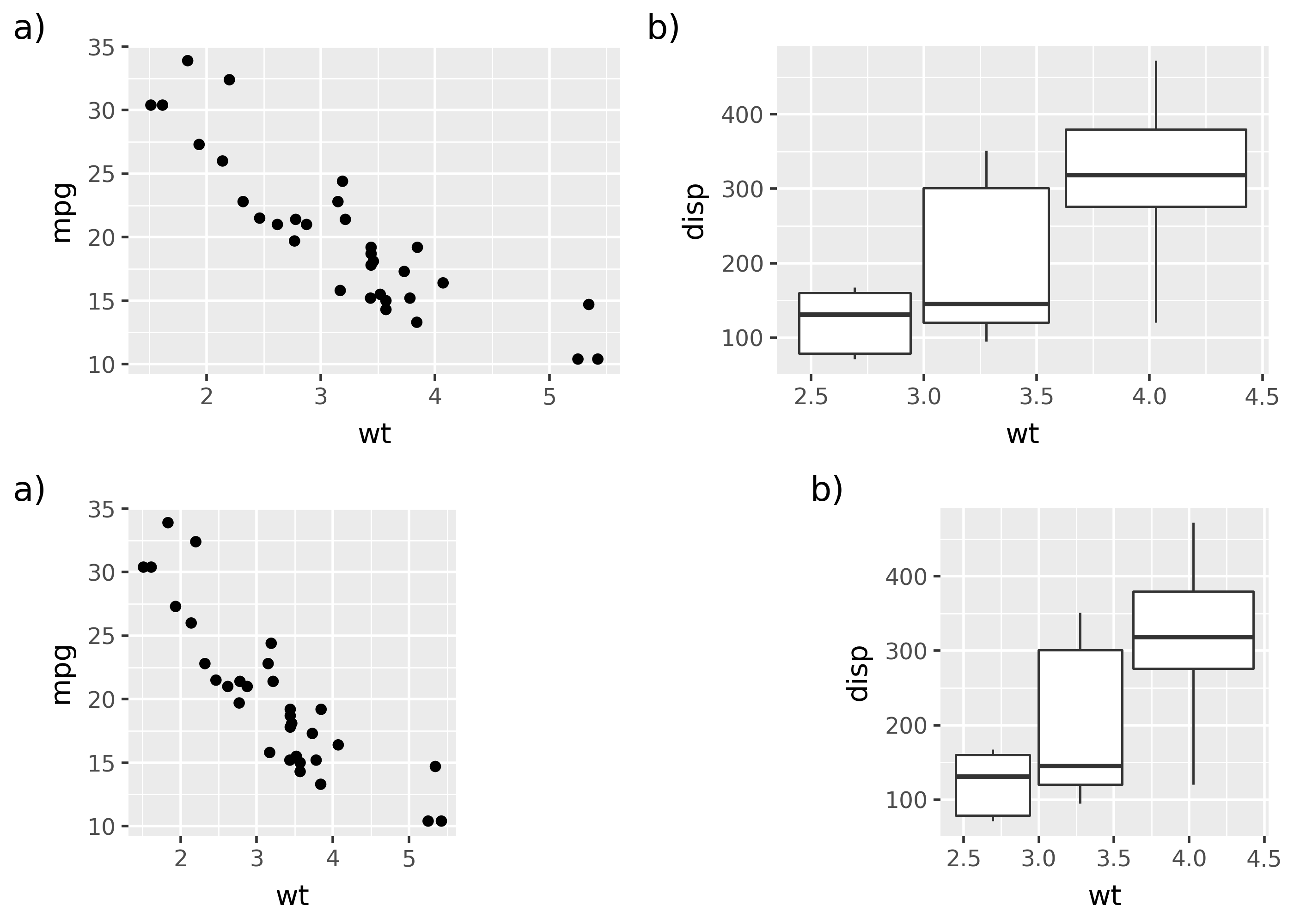
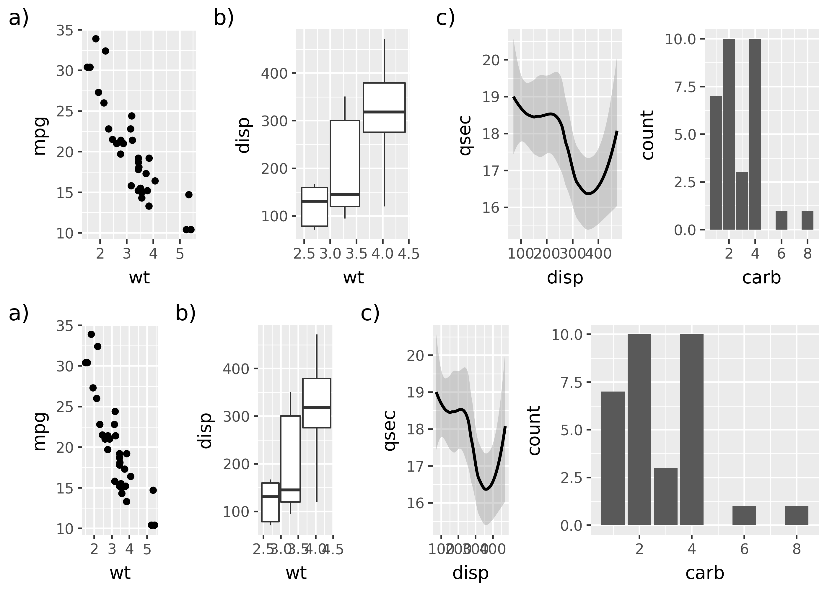
Notice that the tag for p2 (“b)”) is now at the bottom-right.
Adding to composed plots
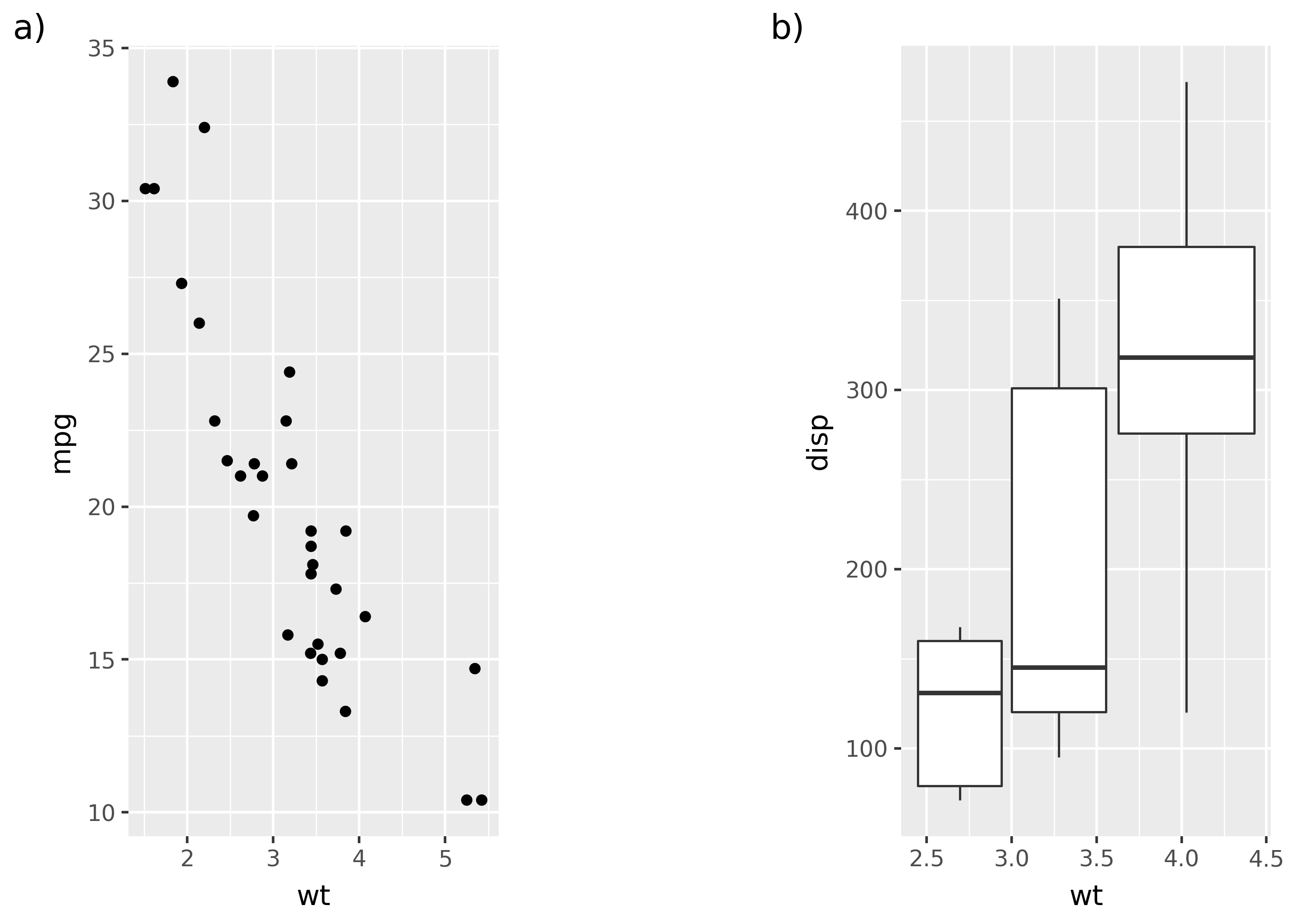
Use the &, *, or + operators to add components like geoms, scales, or themes to plots in a plot composition. The & operator adds to all plots in a composition, while * and + add to the first or last plot, respectively.
composed = p1 | p2composed & theme_minimal() # themes both plotscomposed * theme_minimal() # themes first plot (p1)composed + theme_minimal() # themes last plot (p2)
Adding margins to plots
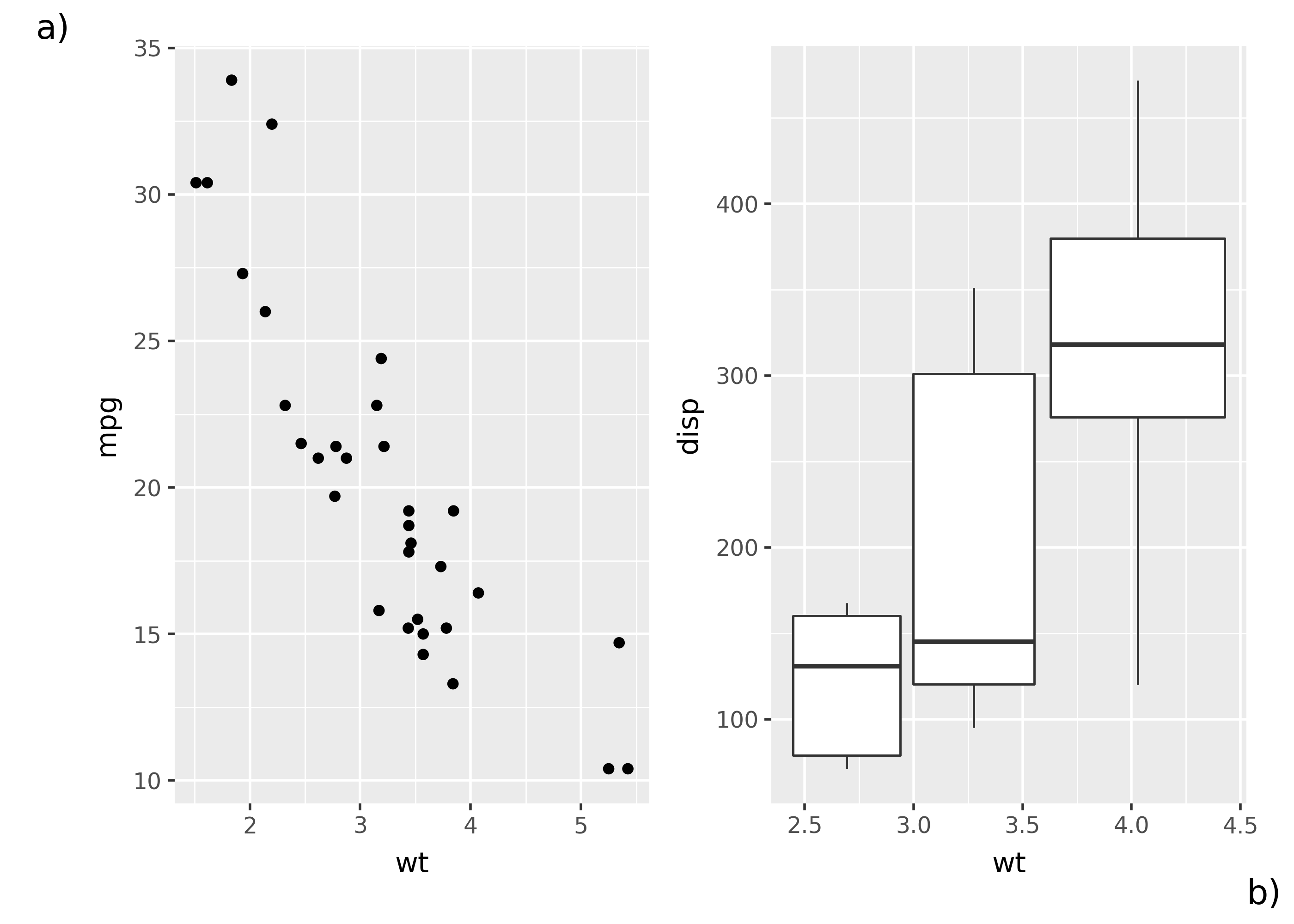
Use options like theme(plot_margin_left=...) to add margins to plots. Margins can be added to the left, right, top, or bottom of a plot.
p1 | p2 + theme(plot_margin_left=0.20)
Notice that a left margin was added to the second plot (p2).
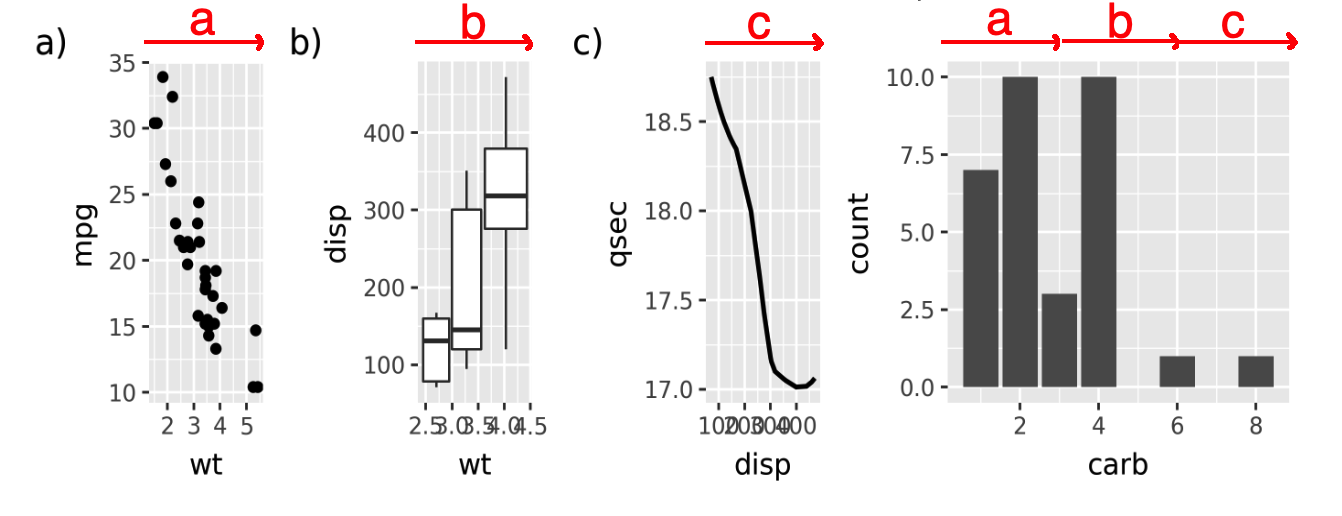
Notice that the top row has the plots side-by-side, while the bottom row puts a space between them.
Nesting level
Nesting level determines the proportion of space a plot (or group of plots) is given. Essentially, each group of plots is a nesting level, and because groups of plots can hold other groups, you can have multiple levels of nesting. This may sound confusing, so this section will start with an example, before explaining nesting levels in more detail.
Use the - operator to put the right-hand plot in its own group, giving it twice as much space as each individual plot on the left.
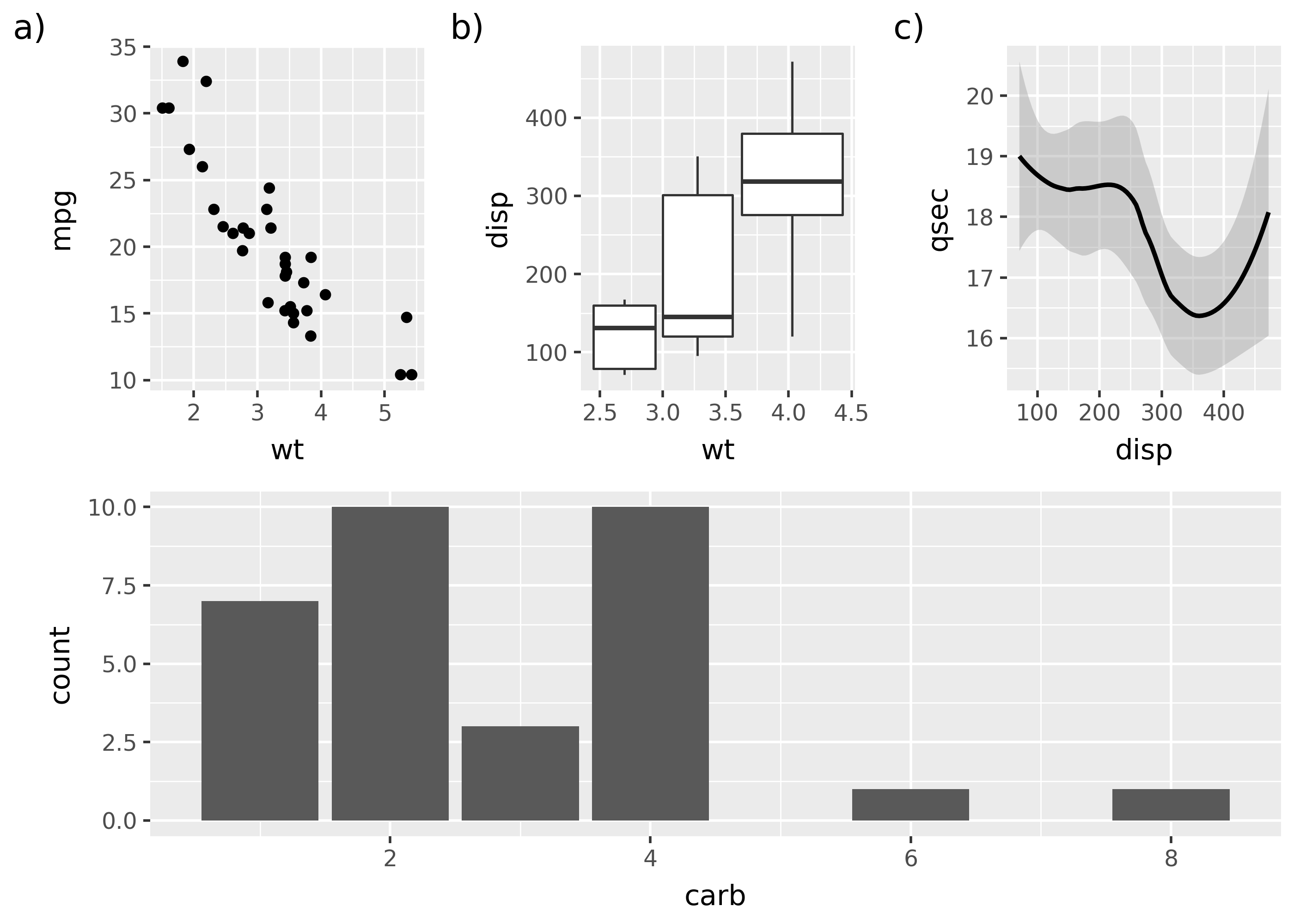
top = p1 | p2 | p3 | p4 # all on same nesting levelbot = (p1 | p2 | p3) - p4 # p1, p2, p3 grouped (lower nesting level)top / bot
Notice that the top row gives each plot panel equal space, while the bottom row gives equal space to the plot panel on the right (the one added with -).
A key here is that the plot panel is the space where geoms are drawn (e.g. points or bars), which excludes areas like the axes and legends. The plot panels for the four bottom plots are marked below.
By default each | adds the plot on the right to the group of plots on the left, and each side-by-side plot in a group is given equal horizontal space. The - operator creates a new group consisting of the left-hand group and the right-hand plot. In this case, each group is a separate nesting level.
More on grouping
Here’s a diagram of the nesting levels for the example above.
Grouping code.
top = p1 | p2 | p3 | p4 # all on same nesting levelbot = (p1 | p2 | p3) - p4 # p1, p2, p3 grouped (lower nesting level)top / bot