from plotnine import ggplot, aes, geom_bar, labs, coord_flip, theme_classic
from plotnine.data import mpgBar chart
In [1]:
geom_bar() makes the height of the bar proportional to the number of cases in each group
In [2]:
mpg.head()| manufacturer | model | displ | year | cyl | trans | drv | cty | hwy | fl | class | |
|---|---|---|---|---|---|---|---|---|---|---|---|
| 0 | audi | a4 | 1.8 | 1999 | 4 | auto(l5) | f | 18 | 29 | p | compact |
| 1 | audi | a4 | 1.8 | 1999 | 4 | manual(m5) | f | 21 | 29 | p | compact |
| 2 | audi | a4 | 2.0 | 2008 | 4 | manual(m6) | f | 20 | 31 | p | compact |
| 3 | audi | a4 | 2.0 | 2008 | 4 | auto(av) | f | 21 | 30 | p | compact |
| 4 | audi | a4 | 2.8 | 1999 | 6 | auto(l5) | f | 16 | 26 | p | compact |
Bar Plot with Counts
In [3]:
# Gallery, distributions
ggplot(mpg) + geom_bar(aes(x="class"))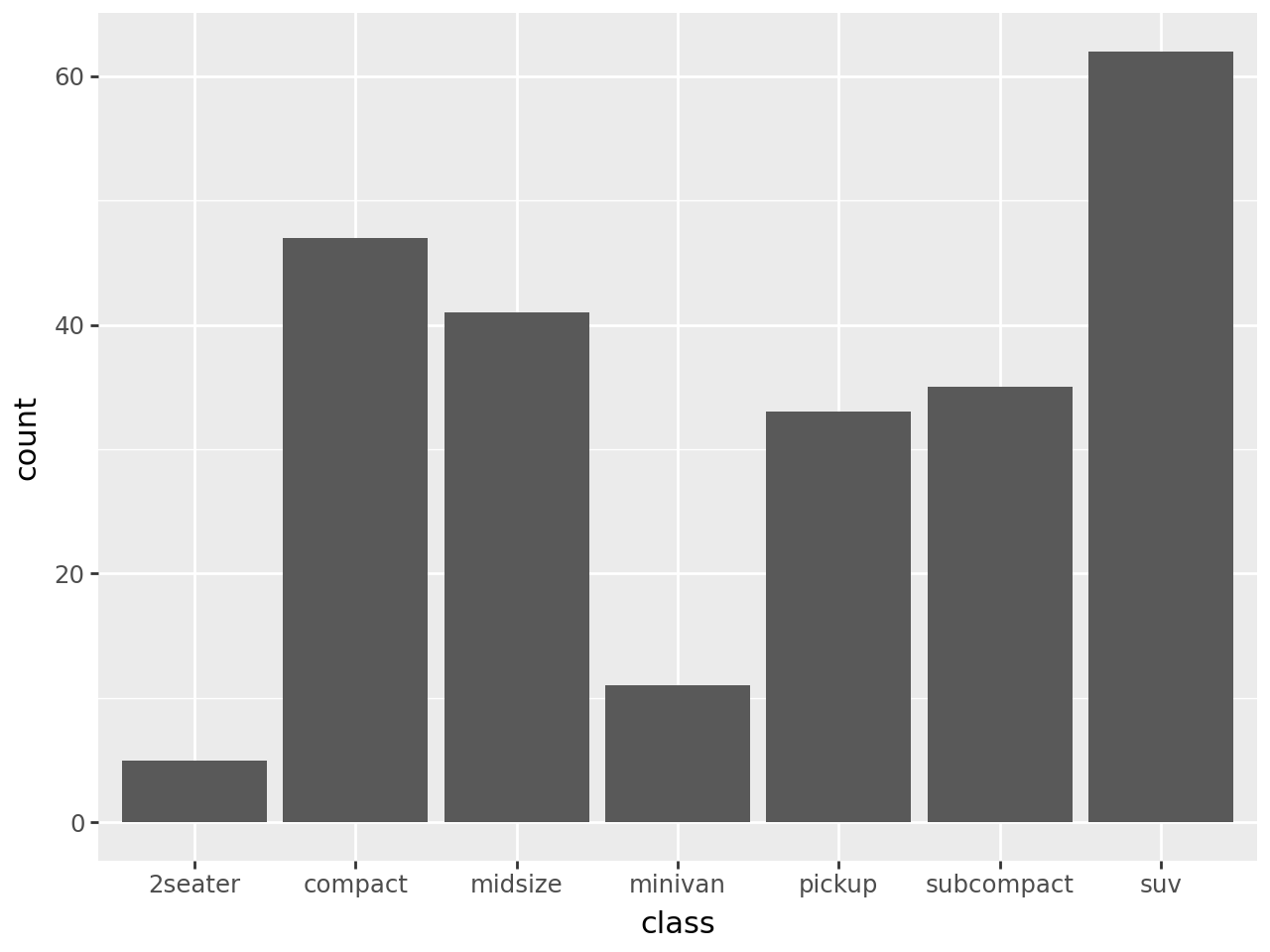
Sorting the bars
We can use the internal function reorder to sort the bars depending on the size of each group. In this case we create a variable class2 with values equal to those of class so because class is a reserved name and:
reorder(class, class, len)is not a valid python expression, while:
reorder(class2, class2, len)is a valid python expression.
In [4]:
mpg["class2"] = mpg["class"]

(
    ggplot(mpg)
    + geom_bar(aes(x="reorder(class2, class2, len)"))
    + labs(x="class")
)
And in descending order
In [5]:
(
    ggplot(mpg)
    + geom_bar(
        aes(x="reorder(class2, class2, len, ascending=False)")
    )
    + labs(x="class")
)
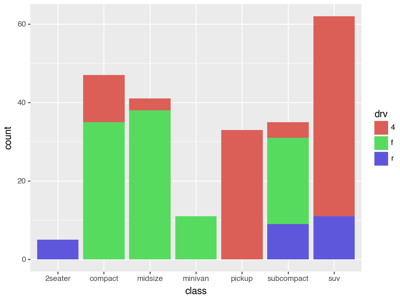
In [6]:
(
    ggplot(mpg)
    + geom_bar(aes(x="class", fill="drv"))
)
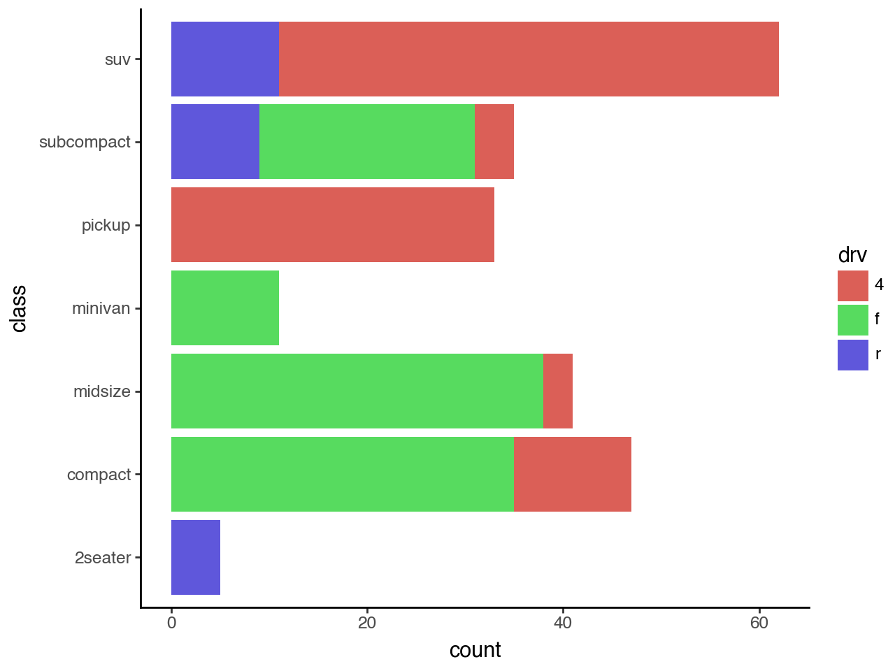
Horizontal Bar Plot with Counts
In [7]:
# Gallery, distributions
(
    ggplot(mpg)
    + geom_bar(aes(x="class", fill="drv"))
    + coord_flip()
    + theme_classic()
)