import pandas as pd
from plotnine import (
ggplot,
aes,
geom_path,
geom_line,
labs,
scale_color_continuous,
element_text,
theme,
)
from plotnine.data import economics
Connected points
geom_path(
    mapping=None,
    data=None,
    *,
    stat="identity",
    position="identity",
    na_rm=False,
    inherit_aes=True,
    show_legend=None,
    raster=False,
    lineend="butt",
    linejoin="round",
    arrow=None,
    **kwargs
)
Parameters
mapping : aes = None-
Aesthetic mappings created with aes. If specified and
inherit_aes=True, it is combined with the default mapping for the plot. You must supply mapping if there is no plot mapping.Aesthetic Default value x y alpha 1color 'black'group linetype 'solid'size 0.5The bold aesthetics are required.
data : DataFrame = None-
The data to be displayed in this layer. If
None, the data from from theggplot()call is used. If specified, it overrides the data from theggplot()call. stat : str | stat = "identity"-
The statistical transformation to use on the data for this layer. If it is a string, it must be the registered and known to Plotnine.
position : str | position = "identity"-
Position adjustment. If it is a string, it must be registered and known to Plotnine.
na_rm : bool = False-
If
False, removes missing values with a warning. IfTruesilently removes missing values. inherit_aes : bool = True-
If
False, overrides the default aesthetics. show_legend : bool | dict = None-
Whether this layer should be included in the legends.
Nonethe default, includes any aesthetics that are mapped. If abool,Falsenever includes andTruealways includes. Adictcan be used to exclude specific aesthetis of the layer from showing in the legend. e.gshow_legend={'color': False}, any other aesthetic are included by default. raster : bool = False-
If
True, draw onto this layer a raster (bitmap) object even ifthe final image is in vector format. lineend : Literal["butt", "round", "projecting"] = "butt"-
Line end style. This option is applied for solid linetypes.
linejoin : Literal["round", "miter", "bevel"] = "round"-
Line join style. This option is applied for solid linetypes.
arrow : arrow = None-
Arrow specification. Default is no arrow.
**kwargs : Any-
Aesthetics or parameters used by the
stat.
See Also
arrow-
for adding arrowhead(s) to paths.
Examples
Path plots
geom_path() connects the observations in the order in which they appear in the data, this is different from geom_line() which connects observations in order of the variable on the x axis.
economics.head(10) # notice the rows are ordered by date| date | pce | pop | psavert | uempmed | unemploy | |
|---|---|---|---|---|---|---|
| 0 | 1967-07-01 | 507.4 | 198712 | 12.5 | 4.5 | 2944 |
| 1 | 1967-08-01 | 510.5 | 198911 | 12.5 | 4.7 | 2945 |
| 2 | 1967-09-01 | 516.3 | 199113 | 11.7 | 4.6 | 2958 |
| 3 | 1967-10-01 | 512.9 | 199311 | 12.5 | 4.9 | 3143 |
| 4 | 1967-11-01 | 518.1 | 199498 | 12.5 | 4.7 | 3066 |
| 5 | 1967-12-01 | 525.8 | 199657 | 12.1 | 4.8 | 3018 |
| 6 | 1968-01-01 | 531.5 | 199808 | 11.7 | 5.1 | 2878 |
| 7 | 1968-02-01 | 534.2 | 199920 | 12.2 | 4.5 | 3001 |
| 8 | 1968-03-01 | 544.9 | 200056 | 11.6 | 4.1 | 2877 |
| 9 | 1968-04-01 | 544.6 | 200208 | 12.2 | 4.6 | 2709 |
Because the data is in date order geom_path() (in pint) produces the same result as geom_line() (in black):
(
    ggplot(economics, aes(x="date", y="unemploy"))
    + geom_line(size=5)  # plot geom_line as the first layer
    + geom_path(
        colour="#ff69b4",  # plot a path - colour pink
        size=1,
    )
    + labs(x="date", y="unemployment (,000)")  # label x & y-axis
)
Plotting unemployment (scaled by population) versus savings rate shows how geom_path() differs from geom_line(). Because geom_path() connects the observations in the order in which they appear in the data, this line is like a “journey through time”:
(
    ggplot(economics, aes(x="unemploy/pop", y="psavert"))
    + geom_path()  # plot geom path
    + labs(x="scaled unemployment", y="saving rate")  # label x & y-axis
)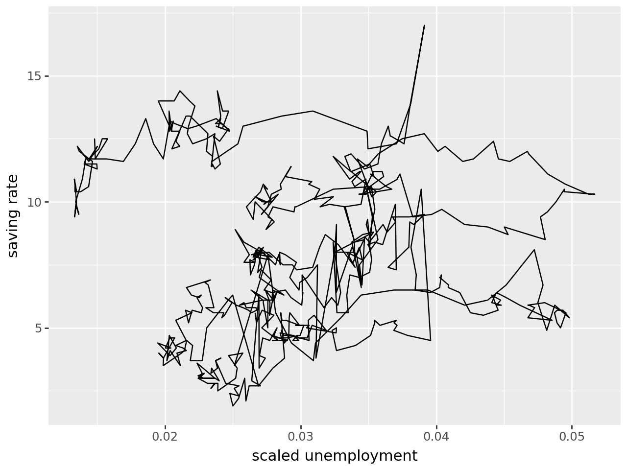
Comparing geom_line() (black) to geom_path() (pink) shows how these two plots differ in what they can show: geom_path() shows the savings rate has gone down over time, which is not evident with geom_path().
(
    ggplot(economics, aes(x="unemploy/pop", y="psavert"))
    + geom_path(
        colour="#ff69b4",  # plot geom_path as the first layer - colour pink
        alpha=0.5,  # line transparency
        size=2.5,
    )  # line thickness
    + geom_line()  # layer geom_line
    + labs(x="scaled unemployment", y="saving rate")  # label x & y-axis
)
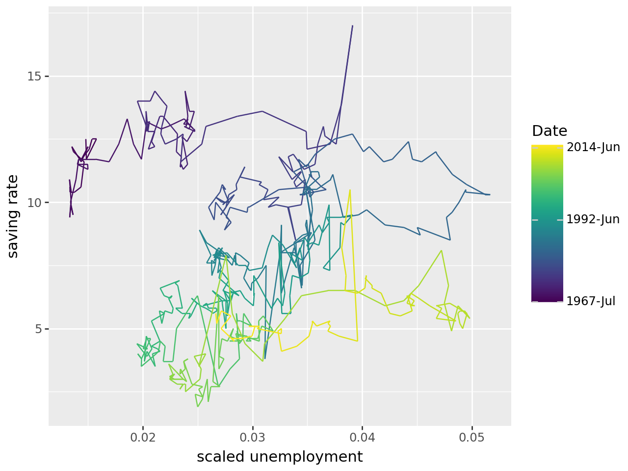
The geom_path can be easier to interpret if time is coloured in. First convert time to a number, and use this number to colour the path:
# convert date to a number
economics["date_as_number"] = pd.to_numeric(economics["date"])
# inspect new column
economics.head()| date | pce | pop | psavert | uempmed | unemploy | date_as_number | |
|---|---|---|---|---|---|---|---|
| 0 | 1967-07-01 | 507.4 | 198712 | 12.5 | 4.5 | 2944 | -79056000000000000 |
| 1 | 1967-08-01 | 510.5 | 198911 | 12.5 | 4.7 | 2945 | -76377600000000000 |
| 2 | 1967-09-01 | 516.3 | 199113 | 11.7 | 4.6 | 2958 | -73699200000000000 |
| 3 | 1967-10-01 | 512.9 | 199311 | 12.5 | 4.9 | 3143 | -71107200000000000 |
| 4 | 1967-11-01 | 518.1 | 199498 | 12.5 | 4.7 | 3066 | -68428800000000000 |
The path is coloured such that it changes with time using the command aes(colour='date_as_number') within geom_path().
# input
legend_breaks = [
    -79056000000000000,
    709948800000000000,
    1401580800000000000,
]  # used to modify colour-graded legend
legend_labels = ["1967-Jul", "1992-Jun", "2014-Jun"]

# plot
(
    ggplot(economics, aes(x="unemploy/pop", y="psavert"))
    + geom_path(
        aes(colour="date_as_number")
    )  # colour geom_path using time variable "date_as_number"
    + labs(x="scaled unemployment", y="saving rate")
    + scale_color_continuous(
        breaks=legend_breaks,  # set legend breaks (where labels will appear)
        labels=legend_labels,
    )  # set labels on legend
    + theme(legend_title=element_text(text="Date"))  # set title of legend
)