import pandas as pd
import numpy as np
from plotnine import (
ggplot,
aes,
geom_path,
geom_point,
geom_col,
labs,
scale_color_discrete,
scale_fill_discrete,
guides,
guide_legend,
)
scale_color_discrete(
    h=15,
    c=100,
    l=65,
    direction=1,
    *,
    name=None,
    breaks=True,
    limits=None,
    labels=True,
    expand=None,
    guide="legend",
    na_value="#7F7F7F",
    aesthetics=(),
    drop=True,
    na_translate=True,
    s=None,
    color_space=None
)
alias of scale_color_hue
Init Parameters
h: float | tuple[float, float] = 15-
Hue. If a float, it is the first hue value, in the range
[0, 360]. The range of the palette will be[first, first + 360).If a tuple, it is the range
[first, last)of the hues. c: float = 100-
Chroma. Must be in the range
[0, 100] l: float = 65-
Lightness. Must be in the range [0, 100]
direction: Literal[1, -1] = 1-
The order of colours in the scale. If -1 the order of colours is reversed. The default is 1.
Parameter Attributes
name: str | None = None-
The name of the scale. It is used as the label of the axis or the title of the guide. Suitable defaults are chosen depending on the type of scale.
breaks: DiscreteBreaksUser = True-
List of major break points. Or a callable that takes a tuple of limits and returns a list of breaks. If
True, automatically calculate the breaks. limits: DiscreteLimitsUser = None-
Limits of the scale. These are the categories (unique values) of the variables. If is only a subset of the values, those that are left out will be treated as missing data and represented with a
na_value. labels: ScaleLabelsUser = True-
Labels at the
breaks. Alternatively, a callable that takes an array_like of break points as input and returns a list of strings. expand: (
tuple[float, float]
| tuple[float, float, float, float]
| None
) = None-
Multiplicative and additive expansion constants that determine how the scale is expanded. If specified must be of length 2 or 4. Specifically the values are in this order:
(mul, add)
(mul_low, add_low, mul_high, add_high)
For example,
(0, 0)- Do not expand.(0, 1)- Expand lower and upper limits by 1 unit.(1, 0)- Expand lower and upper limits by 100%.(0, 0, 0, 0)- Do not expand, as(0, 0).(0, 0, 0, 1)- Expand upper limit by 1 unit.(0, 1, 0.1, 0)- Expand lower limit by 1 unit and upper limit by 10%.(0, 0, 0.1, 2)- Expand upper limit by 10% plus 2 units.
If not specified, suitable defaults are chosen.
guide: Literal["legend"] | None = "legend"na_value: str = "#7F7F7F"-
Color of missing values.
aesthetics: Sequence[ScaledAestheticsName] = ()-
Aesthetics affected by this scale. These are defined by each scale and the user should probably not change them. Have fun.
drop: bool = True-
Whether to drop unused categories from the scale
na_translate: bool = True-
If
Truetranslate missing values and show them. IfFalseremove missing values. s: None = field(default=None, repr=False)-
Not being used and will be removed in a future version
color_space: None = field(default=None, repr=False)-
Not being used and will be removed in a future version
Examples
Make some data
n = 9
df = pd.DataFrame(
    {
        "x": np.arange(1, n+1),
        "y": np.arange(1, n+1),
        "yfit": np.arange(1, n+1) + np.tile([-0.2, 0, 0.2], n // 3),
        "cat": ["a", "b", "c"] * (n // 3),
    }
)
Draw an initial plot.
(
    ggplot(df)
    + geom_col(aes("x", "y"))
)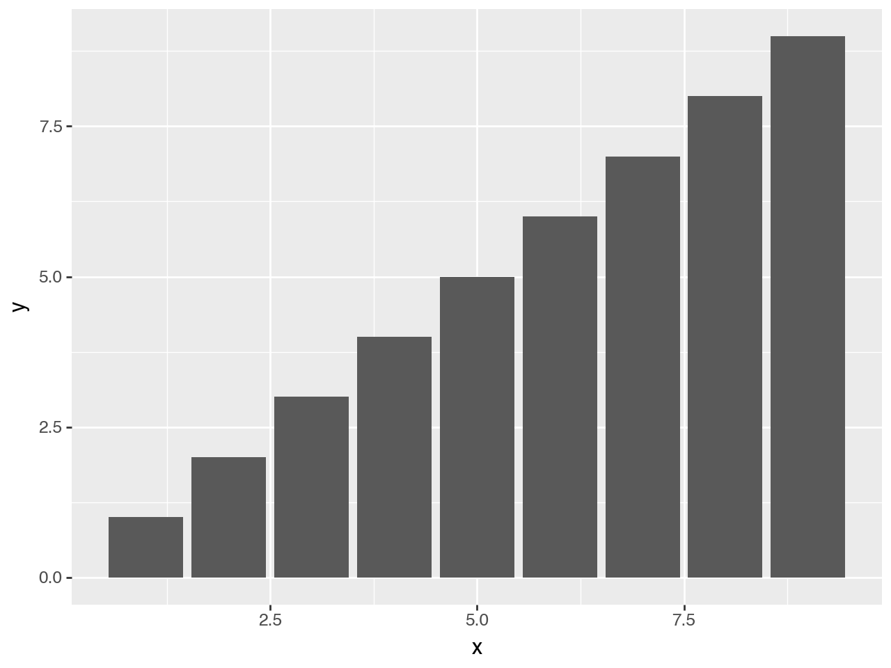
Mapping the fill to a discrete variable uses the default color palette from the scale_fill_discrete
(
    ggplot(df)
    + geom_col(aes("x", "y", fill="cat")) # changed
)
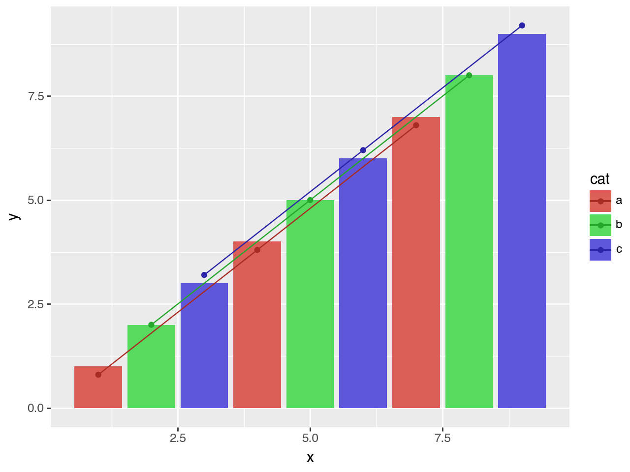
Assuming we want to visualise a “model” on top of the data. We could add this model data as points and a path through the points.
(
    ggplot(df)
    + geom_col(aes("x", "y", fill="cat"))
    + geom_point(aes("x", y="yfit", color="cat"))  # new
    + geom_path(aes("x", y="yfit", color="cat"))   # new
)
There is a clash of colors between the actual data (the bars) and the fitted model (the points and lines). A simple solution is to adjust the colors of the fitted model slightly. We do that by varying the lightness of the default color scale, make them a little darker.
(
    ggplot(df)
    + geom_col(aes("x", "y", fill="cat"))
    + geom_point(aes("x", y="yfit", color="cat"))
    + geom_path(aes("x", y="yfit", color="cat"))
    + scale_color_discrete(l=0.4)   # new
)
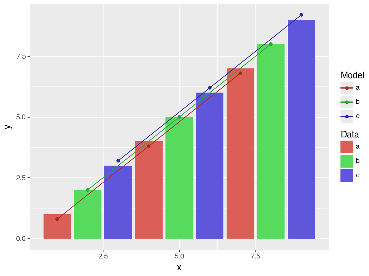
There are two main pieces of information in the plot, but we a single combined legend. Since we use separate aesthetics for the actual data and fitted model, we can have distinct legends for both by giving a name to the scales associated with each.
(
    ggplot(df)
    + geom_col(aes("x", "y", fill="cat"))
    + geom_point(aes("x", y="yfit", color="cat"))
    + geom_path(aes("x", y="yfit", color="cat"))
    + scale_color_discrete(l=0.4, name="Model") # modified
    + scale_fill_discrete(name="Data")          # new
)
Alternatively, we could use the labs class to set the names.
(
    ggplot(df)
    + geom_col(aes("x", "y", fill="cat"))
    + geom_point(aes("x", y="yfit", color="cat"))
    + geom_path(aes("x", y="yfit", color="cat"))
    + scale_color_discrete(l=0.4)
    + labs(fill="Data", color="Model") # new
)
Or we could use guide_legend to rename the titles of the legends.
(
    ggplot(df)
    + geom_col(aes("x", "y", fill="cat"))
    + geom_point(aes("x", y="yfit", color="cat"))
    + geom_path(aes("x", y="yfit", color="cat"))
    + scale_color_discrete(l=0.4)
    + guides( # new
        fill=guide_legend(title="Data"), color=guide_legend(title="Model")
    )
)